Zelda Themed Poker Chips v2 (2 Viewers)

Mysticum

Pair
Joined
Sep 19, 2020
Messages
107
Reaction score
133
Location
Gothenburg, Sweden
I got help with the design from the absolutely fantastic @efdenny. Without asking he just showed me some great ideas and this is how it looks after a couple of iterations:
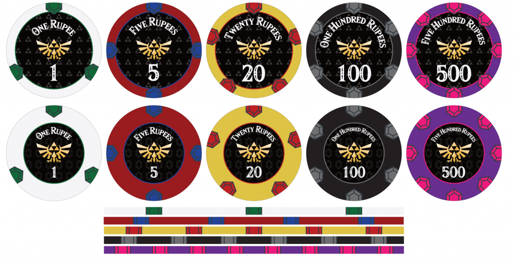

Zelda7-Feedback.png


I'm super happy with the result, but if you have any valuable feedback, now is the time. The main decision to make is whether to go with black background or one of the patterns in the picture. Thanks for your attention. Looking forward to your feedback.
 
More information (didn't want to write more text since I received some backlash last time):

The plan right now is to have the design printed on Sun-Fly PolyInno 43mm with a glossy label in the center. Thus, I'm more likely to go with the bottom design with "small center" for the labels since I think the rupee design will be "too tight" in the "large center", even though I think it looks absolutely dope. Now when I think about it, I'm also not sure that it will work with the rupees going from ceramic print to glossy label print, since they overlap a bit into the black label.

If anyone have experience with the colored ring around the glossy label on PolyInno chips, it would be very much appreciated. Having the print on the label is probably not a good idea, so in that case it has to be printed on the ceramic part and I'm not sure how good it would look in reality.
 
Looks great. Have a look at the sun-flys welcome thread, there are som nice looking b&g acf tributes there with a colored ring on the ceramic part of the face.
 
Looks great. Have a look at the sun-flys welcome thread, there are som nice looking b&g acf tributes there with a colored ring on the ceramic part of the face.

Can't find it. I only find the Mad Duck Poker chips where the ring is printed on the label. It looks surprisingly good, but I'm still skeptical due to 1, less space for the label print, 2, color variation between label and ceramic that might look weird in this case.
 
Thanks...I thought they were ceramics and not hybrids, but now I see it when I take a closer look. Just hope that it works for thinner border as well, but I guess it could work as long as the "inner edge" gets that colors as well. Shouldn't be impossible.
 
If they are going to be denominated in rupees, I would add the currency symbol.

I can’t find it on my keyboard but it’s this:

09704E4E-2EFA-4D20-980F-4931F37C9D9D.jpeg
 
This is a great design. I think the smaller inlay looks better with a better base/inlay balance. Unfortunately longer texts like "Five hundred rupees" get somewhat squashed. I know it's somewhat untraditional, but maybe try putting the number above and the text below. Or find some other text to use, as the amount in letters might not be necessary. The eagle-like symbol could then possibly be slightly enlarged.

The rupee symbol is modern (2010), so I don't know if that would be appropriate in this context. Admittedly, I have no knowledge of the Zelda universe.
 
Well, the real life Rupee don't really have anything to do with the in-game currency, neither is it used in the game.

It's supposed to be fairly generic, the text for denomination have a more decorative pupose than informational.

I'm also wondering if I should start with 300 chips just to see the design in real-life, or if I should go all-in with all the chips I need in one purchase.
 
Last edited:
I would consider going with some other spot color on the 20 because I don’t like to repeat colors from other denoms.

Is it possible to get two colored spots on the hundred? I like the idea of more complex spots on the high denom.

These comments are purely from a poker perspective so I may be very off in terms of the Zelda color theme.

I do think they look very nice! And I like the bottom alternative best
 
I like the bottom row better, you should switch the spot colors on the 100 and 20.
 
I would consider going with some other spot color on the 20 because I don’t like to repeat colors from other denoms.
I like the bottom row better, you should switch the spot colors on the 100 and 20.

From a poker perspective and ideal scenario, I totally agree with you, but in this case it has strong relations with the Zelda theme, and thus, I won't change it. I'm aware of the color repetition, and thanks for your feedback, but in this case that's just a hit I need to take.

Is it possible to get two colored spots on the hundred? I like the idea of more complex spots on the high denom.

We decided to have progressive spots so no denominations had the same. I really liked the 8 spots on the 100, but then the 500 would have the same. Isn't it "better" to have unique spot design on each chip?

I do think they look very nice! And I like the bottom alternative best

Yeah, it seems most people like the bottom row better so I think that's the way to go. I like the top row slightly more on picture, but I think the bottom row translates better to a good chip design for PolyInno 43mm specifically. (Since the rupee would run over both ceramic and label, and it's a risk that it won't look good).
 
We decided to have progressive spots so no denominations had the same. I really liked the 8 spots on the 100, but then the 500 would have the same. Isn't it "better" to have unique spot design on each

Right, this was a comment that I mistakingly made in your other thread when I thought the 100 was the biggest denom. Please ignore
 
Really like the diamond background on the inlay btw. Didn’t notice it at first

Yeah, we have both triangle (Triforce) patterns and diamond (Rupee) pattern in the other row. Which works best do you think? I can't really decide :/
 
I’m sure this’ll be a great set! I also bet you it won’t be the last one ;)
 
I should mention that while most colors are set in stone, the 500 is not one of them.

I think I will go with a slightly darker purple for the chip, and the rupee color is very much open for suggestion. For Zelda purpose, yellow/orange would make most sense, but this is not as strict as the other colors, so feel free to suggest anything here.
 
I'm also wondering is I should start with 300 chips just to see the design in real-life, or if I should go all-in with all the chips I need in one purchase.

At least order all chips of a denomination in one run, as you cannot always be sure a later addon will produce exactly the same result.

I think I will go with a slightly darker purple for the chip, and the rupee color is very much open for suggestion. For Zelda purpose, yellow/orange would make most sense, but this is not as strict as the other colors, so feel free to suggest anything here.
Bright orange might be worth a try.
 
We changed the purple one, but can't decide which one to go with. What do you think?

500-Comparison.png


I also changed the "silver" color for the 100 denomination to be lighter/whiter to create a better contrast.
 
I also want to add a non-denomination (a chip without a number). I'm thinking about having it Green (or perhaps blue).

What do you suggest as edge spot color (color of the rupees), given the colors I already have in my set?
 
This is the candidate to be the final design:
Zelda_final.png


The chip without denomination is mostly concept and not sure I'm going to print that one.

Any last feedback before making the order? (I will still await the last chip samples coming in, but hopefully I'm making an order very soon.)
 
I like these, both as a chip nerd and as a Zelda fan! You should start a thread for samples, all us Nintendo freaks will be like
SmartSelect_20201006-230239_Chrome.jpg


One small thing: I can clearly see that the edge spots are rupees on 20-500 and the green, but not on the 1 or 5. Perhaps change the color of the lines?
 
One small thing: I can clearly see that the edge spots are rupees on 20-500 and the green, but not on the 1 or 5. Perhaps change the color of the lines?

Interesting note... They all use the same color lines, and they all look OK on my screen. Curious to see if anyone else has this issue.
 

Create an account or login to comment

You must be a member in order to leave a comment

Create account

Create an account and join our community. It's easy!

Log in

Already have an account? Log in here.

Back
Top Bottom