Yet another CPC design thread (1 Viewer)

msuroo

Straight
Joined
Feb 27, 2019
Messages
795
Reaction score
1,704
Location
USA
I know there's a few of these going around, but you folks always have such good insight, so I'm going to throw my ideas up too. I'm still in early stages, and I don't have my inlay design done yet, and I know this all ultimately comes down to taste, but just wanted to gather feedback and see if there are any glaring issues I'm not seeing. One thing is for sure, I'm really glad I got color samples - a lot of things changed when I actually laid them out. Anyway, here's where I'm at so far - appreciate any and all feedback!

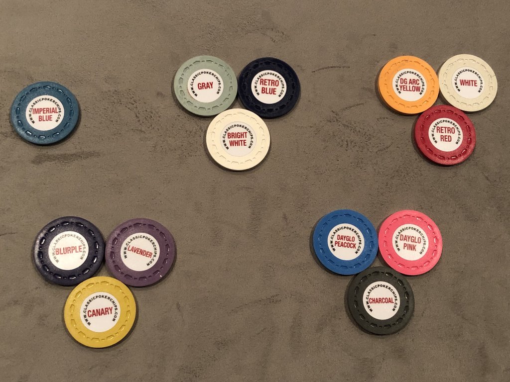
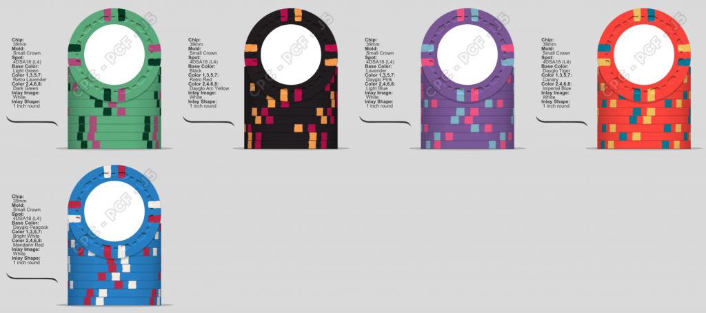
Cash chips (.25/1/5/20/100):

285775

285776


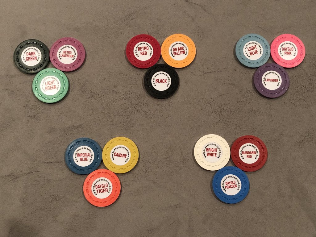
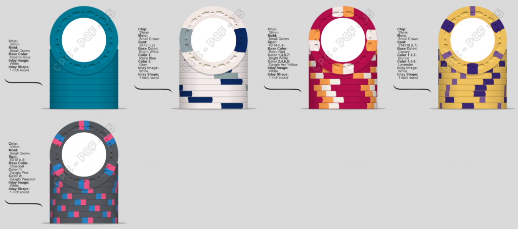
Tourney chips (25/100/500/1K/5K):

285777

285778
 
I'm not a fan of the gray spot on the one dollar chip. The chip looks unbalanced. You have this bright beautiful retro blue spot. Then this meh, gray spot.
 
I agree. Either that or light blue instead of white for the $5.
The T500 is nice, those three colors go very well together.
Agree, light blue over white on the $5

Hmm, I like this in the tool - will have to play around with the color samples when I get home. Might need to change the frac though? Feels like a lot of blue.

I'm not a fan of the gray spot on the one dollar chip. The chip looks unbalanced. You have this bright beautiful retro blue spot. Then this meh, gray spot.

Agree that this is my least favorite spot in the bunch - liked the look of the cinci horseshoe 1, so started there. Wasn’t sure what to use in its place - maybe some sort of green?

285866
 
CPC Retro red base and light blue edge spot go very well together.

Light green base goes well with retro green.
IMG_9821.JPG


Edit; there was supposed to be a pic,
Pic added
 
Last edited:
I like both the cash & tourney sets, IMHO you could go to production with these as is and have 2 great sets, very nicely done.

For the cash, I really like the spot progression, you're breaking down from the solid to the larger spots to medium to medium & small to all small, and the color complexity progression matches nicely. I honestly really like the $1 with the grey spot (I love the Cincy $1 though so I'm probably biased). I think adding another color to the $1 may be too much color - light blue or dg peacock may be too much blue with the imperial quarter. Green would look nice on the individual chip, not sure how that jives with the rest of the set. I personally would go with mandarin red for the fiver but that's just my preference (I think mandarin pairs better with arc yellow), but you have the color sample so you probably like the retro better. I have a very similar yellow chip in my tourney set, I went with retro lavender instead of lavender for the lighter spots, I wanted a little more distinction between the spots, but I think either works well.

For the tourney set, again just minor suggestions, I would swap in DG yellow for canary on the 1k spots, IMHO the dg yellow pops more on the dg tiger base. I'd also look at retro green for the spots on the 25 - dark green is really close to black, I think you'd get a similar contrasting effect with retro green but with a nicer green hue. I was thinking of suggesting DG green for the base on the 25 because you have the other DG bases for the 1k and 5k, but I think the light green you have in the mockup pairs nicer with the pastel-y 500.

Now all that being said, get that draft inlay going, that could change everything.... :ROFL: :ROFLMAO:
Thanks for the super thoughtful response - a lot of these suggestions I’ve considered and could honestly go either way on. (Originally had Mandarin Red as base for the $5, for example, but liked that retro red was just a touch brighter). Looks like retro green could be a good option on the T25, especially based on @Steamtrain ’s set above. Was looking at dg yellow on the T1K, but was worried that the dg tiger base was so bright that the bright spot would almost get lost? Will have another look at that one.

And yeah, really need to get the inlays in there - hopefully soon!

Thanks all for the input so far!
 

Create an account or login to comment

You must be a member in order to leave a comment

Create account

Create an account and join our community. It's easy!

Log in

Already have an account? Log in here.

Back
Top Bottom