World Poker Series Tribute Set (Decision Help) (2 Viewers)

swemon

High Hand
Joined
May 3, 2018
Messages
53
Reaction score
40
Location
Sweden
Hi there,

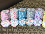
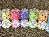
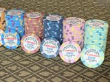
I’m getting close to being able to afford ordering a high-roller STT set of chips, with a T500-base. Specifically, I’m in love with the World Poker Series tribute set from ABC. There’s one minor issue though, which I’d love some help with. The T5K and T25K chips are very close in colour and would cause some issues for the colourblind players we have (even I “see” it, especially in low light). So, since it’s possible to have these chips semi-custom, as read in another thread, which colour(s) would be best for the T25K chip? Don’t want to mess with the previous three since they’re gorgeous. I’ll still be ordering samples, of course. Without seeing them in person yet, the early idea is to use the same Black/Gold colours from the T10K, but might be too much black in the set. Similarly, a white chip might be too close to the grey in the T5K, and a blue/purple might be too close to the pink T500.

Any ideas, PCF? :)
You are absolutely correct that the 5k and 25k don't go well together. If I remember correctly, @Perthmike has played with the real chips and he posted pics of the dirty stack issues.

Great that you're getting samples. My best advice is to let this take its time, don't rush it. You can choose any colors you want, ABC will apply them for you (buy might charge fully custom instead of semi custom, not sure in this case).

Make sure to buy samples of 43mm as well. They usually have random designs they can sell. If not, ask for blanks. Buy enough so that you can get a feel for the shuffle.
 
Have you looked at getting your own custom chips
I have, just on this occasion I'm happy with semi-custom with a tribute to a fantastic design (except the colour of T25K). I'll definitely bear the thread you mentioned in mind for when the time comes to order a fully customised set; likely much further down the line. Knowing me, I will need a looong time.

he posted pics of the dirty stack issues.
I'm off to find those IRL pictures he posted! Glad to know others also agree that T5K and T25K don't go well together.
 
Here's one example, but the thread is full of pics:


Earlier in the thread you can see that the 25k doesn't go too well with the T500 either.
Good memory lol, yeah I didn't love those two chip combos at all.
 
Not sure how @Mr Winberg remembered that thread and @Perthmike’s specific comment!

BTW, I’m not completely against changing up the T5K slightly, should it help facilitate a nicer colour scheme. The T500 and T1K will be left untouched. For example: I also like the lavender/aqua from the WSOP from the year before, but the bright orange/grey is superrr nice. I played around a little in Illustrator; maybe a T25K could also work being off-white (or white) with a blue? Either way, I’ll look into requesting a variety of samples of varying colour combos from ABC/BR.

Any other suggestions welcomed!
 
Been working in Illustrator quite extensively recently. Image tracing, clip masking and colour dropping are pretty much the extend of my abilities. Must've tried hundreds of combinations -- 99% didn't work for me / and the other colour-blind. After all this "work" and going round in circles, I'm almost certainly sold on keeping the T500, T1K and T5K the same; they are my favourites and very classical and nostalgic. Then -- just leaves the next two. We're kind of backed into a corner with the orange and grey (I know), since it eliminates all sorts of red/green and light blue/turquoise. Right now I'm still erring to white (0/0/0/0) and gold (10/15/90/10), followed by some darker blue combination, yet should not interfere with the pink/black T500. Also, this ordering would vastly minimise the chances of T500/T100K ever being used in the same bet. The orange/white/blue causes no issues and a nice combo, in my mind.

Any concerns from the experts? I'm all ears :)
 

Attachments

  • Capture.PNG
    Capture.PNG
    6.5 KB · Views: 108
Which colors do color blind people usually mix up? I'm afraid I'm not knowledgeable enough to help, but that white and gold looks really promising!

Blue and dark blue, personally I would have preferred something with more pop for the top denom. Have you considered red spots?
 
I believe the most common is red/green/brown, sometimes including orange. They would all blend as one colour basically, and there’s essentially no difference if they’re all the same shade. Some people struggle, when dealing with blue/purple/pink. It might even be a little of both (like me). Colourblind spectrums are super individual, I’ve seen sets on here where most (if not all) chips look identical — must empathise that’s through my eyes and not bad choices. For example: a light green 25 chip and a yellow 1000


more pop for the top denom.
100% needed!
 
Made the gold a little more 'gold' and less orange-y AND a change in pattern. because there were too many of those hyphens in both the T5K and T25K. This way, each chip pops out more. Also, made the T100K a violet/purple with a dark red spots (I think it works?). The latter is likely to be rarely used, after all. That's where I'm at right now, anyways.

Edit: forgot to add another option.
 

Attachments

  • Capture2.PNG
    Capture2.PNG
    8.5 KB · Views: 93
  • Capture3.PNG
    Capture3.PNG
    8.2 KB · Views: 90
Last edited:
Took a step back recently. Decided I like the original Bud Jones T25K pattern (but not the colour!); and a consistent pattern across all chips. In order to make the chips more my "own", I ended up drawing these myself in Illustrator to avoid the sensation I cheated. Added some crowns, because, Sweden; and to avoid the rest of the chips looking empty. These crowns probably won't make the edge spots since they'd up upside down in one orientation, so I might add something else there. Finally, I'll go with a dark inlay with a different shape, with a simple design, probably little to no text.

Pink/Green, Yellow/Black, Orange/Grey and White/Cyan.

Thoughts?
 

Attachments

  • 25000.jpg
    25000.jpg
    30.7 KB · Views: 73
  • 5000.jpg
    5000.jpg
    43.9 KB · Views: 67
  • 1000.jpg
    1000.jpg
    46.5 KB · Views: 68
  • 500.jpg
    500.jpg
    40.6 KB · Views: 69
Perhaps, since you are having the same "spot" design among all chips, you get a little more differentiation by using a faux shaped inlay print?

Hex is good for T500. Maybe try some non-traditional ones, like octagon, or trapezoidal gears, or something for the others.
 
Hi there,

I’m getting close to being able to afford ordering a high-roller STT set of chips, with a T500-base. Specifically, I’m in love with the World Poker Series tribute set from ABC. There’s one minor issue though, which I’d love some help with. The T5K and T25K chips are very close in colour and would cause some issues for the colourblind players we have (even I “see” it, especially in low light). So, since it’s possible to have these chips semi-custom, as read in another thread, which colour(s) would be best for the T25K chip? Don’t want to mess with the previous three since they’re gorgeous. I’ll still be ordering samples, of course. Without seeing them in person yet, the early idea is to use the same Black/Gold colours from the T10K, but might be too much black in the set. Similarly, a white chip might be too close to the grey in the T5K, and a blue/purple might be too close to the pink T500.

Any ideas, PCF? :)

ABC will customize colors/spots/text for you easy.

I used their WPS chips as a basis for these:

23753352-5DC0-4801-9604-88FDCDF0C2D6.jpegA59CEB30-7AC8-41CC-9D2C-E5B1DF628EA6.jpeg519A29E1-6A8D-4662-A33A-28C3542AC3CB.jpeg

Just reach out to them. They're really easy to work with.
 
Last edited:

Create an account or login to comment

You must be a member in order to leave a comment

Create account

Create an account and join our community. It's easy!

Log in

Already have an account? Log in here.

Back
Top Bottom