Windy Crest Custom Felts (1 Viewer)

CraigT78

Royal Flush
Supporter
Joined
Aug 4, 2015
Messages
17,214
Reaction score
48,551
Location
Dallas
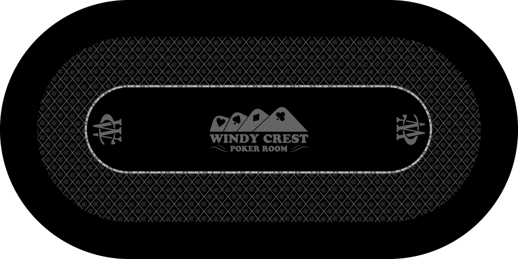
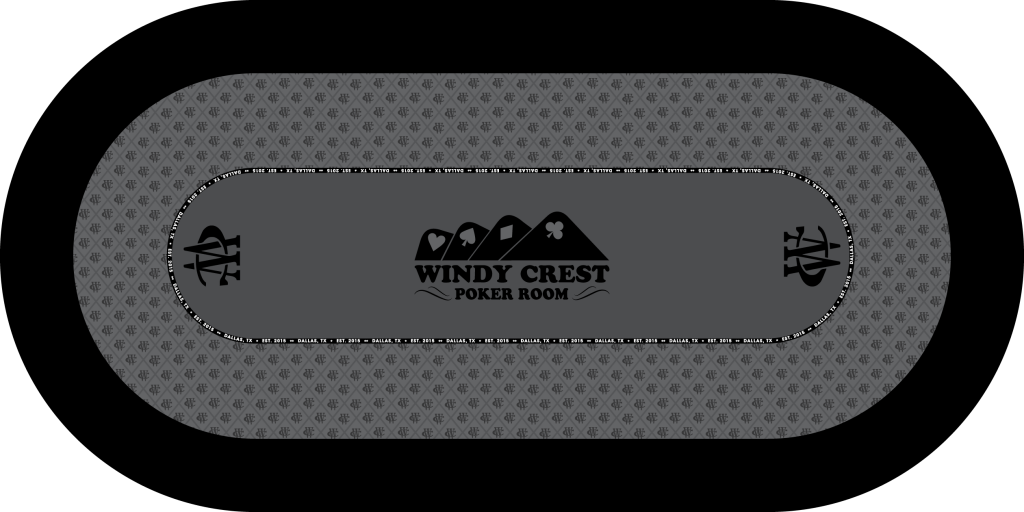
Here it goes - looking for some input on some custom felts. I am looking to do two tables, not sure yet if I want the same design and different colors, or two completely different designs. Anyway here are the first mockups by the one and only @p5woody. My only requirements at this point is to have my logo, the WC, and Dallas, TX 2015. Anything else is game. Please feel free to fire away.
felt2.png
felt3.png


My initial thoughts are:

I like the lighter felt for sure. I plan on black rails, so black on black might be a little much.
I love the thicker betting line design, but think maybe the words are too much? Maybe space them out, or have more black space?
 
  • Like
Reactions: 72o
I like the lighter one too. I think the words as the betting line is fine. I've got that on my table too.

IMG_20160728_202210889.jpg
 
@Mr. Cheese - I do like that with the words - I like how yours are multi colored, it helps break it up. Maybe I could add the four suites in between to give it some space?
 
@Mr. Cheese - I do like that with the words - I like how yours are multi colored, it helps break it up. Maybe I could add the four suites in between to give it some space?

Yeah the four suits might be kind of nice. Especially being you have them on the main logo in the center.
 
I like the lighter felt for sure. I plan on black rails, so black on black might be a little much.
I love the thicker betting line design, but think maybe the words are too much? Maybe space them out, or have more black space?

Given the purely binary choice, I prefer the grey over the black. That being said, both need a splash of color somewhere.

The Windy Crest sets are too colorful for the felt to be entirely monochromatic. Even solid business suits have color squares.
 
Given the purely binary choice, I prefer the grey over the black. That being said, both need a splash of color somewhere.

The Windy Crest sets are too colorful for the felt to be entirely monochromatic. Even solid business suits have color squares.
Excellent feed back - what would you suggest?
 
what would you suggest?
I'm not great with design so I may not be the best person to ask, but I went and looked at your tourney chips & the WC is a different color from the field they're set in. Simlarly, the cards/text of the cash chips are the base color vs. the field surrounding them. I'd probably start by splashing some color on the monograms at the ends, and on either the cards or text in the middle. As for what colors to use...well, that I really don't know. I'd need folks to show me ideas. Again...not usually great w/design in my head.
 
YMMV, but I have a gray felt and it tends to show smudges, perhaps oil from people's hands rather quickly
 
Here are few more mock ups with some color added. I like these much better than the first and have asked Steve to try a couple of other things before I start making changes. Much better IMO.

felt7.png
felt6.png
felt5.png
felt4.png
 
Dark red/maroon probably show the least dirt and wear

Blue probably show less stains or spilled drinks
 
Really liking the 1st red and blue!

Maybe add some colour to the grey in OP to see how that looks?
 
Hmmm honestly I think you have the design nailed down. It looks awesome. I would simply lay out your chips and see which color (if you have sample swatches) would look best to showcase them and not "lose" any chips in the felt colors. I think you really can't go wrong with any of your color choices above. Maybe post pictures of your chips on the color swatches?
 
I like the second burgundy, with grey line. I also like the blue table.

It depends on your room. My room is more rustic, western feel, so blue won't go as well. If it's a bright game type room, like most of the rooms i see on the forum, the blue pops and I like it. It's important to consider your surroundings or the table won't "fit".

On the burgundy, try the WC in grey or black. Or perhaps grey and black, so a black W and a grey C. .

ON the blue table, you could try red and grey with the WC.
 
Alright - going back and forth with Steve and this is where I am landing. This one by far is my favorite so far. I still need an alternate color choice for the second table, but from the design standpoint - what do y'all think?

Felt19.png
 

Create an account or login to comment

You must be a member in order to leave a comment

Create account

Create an account and join our community. It's easy!

Log in

Already have an account? Log in here.

Back
Top Bottom