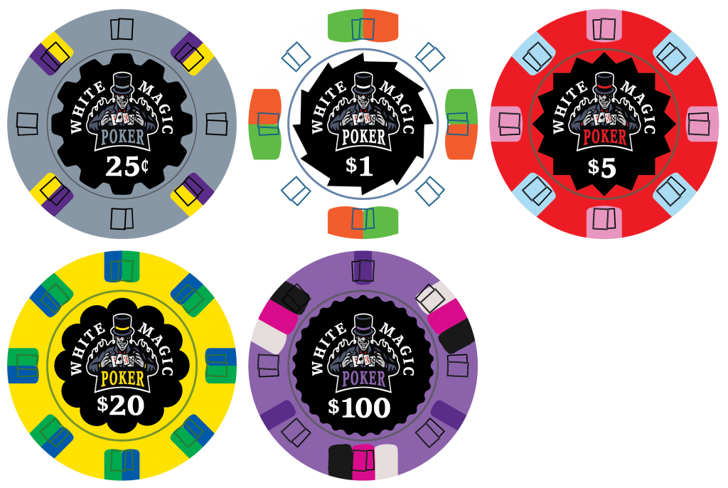
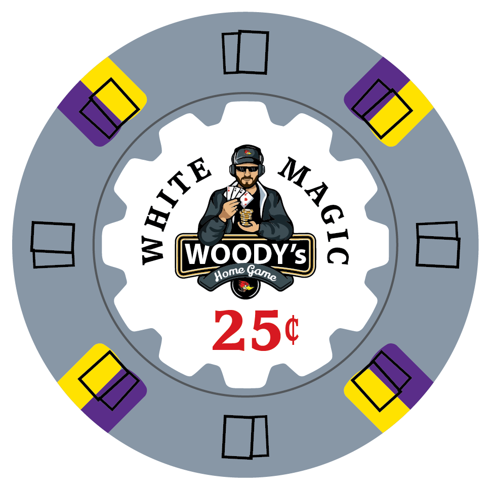
I started playing around with a design idea, feedback and suggestions are welcome. At this point is just a design for fun, but if I end up really liking the final design maybe it will turn into something. Also if there is enough interest maybe it will turn into a GB, who knows. Right now I have it mocked up on the ceramic card mold.
You are using an out of date browser. It may not display this or other websites correctly.
You should upgrade or use an alternative browser.
You should upgrade or use an alternative browser.
White magic design idea (1 Viewer)
- Thread starter p5woody
- Start date
detroitdad
Royal Flush
Hey Steve,
I don't know much about this chip brand. What molds are available? Is there any mold that is "fitting" to this design?
I like this version much better than one of the originals that you shared with me. I think when there is color matching, it has to be minimal. I think this nails it.
Is there a story/reason behind the "white magic" theme? or just a crazy, fun idea that popped into that creative mind of yours?
I love the one. I think its the highlight of the set. The five is also great, but again, that spot pattern feels over used. The progression from the 20 to the 100 feels weird. That doesn't mean that I don't like it. It means that I need to reflect on it for a few days.
The frac is the weakest chip in the lineup. I don't love gray based chips.
My comments are simply nitpicking (which is what I think that you want). Otherwise, I really like where this is headed.
slisk250
Straight Flush
Blue frac in this lineup
ekricket
Royal Flush
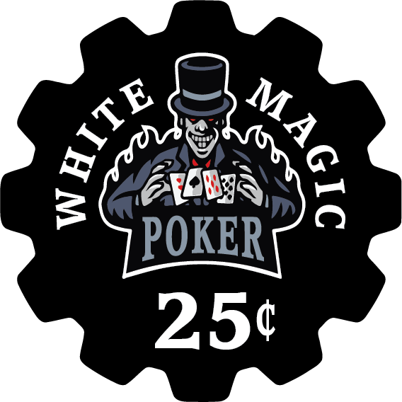
The guy looks too threatening?
Close up of the label
ekricket
Royal Flush
It just looks “dark” to me for the theme it’s portraying. I got no suggestion for improvement except maybe a white label for white magic?
ekricket
Royal Flush
Fwiw this thread makes me really really nervous to reply inIt just looks “dark” to me for the theme it’s portraying. I got no suggestion for improvement except maybe a white label for white magic?
I am personally okay with the 'dark' portrayal of the wizard. My thought was white magic/black magic is dependent on your perspective. If I use magic to win a hand against you in poker, I consider that good (white) magic and you would consider it bad (black) magic. So even though the words say white magic, it would be viewed as black magic.
Quick backstory for this idea: Not really sure when it started, but magic has been used to explain a lot of things in our house. So it has kind of become a running family joke when somebody doesn't want to explain how something happened. Magic is the go to answer.
Quick backstory for this idea: Not really sure when it started, but magic has been used to explain a lot of things in our house. So it has kind of become a running family joke when somebody doesn't want to explain how something happened. Magic is the go to answer.
RichMahogany
Straight Flush
White magic in the poker world=Phil Hellmuth.
I wouldn’t want any chips where the design invokes him, even if unintentionally
I wouldn’t want any chips where the design invokes him, even if unintentionally
slisk250
Straight Flush
Pink frac for this oneI originally had blue
View attachment 600519
Venturalvn
Full House
Cool design Steve! I think I like the mockups with the blue $1 more, but they're both great.
Good to see a new design from your direction!
Good to see a new design from your direction!
mattross1313
Full House
This is a sweet design, $1 is my fave. Look forward to following for any tweaks.
The label made me think of the villain in Princess & the Frog. he was also into dark magic.
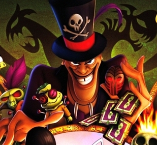
The label made me think of the villain in Princess & the Frog. he was also into dark magic.
This exactly. Except I mostly like Phil, so I’m good with it. Though, if we’re making Helmuth chips, they really should be tournament chips, not cash chips.White magic in the poker world=Phil Hellmuth.
I wouldn’t want any chips where the design invokes him, even if unintentionally
This, but with a pink frac! I like the start. “white magic” text could be a bit more prominent imo, but that’s a preference.I originally had blue
View attachment 600519
Pinesol13
Flush
any significance to the value of the cards he's "magicking" ?
Chipnut
Flush
When the group buy from Sub-Fly? Just kidding. Chips look great. Will be following.
Forty4
Full House
The new one that is being designed “Wand & Hat”Hey Steve,
I don't know much about this chip brand. What molds are available? Is there any mold that is "fitting" to this design?
I like this version much better than one of the originals that you shared with me. I think when there is color matching, it has to be minimal. I think this nails it.
Is there a story/reason behind the "white magic" theme? or just a crazy, fun idea that popped into that creative mind of yours?
I love the one. I think its the highlight of the set. The five is also great, but again, that spot pattern feels over used. The progression from the 20 to the 100 feels weird. That doesn't mean that I don't like it. It means that I need to reflect on it for a few days.
The frac is the weakest chip in the lineup. I don't love gray based chips.
My comments are simply nitpicking (which is what I think that you want). Otherwise, I really like where this is headed.
WOW! This is really fricking cool! Well done!
mtl mile end
Flush
Yeah, should really be an image of the Poker Brat, in his UB cap - maybe for the add-on.White magic in the poker world=Phil Hellmuth.
I wouldn’t want any chips where the design invokes him, even if unintentionally
Klobberer
Full House
Not a Helmuth fan, Woody...
For all you Helmuth fans
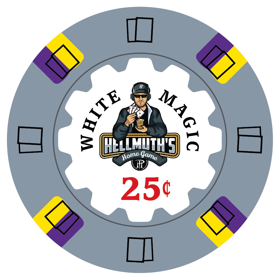
mtl mile end
Flush
C'mon, you gotta admit the UB cap is more appropriate for White Magic.
slisk250
Straight Flush
I’m not a Phil fan but that is cool as hell.
One better, LOL
Similar threads
- Replies
- 2
- Views
- 217
- Replies
- 9
- Views
- 502
- Replies
- 6
- Views
- 636
- Replies
- 5
- Views
- 427
- Replies
- 10
- Views
- 684
