You are using an out of date browser. It may not display this or other websites correctly.
You should upgrade or use an alternative browser.
You should upgrade or use an alternative browser.
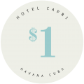
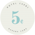
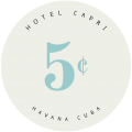
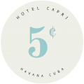
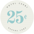
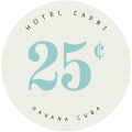
Where do you put the cent symbol? (1 Viewer)
- Thread starter kaimat
- Start date
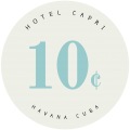
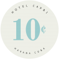
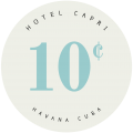
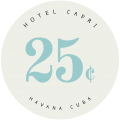
I like it middle, or somewhere between middle and top. At the bottom just looks odd to me.
I like it middle, or somewhere between middle and top. At the bottom just looks odd to me.
I was thinking the same thing. Thank you for the feedback.
Maybe make it a bit bigger, and put it in the top third? The design guys will be much better help than I, though.
Middle, for the win.
Bottom! Make this a poll!
Middle.
WedgeRock
Royal Flush
cgraham86
Pair
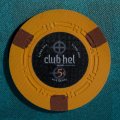
Yes, up top. And it doesn't have to be same "size" as the "$". Make it a bit bigger so it stands out a bit more. Notice how the shaped inlay in the pic for the horseshoe chip the proportion of number to symbol. That's what matters, and that's why the "$" looks better to your eye than the "c".
Symbol should be half the height of the number and either slightly less than flush with the top or middle aligned, definetly not bottom. Generally, center the number without the symbol then add it. The number is dominant to the eye for balance (left to right). It will look out of balance if you center number(s) and symbol together. Every example above in the OP is out of balance.
^^^^^ Concur. Center the actual number. Then add the small $ to the left or the small c symbol to the right.
gopherblue
Straight Flush
was just about to say the exact same thing. (y) :thumbsup:Symbol should be half the height of the number and either slightly less than flush with the top or middle aligned, definetly not bottom. Generally, center the number without the symbol then add it. The number is dominant to the eye for balance (left to right). It will look out of balance if you center number(s) and symbol together. Every example above in the OP is out of balance.
It could be multiple locations.
If it were my set, I would do the symbol for the nickel centered with the apex of the curve of the 5 (basically 1/2 way between your 5 cent options 1 and 2)
The 10 cent symbol would be your 10 cent option 2.
25 cent symbol would be slightly lower than your 25 cent option #3
If it were my set, I would do the symbol for the nickel centered with the apex of the curve of the 5 (basically 1/2 way between your 5 cent options 1 and 2)
The 10 cent symbol would be your 10 cent option 2.
25 cent symbol would be slightly lower than your 25 cent option #3
Last edited:
Nex
Flush
Old State
Full House
- Joined
- Jul 20, 2016
- Messages
- 3,010
- Reaction score
- 4,811
+1 on centering the number!!!
Alex Lundstrum
Two Pair
~3/5 the size of the numbers and flush with top.
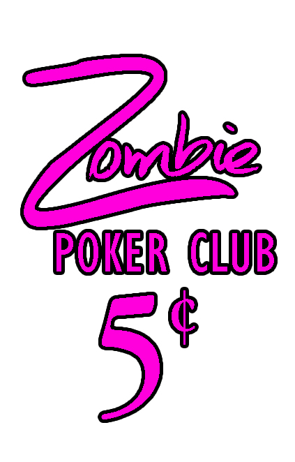
Poker Zombie
Royal Flush
I went up high. I think it should to be big enough to see, so it's roughly 1/2 the size of the denom. Some designs in the thread show cent symbols so small that look like a label imperfection to 50 year old eyes.
Similar threads
- Replies
- 28
- Views
- 975
- Replies
- 26
- Views
- 1K
- Replies
- 0
- Views
- 106
- Replies
- 9
- Views
- 252

