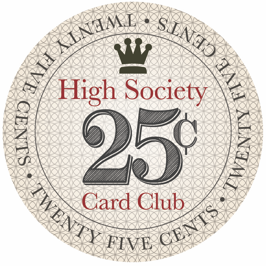
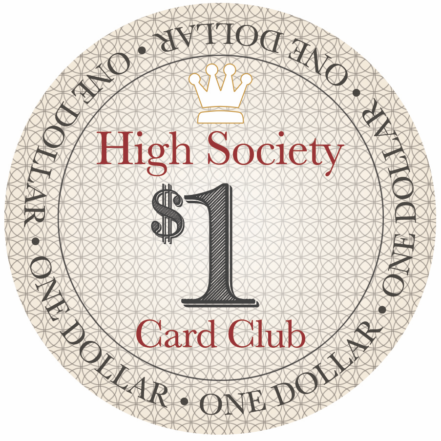
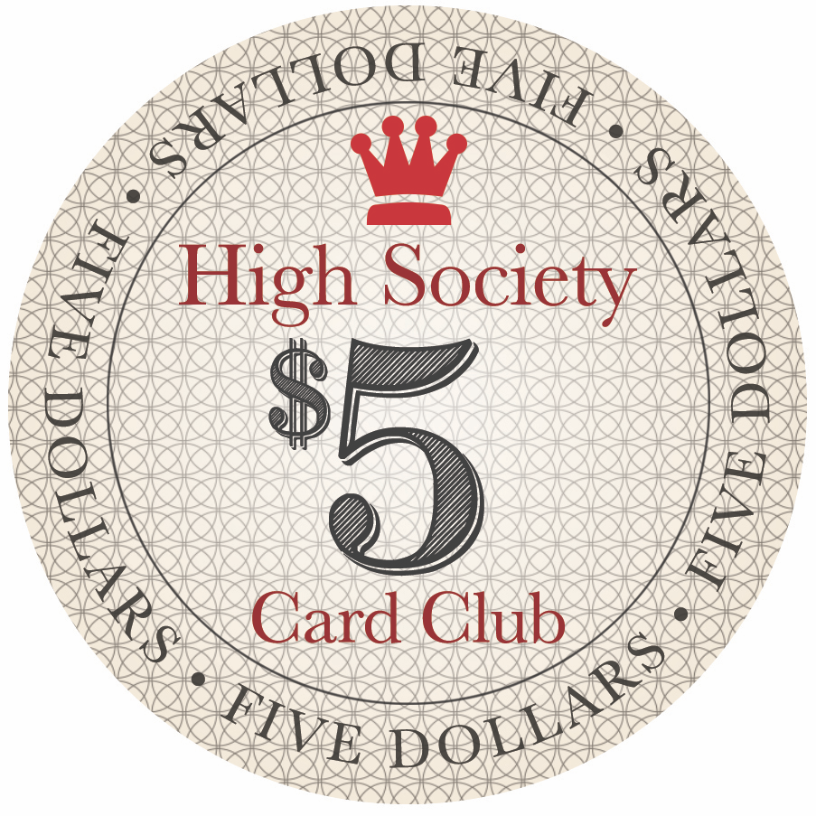
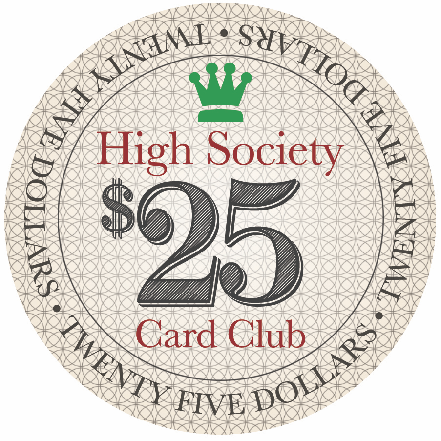
Welcome your feedback - High Society Card Club Relabel Project (1 Viewer)

Matching colours for the crowns and chips or keep them all black?

  • Option 1 - Matching crown and chip colours

    Votes: 6 28.6%
  • Option 2 - All black

    Votes: 15 71.4%

  • Total voters
    21
  • Poll closed .

RoyalBluff

3 of a Kind
Joined
Jan 28, 2019
Messages
551
Reaction score
915
Location
Vancouver, BC, Canada
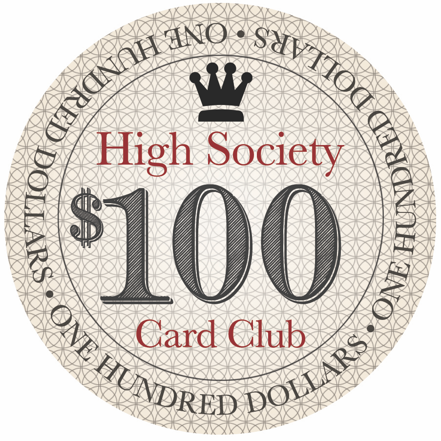
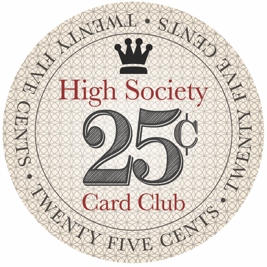
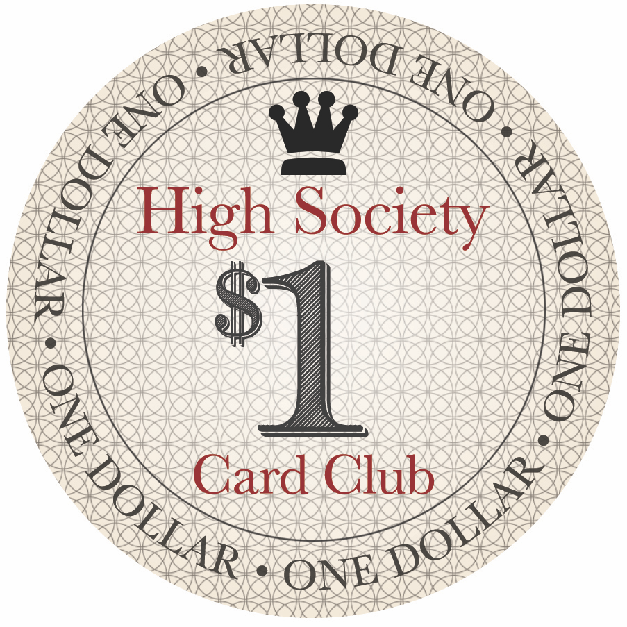
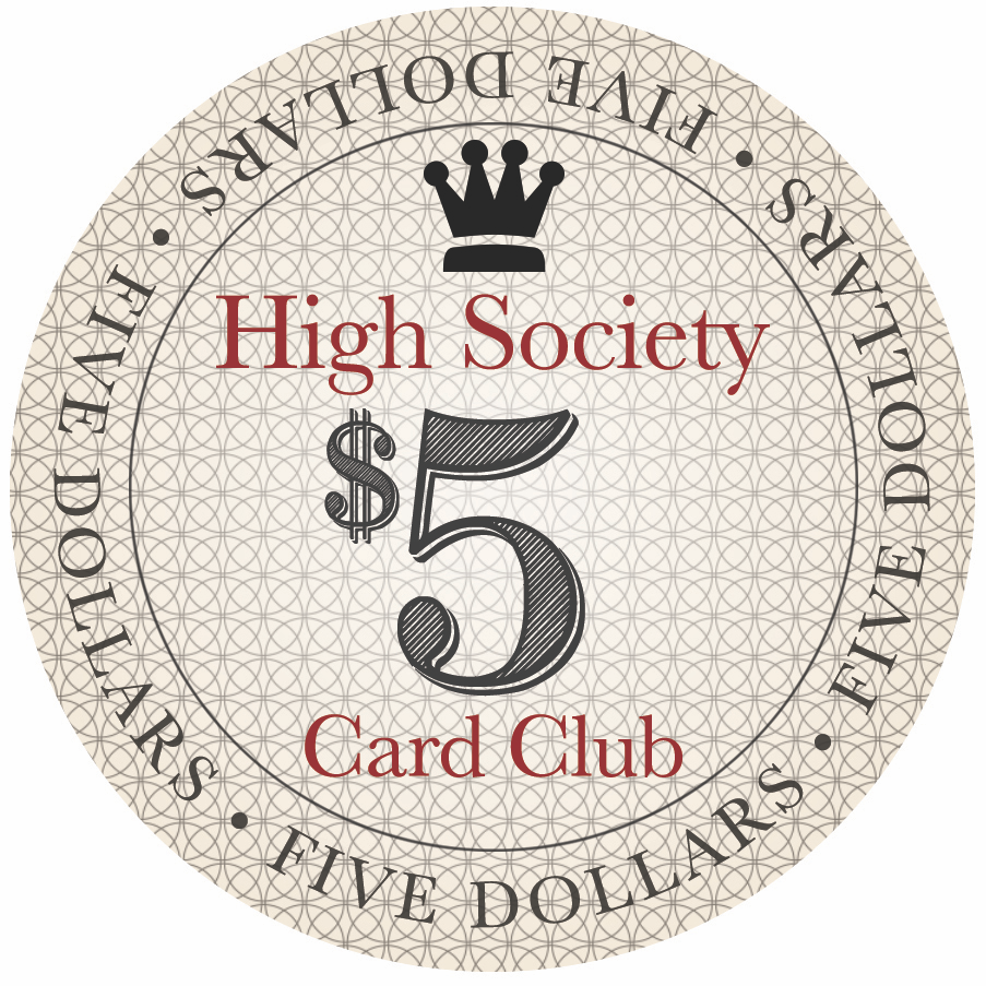
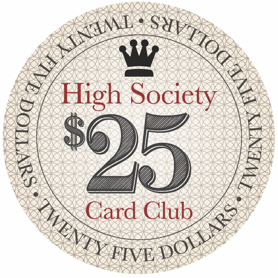
Hey folks! I've acquired some casino-used Double Downs 1's, 5's, and 100's, Paradice 25's (I couldn't get any DD's), and chocolate solid THC's for the fracs for my second relabel project. I received great feedback from @allforcharity and @Beakertwang and so far this is the latest design. Would love your thoughts and feedback.
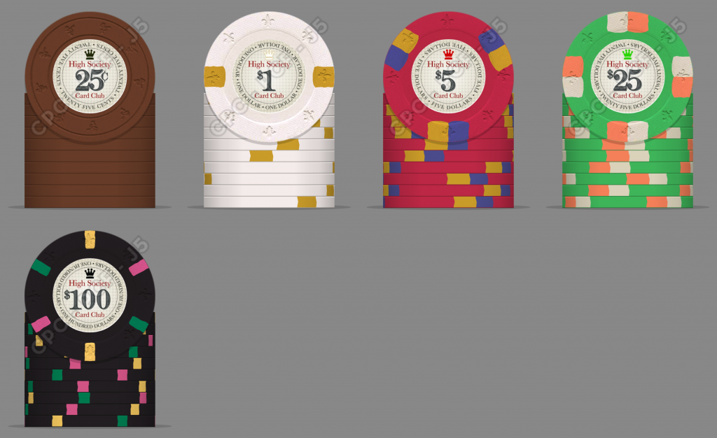
  • Concerned about the round text being too small at 15pt font size.
  • Thoughts coordinating crown colour to match the chip colour, or keep it just one colour (black).
  • CPC mockup below to mimic the RHC mold.
Option 1 - Matching crown and chip colours
275449


275454
275453
275455
275456
275457


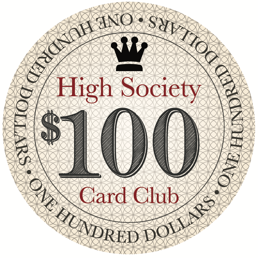
Option 2 - All black crowns
275450


275460
275458
275459
275461
275462


272898
 
Last edited:
The text (High Society Card Club) is a little small for my taste.
 
Dots between the denomination wording? Just small ones.

I actually did this on the first version but since the 1's and 5's have two words each and the rest have 3, therefore uneven number of dots and they stood out too much. I'll play around with it some more.
 
Well, you have the denominationon on each chip 8 times. I’d put a stylized HS in the background (Bellagio style), keep the number denomination, replace the rim text with High Society spelled out in it instead of the Denom.
 
Well, you have the denominationon on each chip 8 times. I’d put a stylized HS in the background (Bellagio style), keep the number denomination, replace the rim text with High Society spelled out in it instead of the Denom.

I like this idea. I wonder how the stylized HS would work with the patterned background, let me try some mockups....
 
I like the design! Excited to watch it develop. My only feedback would be to use the FDL mold if you’re going to mock up in the CPC tool. Smaller indents and no outer concentric ring better simulates the RHC mold.
 
I like the design! Excited to watch it develop. My only feedback would be to use the FDL mold if you’re going to mock up in the CPC tool. Smaller indents and no outer concentric ring better simulates the RHC mold.

Thanks and good call! I’ll replace the mockup in a bit.
 
I actually did this on the first version but since the 1's and 5's have two words each and the rest have 3, therefore uneven number of dots and they stood out too much. I'll play around with it some more.
I can see that. The words just all run together without any breaks for me though. So much so that my eyes gloss over them as noise.

I think it could use a more stylized crown that is more in the style of the denomination font as well. It looks a little too clean/solid/modern for the chip design
 
I can see that. The words just all run together without any breaks for me though. So much so that my eyes gloss over them as noise.

I think it could use a more stylized crown that is more in the style of the denomination font as well. It looks a little too clean/solid/modern for the chip design

Got it, how about this for the dots?
As for the crown, let me dig through some other vectors but this is the only one I have that looks decent.

272975
 
I really like the design. I think it might look better keeping the crown black in all denominations. Just my opinion! (wrote this before seeing the question on the OP)

Thanks! Yeah I’ve gone back and forth between coordinating the chip colour or keep it all black, which adds to the classic look. Maybe I’ll put a poll up for a consensus.
 
Thank you everyone for your inputs so far. I've made the first round of changes and need your help on deciding if I should have the crowns match the colour of the chips, or keep them all black. I added a poll to the thread with a comparison of both options on the updated OP.
 

Create an account or login to comment

You must be a member in order to leave a comment

Create account

Create an account and join our community. It's easy!

Log in

Already have an account? Log in here.

Back
Top Bottom