Walston Card Room Mockup (1 Viewer)

Walle

Sitting Out
Joined
Apr 21, 2021
Messages
22
Reaction score
22
Location
North Carolina
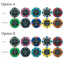
I'm eager to get some quick feedback on my design and denominations/color choices. The top half would be for cash games and the lower half would be for a future tournament set.

I haven't seen anyone do penny/1c chips before but when calculating starting stacks and rebuys I determined I could probably have a lot of fun with friends and family who are not interested in playing for much by having a really cheap $2 buying game. Penny poker has a fun ring to it. I can also drop the bottom 1 or 2 denominations and easily change the game from starting stacks of $2 up to $10 then $50... Etc while still having everyone start with at least 100 big blinds.

Thoughts on the color choices/design?
Screenshot_20210428-163127.png
 
These will look fantastic.

My only feedback is that the nickel and the quarter have the same spot pattern. There isn't anything necessarily wrong with that, but I would probably try to space those out further so they aren't in play at the same time. I would maybe swap the quarter and the 500 chips. Or maybe do the pink quarter and then make the 500 into the nickel and the current quarter into the 500.
 
Love the labels—simple, classy, and easy to read. Love that you’re doing a penny!
 
I had the same thought dilemma. I struggled with the appropriate 500 because I wanted it to be purple. I ended up with that chip because it was darker blue and also tied into the green $25. You may be convincing me into moving it because it could give my cash set a bit more color and the light blue will connect well with the yellow $1000 if moved to the $500 spot. I'll throw together a rendition of this image with that layout when I get back home late this evening. Thanks so much for the feedback!
 
Love the labels—simple, classy, and easy to read. Love that you’re doing a penny!
Wow, thanks so much. Like you said, this design keeps it simple and focuses on the house name and subtle logo that may eventually match a table topper. I really liked how some people did inlay patterns on their custom labels that matched the chip color and considered doing something like that. I haven't done a mockup of what it would look like but I was worried it would become too much and take away from or clash with the spot patterns.
 
Just for reference, here are some other designs from the old drawing board. I took inspiration from the original Royal label (the first label).
Screenshot_20210428-201738.png
 
the 1c,5c,25cent are my favorite chips! i would run them as your 3 most playable denoms youll love them in play at same time! looks nice. very good with the logo !
 
the 1c,5c,25cent are my favorite chips! i would run them as your 3 most playable denoms youll love them in play at same time! looks nice. very good with the logo !
Are you referring to the current grey, pink, light blue chips or if the dark blue was swapped with the light blue? Thanks for your feedback.
 
Ok based on the feedback I have put together an "Option B" in addition to the original "Option A". Which is your favorite? Thanks.
 

Attachments

  • MW Custom Poker Chip Color Denominations - 1c - Option A vs B.png
    MW Custom Poker Chip Color Denominations - 1c - Option A vs B.png
    1,019.6 KB · Views: 120
I seriously appreciate the feedback. One last thing to consider is the fact that the following 3 chip color combinations are likely to be the most used. Does that change your opinion or still go with option B?

Options A

1¢/5¢/25¢ (super micro stakes/aka Penny Poker- $2 buy-in)
PXL_20210503_025847425.PORTRAIT.jpg

5¢/25¢/$1 (micro stakes - $10 buy-in)
PXL_20210503_025858341.PORTRAIT.jpg

25¢/$1/$5 (low stakes - $50 buy-in)
PXL_20210503_025913675.PORTRAIT.jpg
 
Option B

1¢/5¢/25¢ (super micro stakes/aka Penny Poker- $2 buy-in)
PXL_20210503_025757909.PORTRAIT.jpg

5¢/25¢/$1 (micro stakes - $10 buy-in)
PXL_20210503_025810952.PORTRAIT.jpg

25¢/$1/$5 (low stakes - $50 buy-in)
PXL_20210503_025827249.PORTRAIT.jpg

Edge spots side perspective...

Option A
PXL_20210503_025650406.PORTRAIT.jpg


Option B
PXL_20210503_025740411.PORTRAIT.jpg
 
Nice clean logo design!
just my opinion if it helps. Some may disagree.

$.01 PINK “pink penny poker”
.05 yellow
.25 light blue
$1 gray
$5 red

$25 green
$100 black
$500 navy blue
$1k white
$5k orange

There were some original discussions that the pink and navy blue had similar colors and creating dirty stacks. (Photo credit to @Darson )
1620019225007.png
 
Way too many edge spots IMHO... dirty stacks for days
Thanks for your thoughts. I really like the bright colors of the Royals. I suppose it can be a bit busy but I like the vibrancy the colors give and I think sticking with a simple label should help. Since we'll most likely be playing with only 2-4 chip colors at a time, usually 3, I suspect it will be a non issue. Thanks again.
 

Create an account or login to comment

You must be a member in order to leave a comment

Create account

Create an account and join our community. It's easy!

Log in

Already have an account? Log in here.

Back
Top Bottom