I received a lot of help and support from PCF when I gave birth to my Monroe St. Card Room chips. They started out as a rough sketch and evolved into a set me and my son use often. I also can't seem to break my Inkscape addiction. So I'm back to the well...
I continue to be intrigued by the siren song of @BGinGA's T500 base structure -- I'm drawn to its simplicity & efficiency. I already have a set of Dia de los Muertos Chips (which we like a lot), but since they're a T25 base a new T500 base set wouldn't conflict.
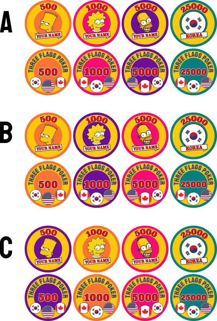
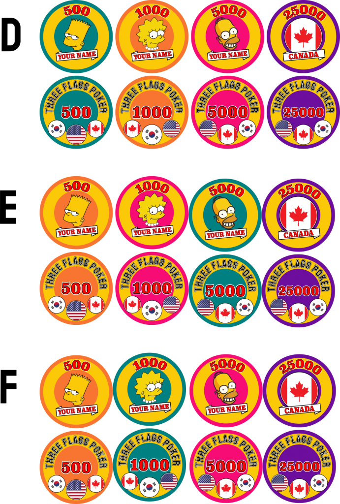
My first attempt at bringing my idea to life fizzled. But now I'm back. I've restyled it "Three Flags Poker" in homage of our multi-country family. The sales pitch to my wife is that this is a set we can give as gifts -- one to my father; one to her parents -- and when we visit we have unique chips to play with. Unique touches are: (i) the flag for our home country on the reverse is in the middle and larger than the other two flags; & (ii) the 25K chip has three different versions (one for each flag; only 2 depicted below). The Simpson characters become would be replaced by caricatures of me, my wife and son.
One thing I'm not sure of yet is the colors. Initially I was going to use brown for the 25K, but that's boring. When I added pink into the line up, it didn't work because of the red in the Canadian flag for the 25K. Similarly, I didn't like the orange in the 5K or 25K chips. Below is a sampling of what I've been staring at. I'm starting to be partial to B.
Any thoughts? (Other than I should find something more productive to do with my spare time....) We'll see if this concept will get past my wife.
