Thoughts on Mocks for Ceramic Set - *Now with Ray-Col Renders! (1 Viewer)

Quicksilver-75

4 of a Kind
Joined
Aug 1, 2014
Messages
6,286
Reaction score
12,090
Location
Great White North
Been puttering away on these for ages....A recent depletion of funds has all but dashed my dreams of getting CPC made. So I'm leaning towards ceramic. These are on 39mm and 43mm chips. I'm not a fan of faux anything on ceramics but I'm convinced I can play with the files until I can get them perfect. I will be doing 3 or 4 files for each denom as well as smudging the edge spots so it gives a feeling of each chip being unique.

My initial thoughts are I don't love the 1000. partially because I'm sure someone here on PCF had these already....

Thoughts?
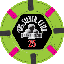
Cera25.jpg
Cera100.jpg
Cera500.jpg
Cera1000.jpg
Cera5000.jpg


ALTERNATES

Cera500v2.jpg
Cera1000v2.jpg
Cera1000v3.jpg
 
Last edited:
I can't stress this enough - do not incorporate a faux mold into your design. I've seen plenty of chips with faux spots where the spots look just fine, but every faux mold I've seen used made the chip look like ugly, cheap crap. It looks fine in mocks, but the realized product is diminished, not enhanced, by the faux mold.

I would encourage you to either go with a hybrid chip, or with the diamond-molded ceramics, or simply remove the mold aspect completely.
 
I would encourage you to either go with a hybrid chip, or with the diamond-molded ceramics, or simply remove the mold aspect completely.
Completely understand...I too, have my reservations. The problem is the Diamond (or cards) polyclay clips dont come in a 43mm slug....stupid, but i digress....
 
Love them Steve!!! Great set for sure...

A couple of things for you to think about: The 2 dark spots on the T100 look too close to me. At first, I thought there were the same. Maybe you can change one of the spots? I would probably change the Gray since you already have Charcoal on the T25. The second thing is that the Red and Yellow spots on the T5K are pretty close to the Orange and Yellow on the T500. Because of that, I would make sure the base, purple and gray, have enough contrast to have similar spot colors.

Again man, awesome set!!!
 
Last edited:
If you go with GOCC you should totally do a sample run of at least one design. I believe it was $30 for 10 chips. It will give you peace of mind with the faux mold and inlay. Sweet looking set - in for a sample!
 
I'd rotate the spots on the 100 and 500 in your latest design to off angles again.
Other than that, it looks balls on screen! Curious how it'll turn out after printing.
 
I'd rotate the spots on the 100 and 500 in your latest design to off angles again.
Other than that, it looks balls on screen! Curious how it'll turn out after printing.
The spots will all be rotated off center in four separate files to varying degrees. But for the simplicity of doing the edge strip I aligned them up to dead center. (y) :thumbsup:
I'm very curious as well. Thank God for prototypes..o_O
 
Well the hundo is a straight ripoff of one of my favorite chips. The Cleveland HS 100. I still hate the 1k. And it will be the workhorse for the set..:(:mad:
 
Outside of the faux mold, I generally like where you're going with these.

Like the 100, 500, and 5k. 1k seems a bit too on palette - I much prefer the original one with the green and blue spots. The 25, even more on palette, save for that red spot - the base & two of the spots are green variants to my eye, then the red smacks you in the face. All of that is subjective, of course, except for the two green-ish spots - I'd change at least one of those if sticking with tri-moons.

Regardless of spots, colors, or patterns, the one change I encourage you to make to all chips once you've nailed down those aforementioned elements is to muddy up the spots so they look more like actual clay spots. As they are now, they look more like stripes rather than clay spots. If you muck up the edges just a bit then you really get a nice faux spot effect. In other words, something more along the lines of this - both on the faces and the edges (but minus the faux mold)..

1259069155-jetons-poker-ceramique-high-poker-rouge-5_Originale.jpg
 
the one change I encourage you to make to all chips once you've nailed down those aforementioned elements is to muddy up the spots so they look more like actual clay spots.
This is a certainty. They will be muddied up as soon as the designs are nailed down. Those are the fine details that get ironed out at the last stage. I plan on having four different file sets for each denom so that it will give each denom some variety and appear more random.
 
Last edited:
Just came to say I love the minimalistic look of the 500 and 5000 chip. Have yet to see any designs quite like those, very cool.
 
Just came to say I love the minimalistic look of the 500 and 5000 chip. Have yet to see any designs quite like those, very cool.
The 500's are a common spot configuration and the 5k is new as of 2016/17. But both are offered by paulson.
 

Create an account or login to comment

You must be a member in order to leave a comment

Create account

Create an account and join our community. It's easy!

Log in

Already have an account? Log in here.

Back
Top Bottom