MoscowRadio
Flush
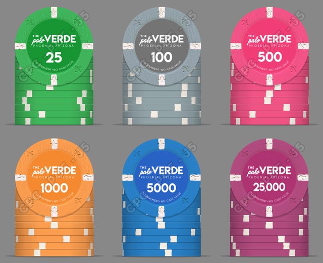
In the 'Poker Chip General' sub-forum I had posted about the 'Wynn Classic' tournament chips and how I liked them. There were actually quite a lot of people who responded positively to those chips. In general, I'm not crazy about wild edge spots, especially on tournament chips. I've always liked tournament sets that didn't implement edge spot progression and I like simple inlays as I think that progression and fancier inlays are more interesting on cash chips. I also really like the Venetian tournament sets that I've seen and, while this may be unpopular, the South Point chips (minus the font). I decided to mock up two versions of a tournament set using a theme that I've always loved: The Palo Verde.
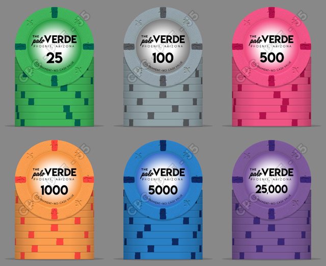
Now, I know that I've mocked up a LOT of chips, and I was never really sure how to use the Palo Verde theme properly, but looking at different tournament sets definitely got me headed in the direction that I wanted.
I like the lighter colors in these sets a lot. Using a black T100 seemed out of place against the other colors, which are all unweighted options from CPC. I'd be really happy to see an unweighted grey or black come out from CPC for this set as I'm not crazy about the brass flakes, but I can definitely live with it.
It would be some time before this set comes to fruition, and while I like both versions, I'm leaning towards the inlays with the gradient on them. However, I thought I'd set up a poll just for fun and see what you guys think.
Thank you all for constantly indulging my mock-ups.")
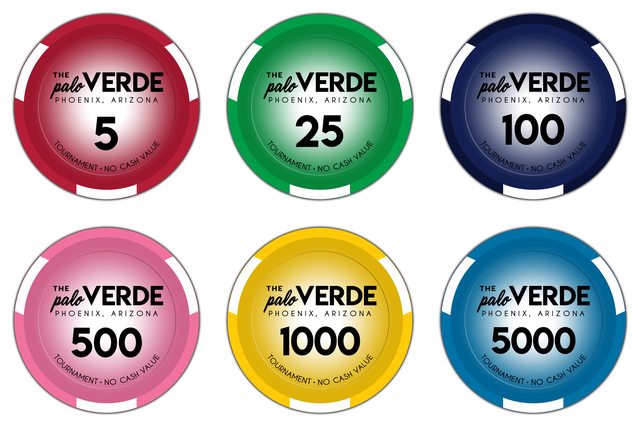
Now, I know that I've mocked up a LOT of chips, and I was never really sure how to use the Palo Verde theme properly, but looking at different tournament sets definitely got me headed in the direction that I wanted.
I like the lighter colors in these sets a lot. Using a black T100 seemed out of place against the other colors, which are all unweighted options from CPC. I'd be really happy to see an unweighted grey or black come out from CPC for this set as I'm not crazy about the brass flakes, but I can definitely live with it.
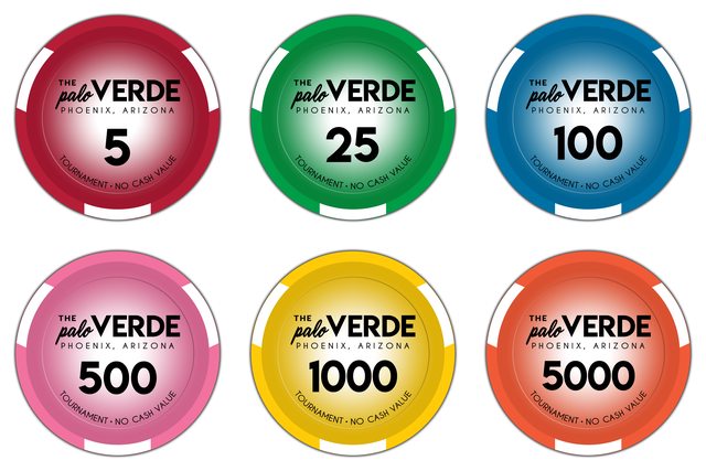
It would be some time before this set comes to fruition, and while I like both versions, I'm leaning towards the inlays with the gradient on them. However, I thought I'd set up a poll just for fun and see what you guys think.
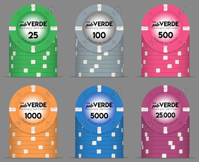
Thank you all for constantly indulging my mock-ups.