i would use a shaped inlay for the $500. if you're only really a fan of those depicted, i would shift the round inlay to the $5 chip.
a couple suggestions:
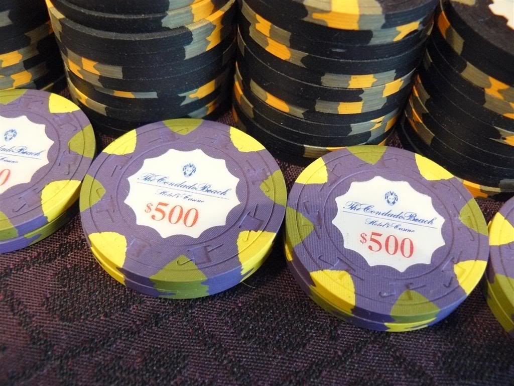
(1) try to put the all the text - name and denom - in a larger, bolder font. it looks very elegant, but will be about 500 times easier to read if either everything is enlarged or the font is emboldened, preferably both. i love the condado beach chips these are modeled after, but the text and denom here appears narrower than that of the condado beach chips which are already very close to the line in terms of size and readability imo.
(2) i would use a shaped inlay for the $500. if you're only really a fan of those depicted, i would shift the round inlay to the $5 chip.
Thought: What about color-matching the denom / spade tree to the base color?
I'm all for color-matching, but I think that sometimes it can be overused and muddle the design. For this particular set I'm looking for 'simple as possible'. I'm pretty plain Jane when it comes to a lot of things, and I love the original chips and how blue logos and fonts were used and then red denoms. I'm a real sucker for a red denomination.
try to put the all the text - name and denom - in a larger, bolder font. it looks very elegant, but will be about 500 times easier to read if either everything is enlarged or the font is emboldened, preferably both. i love the condado beach chips these are modeled after, but the text and denom here appears narrower than that of the condado beach chips which are already very close to the line in terms of size and readability imo.
I've come up with a few different options for the T100. I think I like the second one best, but I'd like to hear what others have to say.
Very nice end result. The black is a great choice over the charcoal IMO.
One other thing have you thought about having "Dealer" in red to match the inlays of the chips? Looks great as is still.