The Jazz Club - 2019 (feedback wished) (1 Viewer)

PokerChipsDesign

Straight
Joined
Nov 18, 2014
Messages
750
Reaction score
1,533
Location
Agen, FR
Hi guys,

I'm currently redesigning a very old ceramic set of mine, The Jazz Club (pics in this giveaway topic).

Here is what the 2012 set looked like :

jazz-club-1-1-jpg.244506

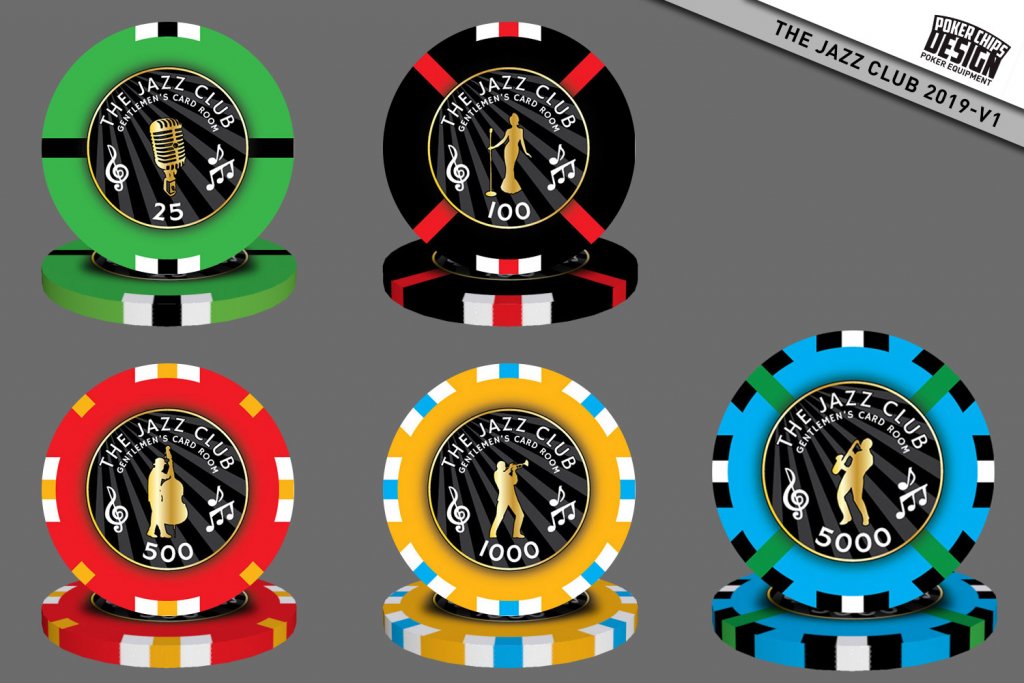
And here is the 2019 version with new colors and new "spots".

For this version, I wanted a black inlay on all chips. I keep the "full color" & giant inlay of the previous version for a cash-game set...

What do you think of the design ???

Thanks
AP
248203
 
Nice update, definitely an improvement. Changing the background burst pattern from a center origin to coming from the top left gives it more of a "lights in a smoky jazz club" feeling, I like how the spot color from one denomination ties into the base color of the next denomination.

The only thing that looks a little off to me is the trumpet and saxophone dudes, they appear to be shifted slightly towards the bottom (more clear space above them then below them), but maybe it's just me.

Are these also going to be on ceramics?
 
The arcing denom looks odd to me as well I would flatten that out. Honestly I love the original chip and not sure how much it can be improved upon but I would switch the angled background for one more like the original, (starburst style) centered behind the musicians/microphone. Like the way the starburst style presents the featured musician/microphone. Love the black inlay. :tup:
 
Thanks for your comments !
Are these also going to be on ceramics?
Yes !
The only suggestion I have would be to remove the arc on the denominations
The arcing denom looks odd to me as well I would flatten that out.
Thanks for that, will change it to flat like the original. It's easier to read you are both right.
the trumpet and saxophone dudes, they appear to be shifted slightly towards the bottom
Will look into that.
Honestly I love the original chip
Me too and I'll use a much more similar design for a Cash set.
 
I like the new 500, 1000 and 5000 more than v1
the only thing that i dont like in that version is the 100 which is too dark compared to other 4,
a white 100 perhaps?


What would be the result if:

the denominations are outside the "inlay"
and if you add musical notes on the rolling edges

?
 
I would do these on the sunfly hybrids and use a metallic label so the figures really shine. The lack of reflection on the gold figure will be the weak point of any solid ceramic.
You are right on the "gold" imitation on ceramics, it's always a challenge ;)
 
Although I think the redesigns are stronger, your first set is a true ceramic design. The redesign is basically under the constraint of an inlay/decal chip. So I agree with @Darson for the hybrid - not only for the gold, but also adding depth to the design (glossy label to contrast with matte ceramic)
 
Last edited:
Hi guys,

I'm currently redesigning a very old ceramic set of mine, The Jazz Club (pics in this giveaway topic).

Here is what the 2012 set looked like :

jazz-club-1-1-jpg.244506

And here is the 2019 version with new colors and new "spots".

For this version, I wanted a black inlay on all chips. I keep the "full color" & giant inlay of the previous version for a cash-game set...

What do you think of the design ???

Thanks
AP
Absolutely love the whole Jazz theme. The updated design is bold and really catches your eye!
 
Here is the V3 version...
  • Tried to get the denomination outside the inlay but with the 100 & 1000 chips it was to busy outside the inlay
  • Placed a music notes background on chips & edegs to maximise the advantage of ceramics: 100% customization
  • Made the denomination flat, much better
  • Added a few black shadows on inlay's elements
  • Made the diagonal lines thiner, so it does not mess with the main color
  • Changed a bit the evolution on the "inserts", makes more sense
Now I need to check with my manufacturer if the music notes background will render ok... ^^

248526
 
Much better with the notes outside and the gray of the 100. Also the thin line on the 25 in less disruptive than v2
5k is an oversisez chip or it's a visual trick?
 
I love this theme.

How difficult will it be for the manufacturer to edge align these? Those thin lines on the 25, 100, and 1000 may be a problem in that respect.
 
Personally, I kinda preferred the pinkish/purplish 500 of the original to the red. Red chips to me scream $5 cash chip - especially when they look like an AS $5. Of course only an obsessive PCF’er would probably notice. :D
 
The inlays are beautiful and clear behind a computer screen. However the reality may be different. Keep in mind the results are different when black ink is printed on white paper than the other way around. On a black inlay the printer is printing around the white text and there may be some bleeding. For this reason I always make my text bigger on black inlays just to be safe
 
the pinkish/purplish 500 of the original to the red. Red chips to me scream $5 cash chip
Yep, I like the purple 500 too... Might keep the red for the $5 cash set ;)
I would consider replacing either the trumpet or saxophone player with a pianist or a drummer.
I will definitly consider that, it seems a drummer is a essential piece of a jazz band... I'll remove the trumpet probably... And keep it for another special chip ;)

Thanks all for all these good advices !
 
Version 4 :
  • Turned the 500 back to pink, looks better - and will use the red for the $5 cash set.
  • Corrected the black lines to gray in the 25
  • Made the texts bigger
  • Changed the trumpet to a drummer
  • Matched the notes' colors with the chip color (inside the inlay)
Now I'm considering making an hybrid set instead of full ceramics... It would definitly look better with this inlay design :/

249330
 
Last edited:
Are you set on having both the microphone and the singer on separate chips? To me, it seems a little redundant, especially if it gives you the chance to have a 5th band member like a pianist which would make an awesome full emsemble. I have a nurse/jazz singer friend who has a group almost exactly like this....
 
@allforcharity The microphone is so nice, that I want it "big" on the design... But you might be right, it seemes redundant with the singer now that you've pointed it ^^
If I find a nice pianist silhouette, I'll probably change it ^^
 
You know the simple solution is to add more denominations - 5, 25k, 100k - they you have have pianist, singer, trumpet etc. Or make bounty chips...
 

Create an account or login to comment

You must be a member in order to leave a comment

Create account

Create an account and join our community. It's easy!

Log in

Already have an account? Log in here.

Back
Top Bottom