The Aerodrome and Red Baron Card Room (1 Viewer)

Mortalpawn

Two Pair
Joined
May 16, 2022
Messages
303
Reaction score
1,277
Location
Northern Virginia
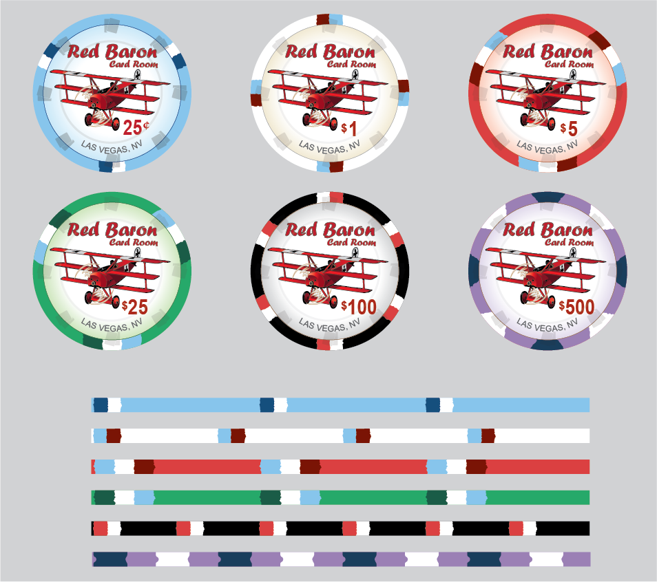
Update 31 Aug: UPDATED edge spots on $1, modified Las Vegas font. Added the Aerodrome theme (WWI Spad) set as well to the Red Baron set (Triplane).

I always wanted to do a aviation set, and I've been playing with several themes over the last few weeks. So here's a new cards mold design - this is a cash set though it would not be hard to make a tourney set. I made a design for both the small and grand label sizes though I like the grand labels here. I may even print a set of these.

So what do you think?
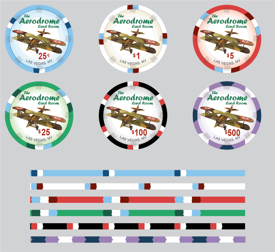
Aerodrome.png


Red-Baron.png
 
Last edited:
Update: Added the Aerodrome set above using the WWI Spad aircraft as an option in addition to the Red Baron triplane.
 
Update 31 Aug: Added the Aerodrome theme (WWI Spad) set as well to the Red Baron set (Triplane).

I always wanted to do a aviation set, and I've been playing with several themes over the last few weeks. So here's a new cards mold design - this is a cash set though it would not be hard to make a tourney set. I made a design for both the small and grand label sizes though I like the grand labels here. I may even print a set of these.

So what do you think?
View attachment 978596


View attachment 978157
Big fan of both and a big fan of the oversized label
 
Cool start!

1. Dirty stacks incoming on fracs & $1s ... in fact, consider using unique spots for each denom.
2. I'd propose using a standard sans serif font for "The", "Card Room", and "Las Vegas, NV" instead of reusing the main font ... would really help Aerodrome or Red Baron stand out as a stylized logo versus reducing it to just some font you found on Microsoft Office.
Here's the first two chips - modded the spot on the $1 to dark red and made the Las Vegas less prominent with a different font and color. Also modded original post photo to bring up to date for latest version.
Asset 10@4x.png
 
Last edited:
We can go farther!
I updated the main images at the top of the post. Was not intending to do it originally but I did a small edit and canceled and the old images disappeared, so I just dropped the new ones in since I overwrote the old ones on my computer several days ago.

So the images at the top of the thread have the new "Las Vegas" and $1 spots now.
Have you tried image with a pilot? Wondering what a helmet with scarf trailing behind would look like or a wing walker and make it more a flying show theme? Yikes don't Google Jane Wicker:(
 
Have you tried image with a pilot? Wondering what a helmet with scarf trailing behind would look like or a wing walker and make it more a flying show theme? Yikes don't Google Jane Wicker:(
I thought about it but then I was afraid I would just end up with the Red Baron pizza logo :)

redbaron.jpg
 
The Lafayette Escadrille largely flew French planes namely the Spad series.
Yes snoopy flew a Sopwith Camel as it was a Canadian Roy Brown credited for shooting down Richthofen (red baron)
All true. most of Richthofen's 80 kills were done with various versions of the Albatros and the Halberstadt CL. He did not switch to the famous Fokker DR. I Triplane until his last 17 kills, and was eventually shot down in one on 29 Apr 1918.

The triplane was developed in response to the Sopwith Camel which had excellent maneuverability and a high rate of climb. However in reality the DR I Triplane was largely outclassed by 1918 by better planes including the Fokker D VII.

However Snoopy made both planes world famous, so that's why the DR I Triplane and Sopwith Camel are the most memorable of the first World War.
 
It really nice but I think for overinlay chip, it will be more prone to dirty stack.

Maybe can consider changing one of the 2 to like example a Yellow which will be vastly different from 25c, $1 & $5

I really liking the more original design for CM recently, keep the design coming
 
It really nice but I think for overinlay chip, it will be more prone to dirty stack.
I guess most people are concerned about the light blue and white chips being a dirty stack issue? I think they would stand out in a stack, but I could be wrong.

I've personally had more problems with the dark colors causing dirty stack issues (dark blue or green and black for instance). I could go to a orange or yellow 0.25 or $1 I guess?
I find both light and dark color combination will have dirty stack issue from experience.

Dark Blue, Dark Green and Brown are even more prone or commonly known because a % of person have green-related colorblindness
 
So I pulled out some light blue and white chips I have laying around and I personally don't see that its a serious problem. I can see that the red-green would be an issue for those who are color blind. In any case I did a quick mockup of orange and yellow - I'm kind of partial to the yellow chip actually.

Thoughts?
Asset 11@4x.png
 
Last edited:
And here's the other two in yellow/orange. I like the idea of the yellow $5, but not completely sold on replacing the 0.25 with orange or yellow yet.

Opinions appreciated:
Asset 9@4x.png
 
There's lots and lots of light blue in this set. Maybe mix it up a bit more? I think the red baron theme is pretty cool. I'd probably lean even more on the red as a predominant color.
I was originally trying to get blue-white in there for sky colors. The red is pretty obvious with the Red Baron.

Here's an alternate palette with most of the blue eliminated a darker storm/sunset sky color palette including more red. Not sure I entirely prefer this to the brighter colors of the original though.
Asset 14@2x.png
 
I would make sure any text and the denom are well clear of the card mold. That indentation doesn’t seem to accept the ink in the same way as the upper surface of the chip.
 

Create an account or login to comment

You must be a member in order to leave a comment

Create account

Create an account and join our community. It's easy!

Log in

Already have an account? Log in here.

Back
Top Bottom