Stronghold Club - Custom CPS Label (1 Viewer)

Ragman

High Hand
Joined
Jun 25, 2018
Messages
61
Reaction score
45
Location
North Carolina, US
All - I'm doing a custom labeled cash set with the 1000+ Championship Poker Series blanks I got from @Lars (thanks man!). As the $1s were already labeled with the stock image, I originally planned to have replica labels printed to match the original artwork (after securing the artwork owner's permission of course). After thinking on it more, I decided that I might as well design my own label, and something that would compliment the tower and spear mold. I wanted to do something fairly simple, with an image, the name, and the denomination. After researching, I found a classic elephant and tower image used in heraldry and it seemed a good fit.

Would love your feedback on this prototype I'm calling v1:
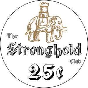
Stronghold_v1_large.png


The font used for the name is Old Wise Sketch and the denomination is Fraktur Shadowed. The labels will be approximately 1.125 in., so it should be nice and bold and readable. I may fill the denomination with a color matching the chip color (orange for 5c, yellow for 25c, blue for $1, red for $5). Not sure about that yet.
 
Print them out at 100% size. I'd have concerns about the "the" and "club" getting muddy (esp. on black), paper proof is the best way to be sure.
 
Elephants are cool!
I'd like the elephant bolder. Any other cool elephant graphics available?
Maybe drop the " The"?
Stronghold font makes me think of Excalibur, while the denomination font makes me think of Lawrence of Arabia
 
Good points on the "The" and "Club" washing out. Also agree on the font. Oddly, most of the medieval fonts have numerals that look like that. I'll work on it.

There are other elephant graphics available, but the "elephant and castle" I chose is classic heraldry and also public domain ;)

I'll brighten it up a bit. In the meantime, here are mock ups of the other colors.

Stronghold_v2_Yellow.png
Stronghold_v2_Blue.png
Stronghold_v2_Red.png
 
Make the elephant image larger? Denom smaller?

I want more elephant!!!
 
So painting ate my whole holiday weekend, and it's still not done. I've not yet created the two sided-label version, but I did update the original one (to be used on both sides.) Bigger elephant with color changed to brass from bronze, dropped the "the", layout change to "Stronghold Club" and font change for denomination:

Stronghold_v3.png
 
Here is a super quick mock up of the 2-sided label. I'm thinking I may want to add a small embellishment to the "Stronghold Club" side:

Stronghold_v3_2sided.png


The S and C on the elephant side may need to be bumped up too. As always, would love your feedback.
 
For elephant side, maybe shrink the graphic just a tad. Enlarge the "S" and "C" and put them on the same plane, with the "S" beside the tail and the "C" beside the tusk. Should also allow for an ever-so-slightly larger denom.

For the text side, Move "Stronghold Club" to the bottom of the chip, far down enough to leave a large black field on the top. Then crank up the font size on the denom and place it in the middle of the black field. You may even have enough space to write "FIVE CENTS" (or whatever) in curved text at the top of the inlay.
Taking these suggestions into account, here is version 4:

Stronghold_v4_2sided_5cents.png


This is a rough layout, and some of the spacing and alignment isn't exactly right, but good enough to get the concept. I'm thinking that I made the denomination too large on the "tails" side (without the elephant). The demons will be 5c, 25c, $1 and $5, and I think I'd like to have the same size font for all denoms. The 2 character 25 is pushing it with this font size.

Also wasn't 100% sure on the color of the "FIVE CENTS" (or ONE DOLLAR or whatever) but using the same brass color as the elephant looked pretty good.

At this point I think I'm getting dialed in. What do you all think?
 
I like it! The "S" and "C" could be larger if you want. You might need to thicken or bold the "FIVE CENTS" text as thin lines tend to get lost on a black background.

Not to complicate things, but if you wanted the elephant on both sides of the inlay, you could use a "ghost image" on your large denom side, maybe in a dark purple colour, or something.

By the way, I really like your Jesus Quintana avatar!
 
I was just thinking, wouldn't this look great on the Elephant and Crown mold by CPC?
Certainly would. If it wasn’t for the thousand China Clays I just bought, the two kids in college, and the two in high school right behind them I’d have a rec room to put them in too!
 

Create an account or login to comment

You must be a member in order to leave a comment

Create account

Create an account and join our community. It's easy!

Log in

Already have an account? Log in here.

Back
Top Bottom