The samples are the real thing and absolutely invaluable. Even a personal photo of the samples in my experience doesn't look how they REALLY look. I think the canary, peach?, lt green? you have in your most recent pic would make for a very cool looking chip.
You are using an out of date browser. It may not display this or other websites correctly.
You should upgrade or use an alternative browser.
You should upgrade or use an alternative browser.
Starting on my New Year's resolution (1 Viewer)
- Thread starter arch3r
- Start date
Some of the light-on-white text is a little hard to read. Maybe try a black outline?
Will there be enough room here for a numerical denom? Or will that go on the other side?
Will there be enough room here for a numerical denom? Or will that go on the other side?
The samples are the real thing and absolutely invaluable. Even a personal photo of the samples in my experience doesn't look how they REALLY look. I think the canary, peach?, lt green? you have in your most recent pic would make for a very cool looking chip.
Just putting this here... @Chippy McChiperson (Are they the same colors??)
Looks like the same color combo. Great minds think alike. Would love a sample set of those chips to see them in person.
Looks like the same color combo. Great minds think alike. Would love a sample set of those chips to see them in person.
You should come up for a game. I know Chippy wouldn't mind bringing the set.
Chippy McChiperson
4 of a Kind
It's a dg yellow base, with dg green and dg tiger edge spots. Love how they look together, it might be my favorite chip from the set.
Edit: here's a better picture
Last edited:
Chippy McChiperson
4 of a Kind
Looks like the same color combo. Great minds think alike. Would love a sample set of those chips to see them in person.
If I had any extra I would ship one to you, but unfortunately I don't.
You should come up for a game. I know Chippy wouldn't mind bringing the set.
I will make it up there for a game eventually. Life just keeps getting in the way.
End of February ( 2 months now) and still have not finalized the chips. But I think I am getting closer. I have simplified the spot patterns. All will be 3DS316+ It just makes it easier. Plus I really like the look. Debated a bit on T1000/T5000 vs T2000/T10000 and am pretty sure I'm going with the "standard". Less possible confusion from those playing.
So here is ( what I hope ) is the final chip/spot design.
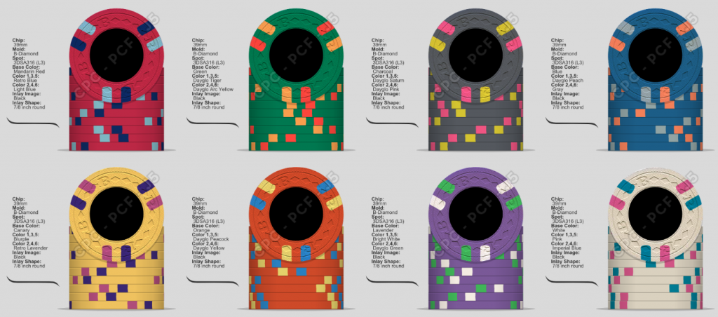
I have mocked up a complete set, T5 through T100000 but will most likely only produce the T25(green) through T5000(orange) or T25000(purple) to start. I can always add on later if I need/want it. Thoughts/Comments?
I have changed the mold to the B-mold based on the chip name, which will be Club Brookwood. Brookwood is the name of the street I grew up on and CB or my initials so there is that tie in as well. Artwork concepts is just starting. Reached out the J5 and started that conversation, but right now its nothing but a bunch of doodles sprawled across my desk. I still want to go for an old school/vintage, yet colorful, look so I'm trying to draw ( pun intended ) inspiration from chips from the 60s. I quickly mocked up (stole) and recolored a Circus Circus inlay in post #30 of this thread. Not looking to make a tribute set, but more of just a direction I am heading. Wish I had a more clear idea of what I wanted. Would love any suggestions/ideas on other places to pull inspiration from. Trying to get this idea in my head realized on paper, and ultimately a chip, is a pain in the ass. So anyone out there more creative than me ( which is probably most of you ) have any ideas, please share them. Thanks.
So here is ( what I hope ) is the final chip/spot design.
I have mocked up a complete set, T5 through T100000 but will most likely only produce the T25(green) through T5000(orange) or T25000(purple) to start. I can always add on later if I need/want it. Thoughts/Comments?
I have changed the mold to the B-mold based on the chip name, which will be Club Brookwood. Brookwood is the name of the street I grew up on and CB or my initials so there is that tie in as well. Artwork concepts is just starting. Reached out the J5 and started that conversation, but right now its nothing but a bunch of doodles sprawled across my desk. I still want to go for an old school/vintage, yet colorful, look so I'm trying to draw ( pun intended ) inspiration from chips from the 60s. I quickly mocked up (stole) and recolored a Circus Circus inlay in post #30 of this thread. Not looking to make a tribute set, but more of just a direction I am heading. Wish I had a more clear idea of what I wanted. Would love any suggestions/ideas on other places to pull inspiration from. Trying to get this idea in my head realized on paper, and ultimately a chip, is a pain in the ass. So anyone out there more creative than me ( which is probably most of you ) have any ideas, please share them. Thanks.
Chippy McChiperson
4 of a Kind
End of February ( 2 months now) and still have not finalized the chips. But I think I am getting closer. I have simplified the spot patterns. All will be 3DS316+ It just makes it easier. Plus I really like the look. Debated a bit on T1000/T5000 vs T2000/T10000 and am pretty sure I'm going with the "standard". Less possible confusion from those playing.
So here is ( what I hope ) is the final chip/spot design.
View attachment 157049
I have mocked up a complete set, T5 through T100000 but will most likely only produce the T25(green) through T5000(orange) or T25000(purple) to start. I can always add on later if I need/want it. Thoughts/Comments?
I have changed the mold to the B-mold based on the chip name, which will be Club Brookwood. Brookwood is the name of the street I grew up on and CB or my initials so there is that tie in as well. Artwork concepts is just starting. Reached out the J5 and started that conversation, but right now its nothing but a bunch of doodles sprawled across my desk. I still want to go for an old school/vintage, yet colorful, look so I'm trying to draw ( pun intended ) inspiration from chips from the 60s. I quickly mocked up (stole) and recolored a Circus Circus inlay in post #30 of this thread. Not looking to make a tribute set, but more of just a direction I am heading. Wish I had a more clear idea of what I wanted. Would love any suggestions/ideas on other places to pull inspiration from. Trying to get this idea in my head realized on paper, and ultimately a chip, is a pain in the ass. So anyone out there more creative than me ( which is probably most of you ) have any ideas, please share them. Thanks.
I like them all, but I think the 5000 for me is my favorite. Those three colors work so well together. I would caution you to get color samples from CPC or borrow from somebody though before you make your final decisions (if you dont already have them), the colors on your monitor sometimes vary wildly from real life.
This is a lot of money to spend, so take your time. I'll be mocking up my own customs for maybe 1-2 years before I pull the trigger. Designs look great to me, though! (y) :thumbsup:
I like them all, but I think the 5000 for me is my favorite. Those three colors work so well together. I would caution you to get color samples from CPC or borrow from somebody though before you make your final decisions (if you dont already have them), the colors on your monitor sometimes vary wildly from real life.
I have a sample color set. And that is how I initially put the colors together.
And for the most part, I think it all works. Considering making the T5000 DG Peach so its a brighter Orange and then changing the T500 to have a Butterscotch spot instead of the DG Peach. I am trying not to reuse any colors. Doing that though might make the T500 a bit to dark for the rest of the set?
Chippy McChiperson
4 of a Kind
Then you'd have a yellow in 4 consecutive chips though.
Then you'd have a yellow in 4 consecutive chips though.
Do you really consider Butterscotch a yellow? I put it in the brown family myself.
And I could always just swap the orange and dg peach and call it a day. But again, I'm still concerned that the blue T500 will be too dark? The dg peach on it helps brighten it up. Plus I was trying to use weighted colors as the base and highlight the chips with the mostly DG colors. Anyway, I'll keep tweaking it a bit. Thanks for the feedback.
Chippy McChiperson
4 of a Kind
I think they'd both work well, but I really like the one you already mocked up with the orange base
I'm back at it again. A few minor color tweaks.
These are the final colors (I hope). Opinions are still welcome.
Still deciding if I want to produce the white chip. Don't think I need a T100000. It'll probably wind up as a bounty if I make it.
Now I'm just trying to decide on spot pattern. What do you think? I'm leaning towards Options 1 or 2.
Option 1.
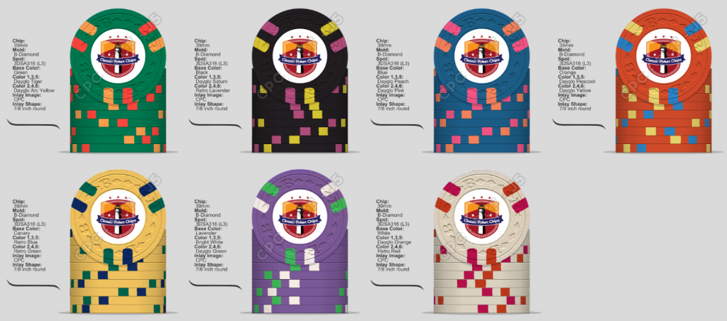
Option 2.
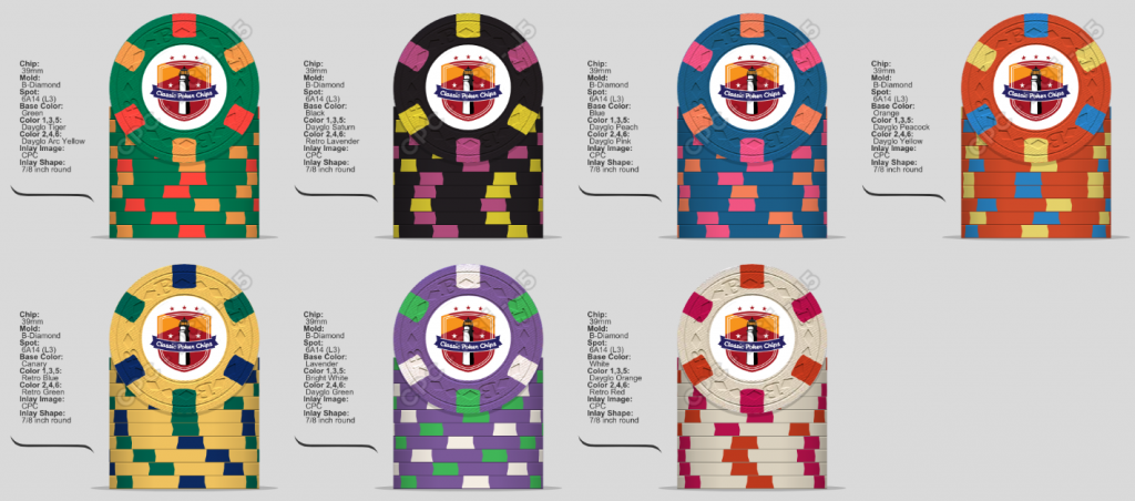
Option 3.
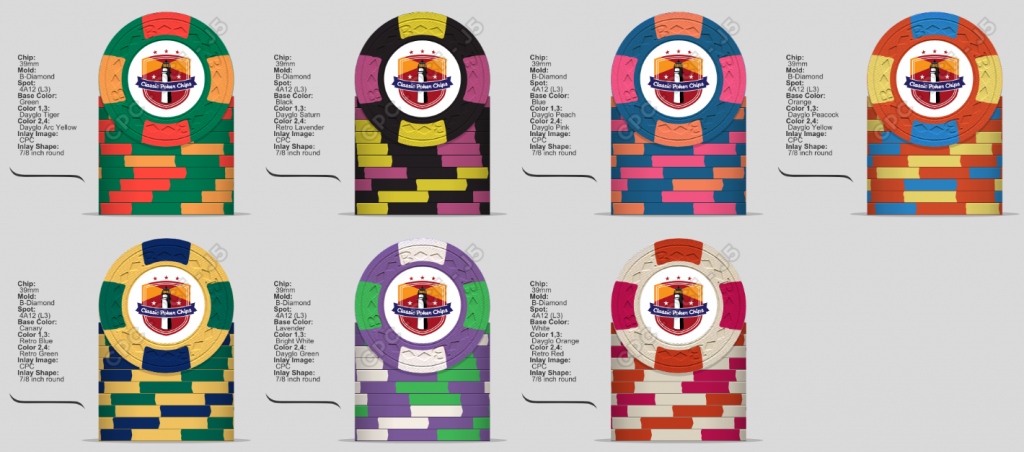
Option 4.
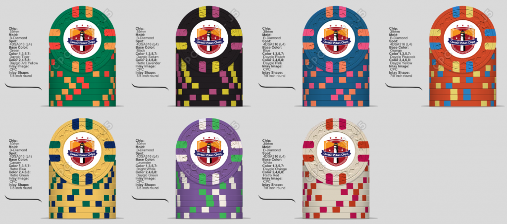
Option 5.
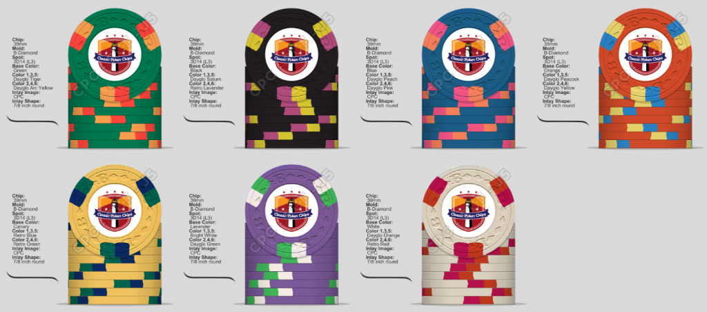
Option 6.
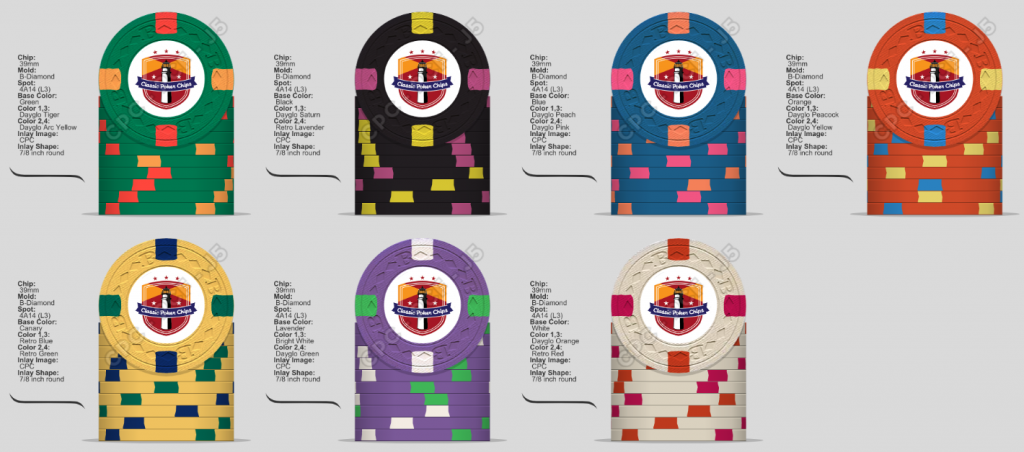
These are the final colors (I hope). Opinions are still welcome.
Still deciding if I want to produce the white chip. Don't think I need a T100000. It'll probably wind up as a bounty if I make it.
Now I'm just trying to decide on spot pattern. What do you think? I'm leaning towards Options 1 or 2.
Option 1.
Option 2.
Option 3.
Option 4.
Option 5.
Option 6.
deliciousburrito
Sitting Out
I'm back at it again. A few minor color tweaks.
These are the final colors (I hope). Opinions are still welcome.
Still deciding if I want to produce the white chip. Don't think I need a T100000. It'll probably wind up as a bounty if I make it.
Now I'm just trying to decide on spot pattern. What do you think? I'm leaning towards Options 1 or 2.
Option 1.
View attachment 164014
Option 2.
View attachment 164015
Option 3.
View attachment 164016
Option 4.
View attachment 164017
Option 5.
View attachment 164018
Option 6.
View attachment 164019
I like option 2! I'm digging the black chips and the blues!
I'm back at it again. A few minor color tweaks.
These are the final colors (I hope). Opinions are still welcome.
Still deciding if I want to produce the white chip. Don't think I need a T100000. It'll probably wind up as a bounty if I make it.
Now I'm just trying to decide on spot pattern. What do you think? I'm leaning towards Options 1 or 2.
Option 1.
View attachment 164014
Option 2.
View attachment 164015
Option 3.
View attachment 164016
Option 4.
View attachment 164017
Option 5.
View attachment 164018
Option 6.
View attachment 164019
For me, Option 2 is the stand out winner here. The 500 and the 1000 are really great, especially the 500... love it.
When I first started my tournament set, I started with he exact spot patterns from 1 & 2... then I went for different . I love 1
Pablito
High Hand
Option 4 is my favourite. Any possibility to add a spot progression?? 
codeman00
Flush
Option #2 is my favorite with Option #1 behind it. Love the $500...definitely my favorite chip of the set!
Option 4 is my favourite. Any possibility to add a spot progression??
I started off thinking I wanted spot progression, but I'm having a hard enough time deciding with so many options. Plus tourney sets I think look good all work the same spots, as long as the color progression is there.
Option #2 is my favorite with Option #1 behind it. Love the $500...definitely my favorite chip of the set!
Leaning towards#1 or #4 right now. I like #2 but I think you lose a bit too much of the base chip color with it. If I were doing only a single spot color, then #2 would be where is be leaning.
codeman00
Flush
I definitely see what you're saying. I can get behind #4 too !Leaning towards#1 or #4 right now. I like #2 but I think you lose a bit too much of the base chip color with it. If I were doing only a single spot color, then #2 would be where is be leaning.
Similar threads
- Replies
- 31
- Views
- 1K
- Replies
- 25
- Views
- 1K
- Replies
- 20
- Views
- 818
