Start of a custom set journey (1 Viewer)

Prototypep3

High Hand
Joined
Apr 25, 2017
Messages
80
Reaction score
72
Location
Australia
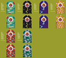
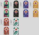
Been a long time since I've been on the forum but I'm back. After a few very good years with my Asconas I'm now looking into the world of custom chips and after so long using ceramics I'm interested in making the switch to clay. I do have some samples of paulsons as my only real clay chips but I enjoy the textural difference. I've got a colour and mold sample set coming from CPC but this is what I have mocked up so far. Thoughts?
 

Attachments

  • 69617c6c-1f35-4fa3-8455-b7b2bc305936.png
    69617c6c-1f35-4fa3-8455-b7b2bc305936.png
    723.4 KB · Views: 196
Welcome back fellow chipper!!

The set looks very dark overall, hope there is lots of good lighting in the ole poker room, there may be issues with partially color blind members with that Black and Dark Purple.

As far as the Tri moon T25... either a quarter pie with 3 colors (basically two quarters green, then 1/4 (blue), 1/4 (red) or even the awesome 1/2 pie option is pretty cool for low denoms (2 shades of green comes to mind)

Also going with a Gray fir the base on the Hundo would probably help and then maybe a blue for the T25k, or stay black and go with a lighter purple for the T500. The spot progression looks a bit reversed on the T1k to the T5k but maybe that is just me, but I love that Mustard yellow 1k... pretty cool there!

Still a noob myself with just two years in the hobby so just my thoughts but definitely not of quality "refinement" yet to help on such issues.

Fellow Chipper Ben
With regards to the colour choices I'm actually completely colourblind. Monochrome is all I see in so these choices were what stood out as very contrast heavy and pleasing to my eye. This might change when I receive the colour samples from CPC though. I'll play around with the pie options on the T25. Will play around with the other colours too I just have to make sure what options I do pick are something I can spot the difference across the table with lol. Thank you for the constructive input though, it's always appreciated!
 
With regards to the colour choices I'm actually completely colourblind. Monochrome is all I see in so these choices were what stood out as very contrast heavy and pleasing to my eye. This might change when I receive the colour samples from CPC though. I'll play around with the pie options on the T25. Will play around with the other colours too I just have to make sure what options I do pick are something I can spot the difference across the table with lol. Thank you for the constructive input though, it's always appreciated!
Not sure how busy he may be but an amazing chipper @k9dr also has color issues. He has also played probably more sets than just about anyone on the forum (he travels to almost every meet up and has probably seen just about every color combo) I think he would be the one to ask about color choices for those that struggle with colors on poker chips.

Ben
 
With regards to the colour choices I'm actually completely colourblind. Monochrome is all I see in so these choices were what stood out as very contrast heavy and pleasing to my eye. This might change when I receive the colour samples from CPC though. I'll play around with the pie options on the T25. Will play around with the other colours too I just have to make sure what options I do pick are something I can spot the difference across the table with lol. Thank you for the constructive input though, it's always appreciated!
Important element there- high contrast colors using clear spot patterns. That can work.

Are the base colors you used the ones you found most pleasing?
 
Important element there- high contrast colors using clear spot patterns. That can work.

Are the base colors you used the ones you found most pleasing?
Most pleasing and along with what I found to be the typical colours of each denomination. I basically looked up what colour is most often used for each chip, set the one I liked best {and looks easiest to tell apart from others} as the base and just went from there. Edge spot colours are another beast in themselves, I have no idea what colours should go with which base chip so I basically guessed around what looks best to me in the design app.
 
Is this for a tournament set or cash set?

Colors aren’t absolute, either way, especially with CPC colors. Some quick examples: orange for yellow; maroon or chocolate for black; pinks for red.
 
Here's an updated look with some of the changes already suggested.
 

Attachments

  • inlay chips 2.png
    inlay chips 2.png
    656.3 KB · Views: 92
Not sure how busy he may be but an amazing chipper @k9dr also has color issues. He has also played probably more sets than just about anyone on the forum (he travels to almost every meet up and has probably seen just about every color combo) I think he would be the one to ask about color choices for those that struggle with colors on poker chips.

Ben

On the contrary, I am not much help in choosing colors. I know what I like when I see it, and definitely prefer high contrast spots.
 
On the contrary, I am not much help in choosing colors. I know what I like when I see it, and definitely prefer high contrast spots.
You and me both. One local league here doesn't even have denoms on their chips, I simply had to stop going. Constantly having to ask for help sorting chips because shades are too close is a nightmare for me. Luckily the other league that was here had denoms and I did very well there until it shut down. Home games are a much different story.
 
Maybe play with:
Green: DG green, DG peacock (blue) // green
Black: DG peacock (blue), retro blue // charcoal, chocolate, maroon, imperial blue
Purple: DG pink, lavender, retro lavender // purple
Yellow: DG arc yellow, DG peach, DG tiger // butterscotch, canary, yellow
Red: DG pink, mandarin red, retro red // orange, DG orange
Gray: bright white // white, gray


You could go brighter with the DGs or you could go more fall warmth (after the // above).

Any way you go, you’ll find a lot folk here willing to assist.
 
A very very basic and quick mockup of the inlay design I'm going for.
 

Attachments

  • 3 point inlay1.jpg
    3 point inlay1.jpg
    134.4 KB · Views: 80

Create an account or login to comment

You must be a member in order to leave a comment

Create account

Create an account and join our community. It's easy!

Log in

Already have an account? Log in here.

Back
Top Bottom