Spot color advice... (1 Viewer)

warma

Full House
Joined
Dec 14, 2019
Messages
3,534
Reaction score
5,044
Location
DMV
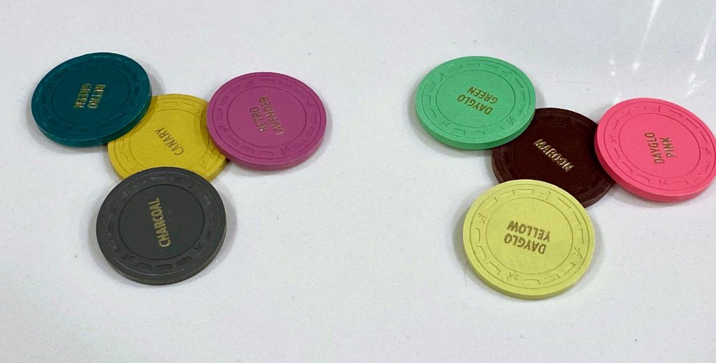
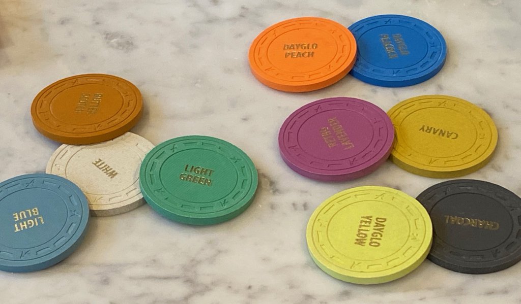
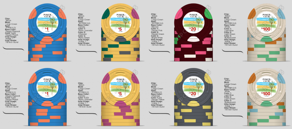
I've probably been thinking too much about this, so it's time to ask for help. I'm going with a try-moon spot across the chips. The $1 and $100 are good- I'm waffling on the $5 and $20 and would appreciate your thoughts. CPC has a lot of variations of the same color, so it's tough to get a lot of variety in here. Mock-up with photos of color samples.

Thanks!
LJPC2.png
IMG_3555.jpeg
IMG_3551.jpeg
 
I like maroon as a $20. Try Tiger instead of pink. Maybe put DG pink on the $100 instead of butterscotch?

And maybe not green on 3 chips.
 
In addition to my above post, try retro red instead of retro lavender on the $5. And then use retro lavender on the $100 instead of butterscotch.

And I LOVE the $1.:tup:
 
Hi,

Welcome to PCF. Cali sets rule!

First, you are never thinking too much about this....next this is pretty solid to begin with...the top row in particular. It is a challenge to make several 4 color chips in a lineup and have them work together. The well loved Mapes set is a good example of a set that included three trimoon chips with 4 colors and they work well together.

Inlay - you have a very nice concept here. Who did the art? The font and denom could be much larger IMO. Will it be a generic "Poker Room" or will you customize? You have a very solid set developing...better than almost anything I see from a new chipper. You are on your way.


Making the $1 a two color chip is a good choice and I really like Peacock/Peach here...large crown is an excellent choice too. I agree with the comment about similar colors for dirty stacks that allforcharity mentions. Your top row has none of these issues at all but three chips with green in a row and the 5/20 transition needs some diversity green/pink similarities...

After playing for a few minutes here are a couple options to think about (your set is in the top row).

Some notes: - I think DG Yellow is the best CPC yellow by a long shot. Consider using it as a base chip. Chocolate colors with mint are always nice, Retro blue is a great color to use as a spot on a light chip base. I prefer a trimoon chip that has at least one very bold contrasting color in it.

I agree that you could work in Tiger on the 20 in place of DG pink.

Good luck!

noob1.jpg

noob2.jpg
noob3.jpg
 
Thanks for the input, really helpful. The green thing was bothering me- I didn't want to change the $100, but I really like the above edit!

I'm still playing with the artwork and will wrap it up soon. I'd been playing with multiple concepts over the years and over the holiday break, I just started sketching and ended up with the design. Familiar, but not too literal. The group name is La Jolla Poker Club- too much to fit on top, so I'm toying with options on splitting the La Jolla (location) from the rest.
 
Re the name, I’d cut “Poker” from the name. First, it is implied, and second, it is more true to Cali cardrooms to just use “Club.”

La Jolla Club, for the win.

Bonus is it is less of a mouthful, and your chips will be known as the LJCs here on PCF. :tup:
 
Re the name, I’d cut “Poker” from the name. First, it is implied, and second, it is more true to Cali cardrooms to just use “Club.”

La Jolla Club, for the win.

Bonus is it is less of a mouthful, and your chips will be known as the LJCs here on PCF. :tup:

I really didn't want to drop Poker for a few reasons. The suggestion, though, warranted a try, which got me thinking... and led to some other tinkering. I'm happy with where this is going. Thanks!

Unknown-3.png
 

Create an account or login to comment

You must be a member in order to leave a comment

Create account

Create an account and join our community. It's easy!

Log in

Already have an account? Log in here.

Back
Top Bottom