So very, very close! (1 Viewer)

Joined
Apr 24, 2019
Messages
101
Reaction score
88
Location
Alabama
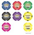
These are for my casino party rental business. Before sending this off for print, just curious what others may think!
I took the suggestions from others in the previous thread and applied them!
The only minor tweak I have for these is to make the outline of the denomination a little bit thicker.

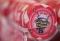
(Original chip also pictured)
 

Attachments

  • Screen Shot 2019-05-21 at 3.07.20 PM.png
    Screen Shot 2019-05-21 at 3.07.20 PM.png
    668.4 KB · Views: 395
  • IMG_2101.JPG
    IMG_2101.JPG
    221.2 KB · Views: 367
I liked the kite shield of the original. How about a winged helm for the new ones?

I appreciate the comment about the shield. The issue I have is that it's a bit bulky and I don't use it on the website, tables, etc. So it's just different to not have the chips be uniform. Eventually the 'new' chips will far outweigh the old ones with the shield.

And a winged helm? Forgive me... what is that?!
 
Needs something, it’s pretty bland without anything in the background

Even a big/cool looking FDL since you use that other places
 
In the drafts you've attached. It looks like gradient has been applied individually to each of the letters of "Casino Knight" and it makes it a little harder to read. May want to consider applying it to the "Casino Knight" text as a group.

May also want to bulk up the stroke on the text as well to help it stand out.

The original image is a good example. The text has a gradient, but it doesn't re-start with every letter.

Good eye!

So the story behind that is the manufacturer of the chip took the design logo and smoothed it out to make it easier to read... and he'll do the same thing once I submit the artwork to him!
 

Create an account or login to comment

You must be a member in order to leave a comment

Create account

Create an account and join our community. It's easy!

Log in

Already have an account? Log in here.

Back
Top Bottom