So close... just minor tweaks needed! (1 Viewer)

Joined
Apr 24, 2019
Messages
101
Reaction score
88
Location
Alabama
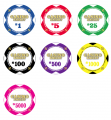
I have a casino party business and am tweaking the chips I have. In the beginning I thought it was cool to have a shield under the logo... but since then I don't care for it since it doesn't add much and is tough to see anyways.

The current design has the denominations the same color as the chip (blue 1 with a blue $1), but I think in order for the chip to not have such a huge looking change is to keep the denomination black like the previous ones I have.

See what you think!
 

Attachments

  • chips_01.jpeg
    chips_01.jpeg
    115.1 KB · Views: 368
  • Screen Shot 2019-05-14 at 2.35.02 PM.png
    Screen Shot 2019-05-14 at 2.35.02 PM.png
    276.5 KB · Views: 366
Don’t want to pile on, but the originals are awesome! There’s also something to real pics vs mock ups, so that could be part of it too
 
Gotta admit... saving me some good $ on the redesign and set-up fees! Love the feedback! I have a tendency to overthink and obsess on the details, so this certainly helps!
 
Another one for the current/original design. Good luck!
 
Like your originals too. There are a couple tweaks I would do though:
- Invert the fleur de lis, for me they should be the same way up as the text
- Change your edgespot colours from white to something else contrasting for each chip; white looks too much like dice chip. If you want to keep them all the same, try black as an option.
 
Much prefer the originals too... that would be 0-9 if still counting.
Looks like there may be some better ideas for tweaking than removing the piece that allows the wordplay to make sense.
 
Like your originals too. There are a couple tweaks I would do though:
- Invert the fleur de lis, for me they should be the same way up as the text
- Change your edgespot colours from white to something else contrasting for each chip; white looks too much like dice chip. If you want to keep them all the same, try black as an option.

Holy crap... never even noticed the fleur de lis being upside down! Good catch! Sadly, that's going to really bother me now!!

And as far as the white edge spot pips... I would LOVE to change them, but I already have over 2,500 of these and they are all white like that. I wish I had thought about that back when I was getting these suckers made up!

If I got new ones with different colors, they wouldn't match and would stand out. Drat!
 

Attachments

  • IMG_2090.JPG
    IMG_2090.JPG
    97.1 KB · Views: 170
  • IMG_2096.JPG
    IMG_2096.JPG
    218.6 KB · Views: 186
Ok, back to the drawing board.

Going to lose the shield (since it's not on the site, business cards, videos, etc).
Going to add the gradient back in.
Will see how it looks with the denomination matching the color vs keeping the denomination black, as well.
 
Originals. I think the new design has just way too much white. I understand the edge spot consistency, but I think the center is too big and too white also
 
I also like the originals. One way to keep the color-matched denominations would be to use a black stroke and a drop shadow to make them stand out a bit more!
 

Create an account or login to comment

You must be a member in order to leave a comment

Create account

Create an account and join our community. It's easy!

Log in

Already have an account? Log in here.

Back
Top Bottom