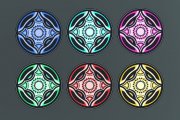
That's what I had initially, but then a friend suggested trying black and another friend liked black as well. Here's with
darker subsets, and here's
two compared.
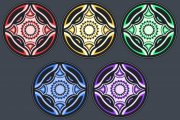
Initially, I had a bit different design with the smallest details like the dots as bigger patterns around the chip. I ended up moving things around and thought of removing the small details because I'm sure those wouldn't print anyway but decided to keep them because they add an element of detail on a bigger scale. On a smaller scale, I'll be happy if the green dots and black colors in-between are printed to create a small space between each green dot. If the test prints will come back without black space in-between, I'll remove a couple of dots to add more space.
Sorry, not entirely sure what do you mean, but I assume you're also talking about the small details
")