Hello,
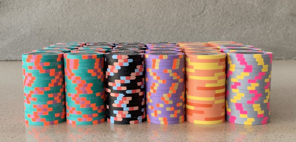
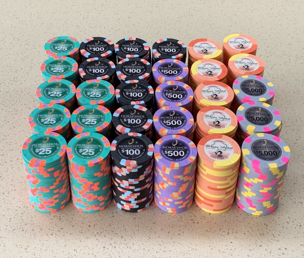
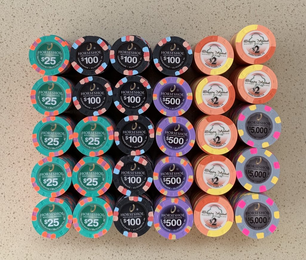
My goal is building a tournament set with colors that pop and can handle:
1) T25 base tourney for up to 20 players.
2) T100 base single table tourney for up to 10 players.
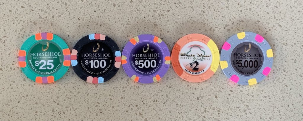
I am not using the $1k HSI chips, but instead I am planning on using the Santa Ysabel $2 chips as a T1,000 chip. I plan on removing the existing inlays and replacing them with Gear labels. The reason for choosing the Santa Ysabel $2s is because they have yellow and orange edge spots and the colors pop.
Two HSI secondary chips use faux shaped inlays and they other two primary chips use inlays with a black background. Three of the HSI chips use a white text and one uses black text.
I am leaning towards using an inlay with a black background on the Santa Ysabel $2s. I am not sure if there would be enough contrast using an orange or melon colored faux shaped inlay with a white text so that the white text would start out enough to be easily read.
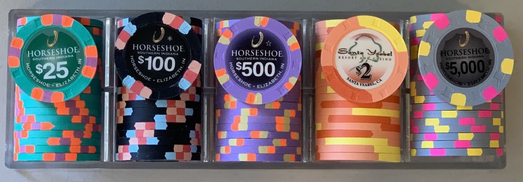
Lineup:
HSI $25 secondary as T25
HSI $100 primary as T100
HSI $500 primary as T500
Santa Ysabel $2 as T1,000
HSI $5k secondary as T5k
My questions regarding the Santa Ysabel $2s are:
Should I use a faux shaped inlay?
OR
Should I use an inlay with a black background?
I am curious to hear your thoughts/comments.
I took pictures using natural light, but I found it difficult for my camera to capture some of the bright colors especially the blaze orange.
Last edited:
