appreciate the effort, but 3 chips in a row and 4/5 chips in a set all using a shade of yellow/orange is exactly the kind of issue I am trying to avoid.
for reference, this $1 is the chip the made me want to use a light chocolate quarter. understand it's not for everyone, but I appreciate the old school look (chip/photo credit @PlaidDragon):
View attachment 397359
Oooo! Dragons!
I've always liked the Orleans $1 given it's the only casino I can think of that has that color for a 1, minus the spots. That was my inspiration for the Dragons.
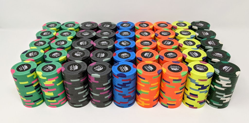
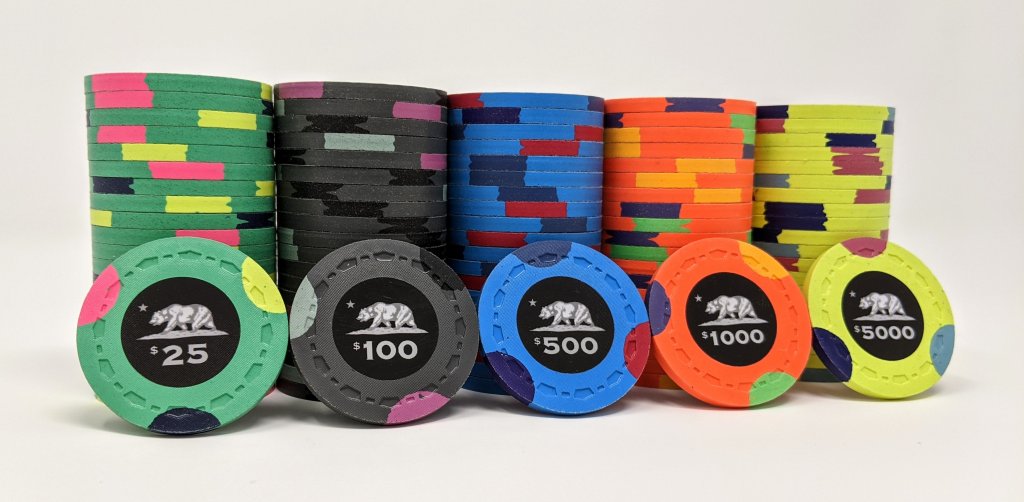
Btw, your tourney set colors from post 13 are perfect. I wouldn't change them any further.