Ronin Club - Custom Ceramic Mockup (1 Viewer)

Solanthos

High Hand
Joined
Jun 10, 2019
Messages
66
Reaction score
62
Location
PNW
I've wanted a custom set for as long as I've been playing poker - 17 years now. It's finally time. I ordered some sample sets and was pretty impressed with BRPro's offerings. I then happened upon the Bosco thread and @HobokenNJ who made a chip designer based on the Bosco Kickstarter. Between that, their AI files, some time with Inkscape, and some inspiration from some of my favorite sports team colors and existing chips... here's my first swing at a custom set.

Ronin is our 10 year old English Shepherd, so I thought it would be cool if the set was in his name. I also liked the idea of a bunch of masterless samurai gathered around a poker or gaming table in their spare time.

I know there might be some comments about doing edge spots on ceramics, but edgespots are one of my favorite elements of chips and I think ceramics the best option for me right now.

Let me know what you think!
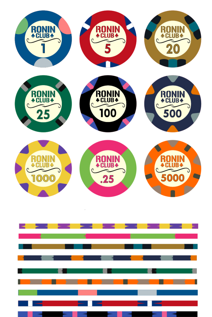
Draft1a.png
 
These look awesome! You should also look into Sunfly samples as BRPro doesn't do aligned edges by default. Edge spots look completely fine on ceramic chips.
 
Very good start ! :tup:

I'm a little concerned about the 100 & 500 colors that might be to close once printed. That would need prototyping to be sure.
Also, you might want to remove the swirls in the inlay and re-organise the elements and use one of the secondary colors for the denomination ;)

1589179460203.png
 
Very good start ! :tup:

I'm a little concerned about the 100 & 500 colors that might be to close once printed. That would need prototyping to be sure.
Also, you might want to remove the swirls in the inlay and re-organise the elements and use one of the secondary colors for the denomination ;)

View attachment 456595
I second everything here. I don’t think the swirls add value, and look a bit like a twirled mustache. If there’s room for an added element, perhaps something that gives a small nod to the shepherd or feudal Japan.

You may not want this type of theme, but you could even replace the swirls with a thin blade to seperate text and denoms. There’s plenty of blades and staffs used by ronin that you could do a different one for each denom, katana, naginata, wakizashi, etc.
 
Agreed on T25, T100, and T500 being too close/dark to be easily distinguished during play.

Consider going with a gray T100 to make them stand apart, or using MUCH lighter versions of the green and purple chips.


Lol at the split 8V spots on the T100 -- very realistic. :tup:
 
Thanks for the feedback so far! Keep it coming! :) A few comments -

I did play with adding secondary colors into the swirl or the denom but ultimately went back to using the base color. Crossed swords were definitely among the ideas for the middle separator, but I didn't find anything to my liking that didn't seem to clutter up the inlay. I might revisit that though.

I definitely worry about T100 and T500 being too close. It's just a matter of deciding what to give up. The green chip has Dallas Stars colors (Victory Green, silver, black) and the blue chip has UVA and Dallas Cowboys colors (navy, silver, orange), so if I want to keep that theme I would need to change the WSOP-inspired 100. How far into the gray spectrum do you think it would need to be to differentiate it well enough? I'm not necessarily opposed to something closer to Day Green for the 25 and lavender or Desert Flower for the 500 but then we're basically just making WSOP Primaries anyway. :)
 
Going to play tonight with adding a katana, or two crossed katana, or a katana and a wakizashi...

@trever Believe it or not, that was an idea I played with as well... here's a screenshot of an attempt to use it as an initial mark (similar to how Bud Jones chips have the BJ initials, etc...).

1589220014822.png


Although that kanji does look a bit different than the Google Translated ones I used; I really like that the top symbol looks like like an R with maybe a claw or pawprint behind it! Great find.
 
I tried a picture of a real katana but I don't think the level of detail translates well to a chip, so I found some silhouettes instead. I think I like the crossed swords the most.

1589260952179.png
 
One last prototype post before I send some email off to BRPro... I think I might start by ordering the 500s in small quantity to check the color comparison and then redesign from there if I need to do so.

Draft3.png
 

Create an account or login to comment

You must be a member in order to leave a comment

Create account

Create an account and join our community. It's easy!

Log in

Already have an account? Log in here.

Back
Top Bottom