Princess' CatHouse (now Private Club) (1 Viewer)

Kid_Eastwood

Full House
Joined
Jan 28, 2016
Messages
4,792
Reaction score
8,364
Location
BE
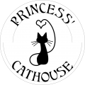
I'd love to get a custom hotstamp cash-set and I've done a pretty straight-forward and old school design.
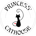
Princess_CatHouse.png

The theme is inspired from my cat. :)

The chips would all get the same logo on one side and the denomination on the other one.
First, I'd be looking in a cash set:
- Red 25c
- Blue $1
- Yellow $5
- Black $20

Update:
The project took a totally different direction and here's the outcome for the tournament set : https://www.pokerchipforum.com/threads/princess-cathouse-now-private-club.46923/page-2#post-903696

The cash set is in design phase.

Kid.
 
Last edited:
Double-stamping to get the red heart? That would be pretty badass if you could pull it off.

I'm not sure that it can be done. At best, it can be part of the stamp but I fear it'll be too small.
 
You could make the loop of the tail bigger so that the heart could be bigger as well.

I’ll try that this evening.

Also, for curiosity, I’ve asked SunFly for a quote to implement this design on their PolySpectra line for the tourney set :

T25 = May Green (120)
T100 = Silver (120)
T500 = Berry (50)
T1000 = Canary (120)
T5000 = Paris Pink (20)
Bounty = Nectar Peach (or an octagon plaque...) (10)
 
I'd make that cat head and whiskers much larger to really give the silhouette of a cat...otherwise it could get lost as a metallic stamp.

Thoughts? - I like your stamp concept too.
 
I love it....a custom hotstamped set is a loooot of work but very rewarding if you are able to pull it off.

20140131_135839.jpg


If you are able to have a 'full patch' of foil and put the heart inside...then you have a little spot of base color (like I did with the trumpet).
Maybe you could fill the 'O' in cathouse and put the heart inside it ?
 
Last edited:
I'd make that cat head and whiskers much larger to really give the silhouette of a cat...otherwise it could get lost as a metallic stamp.

Thoughts? - I like your stamp concept too.

I fear also for the whiskers. I’ll maybe make them thicker. The head, I would’t because proportions would feel strange I think.

Also, I would not make the complete design of the cat bigger because it’ll make the design too crowded. I like the fact that there are room between the cat and the texts.

Also, looking at @Thomacetti example, I think thin lines could render quite well.

I love it....a custom hotstamped set is a loooot of work but very rewarding if you are able to pull it off.

View attachment 340695

If you are able to have a 'full patch' of foil and put the heart inside...then you have a little spot of base color (like I did with the trumpet).
Maybe you could fill the 'O' in cathouse and put the heart inside it ?

Your set is amazing and what you did with the trompet renders really well.

For the heart, I’ve another idea : shape the tail as a heart instead of the current curve. But I’ll have to try because what I like with the current shape is the fact that the silhouette seem ‘thin’ and ‘high’. I tried what @Rhodeman77 suggested to have a bigger heart but it gives the impression of a less willowy silouhette and I did not like.

Off topic : we should plan a game sometime...
 
Last edited:

I've reworked the design :
- Head is a little bit larger ;
- Whiskers longer ;
- Tail is heart-shaped ;
- Start of the tail has be refined.
- Overall logo size is increased a little bit.

Princess_CatHouse_New.png
 
Last edited:
A possibility for my cash set would be the SunFly PolySpectra chips in the following line-up for denominations 25c / $1 / $5 / $20.
6EF28477-15C3-40F4-A5CD-36B743D066AC.png

If they would provide black color for the PolySpectra, I’d have chosen it for the $20.

Depending on the quote, I’ll request for a sample.

I also asked a quote for Matusi hotstamps...
 
Last edited:
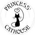
So, I reworked the silouhette and I'm done with it !
I'm quite satisfied with the new shape of the tail and the shape of the heart.

Princess_CatHouse.png

Update :

In order to have a less crowdy design I only put the first letter as uppercase.
Also, I changed the name a little bit to make to make it "more poker" but still with a small wink for brothel chips.

Princess_Private_Club.png

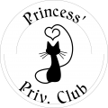
And with the "Private" word shortened in order to have more or less the same text size on top and at the botton.

Princess_Priv_Club.png

Your thoughts ?
 
Last edited:
@allforcharity you're right.

I've just observed that Princess' head and heart was slightly off centered. I fixed this. I've also reduced a little bit the spacing between all letters at the bottom and between the 'P' and the 'R' on the upper text.

Princess_Private_Club.png

I'll keep it simple for the cash set (logo on one side and denom on the other side) and for the tournament set (which will probably not be hotstamp), I've some room to place the denom on the inlay/label (but this is for later).
 
Last edited:
Hi,

I've continued with my theme and started to work on the tournament set.
It'll probably an hybrid from SunFly (43mm and 25mm sticker) inspired from WSOP 2007 secondaries.

19524e6d-717a-40f5-a94c-b6c989c87127.png
e3caf6b5-a26a-4e36-9883-f019914e9fce.png

What is your preference ?
1. No border for the cat and uniform background.
2. No border for the cat and gradient background.
3. Borders for the cat and uniform background.
4. Borders for the cat and gradient background.
5. White border for the cat, uniform gradient and white denom.

My main questions are:
- would the borders be visible when printing ? Isn't it a too thin line ?
- would this kind of gradient render well ? (note that I'll choose labels that fills completely the recessed area)

Note: I might still decide to go with 618 edge spots. But my main focus now is the sticker.
 
Last edited:
My vote: 4.
But you'll need to stretch your graphics as wide as possible to the limits of the inlay, otherwise may be hard to see, or it basically gets drowned in a sea of background colour.
 
I can definitely stretch it more.
The problem with the chip designer tool is that it only allows 7/8 inches (2.2 cm) on 44mm chips. My labels will be 25mm.
That’s why here the impression is that there is a big space between the rim of the recessed area and the design.
Also, it was late yesterday and had to add another possibility : same as 5 but with background gradient.
I’ll also try the cat silouhette in plain color rather than a rainbow gradient.
 
So I continue my work on the tournament chip.
Here're the 2 choices I kept.
g3320.pngPrincess-T25.png
(just forget about the border of the label, it's there to illustrate where the rim of the recessed area is)

FYI, they will be SunFly Hybrid, 43mm with 25mm label.

I think my preference is the first one, with gradient and black currency.
What do you prefer ?
 
So I continue my work on the tournament chip.
Here're the 2 choices I kept.
View attachment 343876View attachment 343877
(just forget about the border of the label, it's there to illustrate where the rim of the recessed area is)

FYI, they will be SunFly Hybrid, 43mm with 25mm label.

I think my preference is the first one, with gradient and black currency.
What do you prefer ?
Inlay with no border is my choice.
 
Inlay with no border is my choice.

There will be no border at the end.
I just still hesitate a little bit between gradient + black currency vs no gradient + white currency.

--

Here's the lineup with gradient and black currency :
Princess-Lineup.png
 
Last edited:
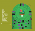
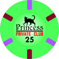
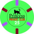
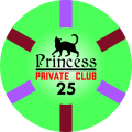
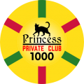
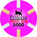
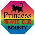
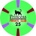
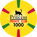
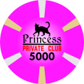
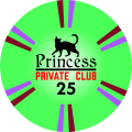
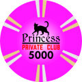
So I reworked a little bit the tournament chips. I changed some colors and also changed the chip design. Still based on a 618 pattern but for a ceramic chip, I preferred to make the spot going all the way to the recessed area.

Princess-T25-ChipAndLabel.pngPrincess-T100-ChipAndLabel.pngPrincess-T500-ChipAndLabel.pngPrincess-T1000-ChipAndLabel.pngPrincess-T5000-ChipAndLabel.png
Princess-Bounty.pngPrincess-Dealer.png

Still to do : the design of the edges.
 
Last edited:
I wanted something different than an immitation of clay edge spots. That's why in the previous version, I already made the spot going all the way to the recessed area.

I just now created 2 new versions of the spots.

V2
Princess-T25.pngPrincess-T100.pngPrincess-T500.pngPrincess-T1000.pngPrincess-T5000.png

V3
Princess-T25.pngPrincess-T100.pngPrincess-T500.pngPrincess-T1000.pngPrincess-T5000.png

What is your preferred one between V1, V2 and V3 ?
 
Last edited:
For a tournament set, I prefer to have all the chips with the same spots.
Clearly, it's between v2 and v3 for me too.

Anyway, I might have to rework a little bit the label (on the T500 and Bounty the words "PRIVATE CLUB" might not be very clear at printing).
Also, SunFly is on holidays this entire week.

So I've still some time to decide before ordering.
 

Create an account or login to comment

You must be a member in order to leave a comment

Create account

Create an account and join our community. It's easy!

Log in

Already have an account? Log in here.

Back
Top Bottom