Pretty much done now.... (1 Viewer)

Tsarbomba

Pair
Joined
Apr 16, 2018
Messages
125
Reaction score
91
Location
USA
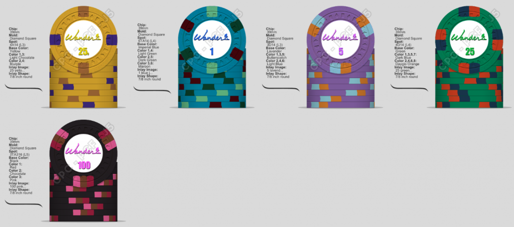
Ive come to realize that in person chips, look a heck of alot better then on the designer. While feedback had been great, I feel it only goes so far based on what people like for design, text, ect. I think NEX has done a great job helping me understand colors and edge sports more. So after ALOT of time with many different desings. I pretty much settled on this. Some designs seemed good in my head, but never came out as good. Others seemed, so mushy with (stuff) in it, others seemed to dark or to bright. So, with me taking my very first trip to Vegas and staying at the Encore a few weeks back, and these being my first custom chips, I figured Id link the two. I love the outdoors too, so to put everything together and get a clean inlay design, Im pretty stoked about.
234wef.jpg


.25 yellow jpeg.jpg


cpc wander.png
 
Last edited:
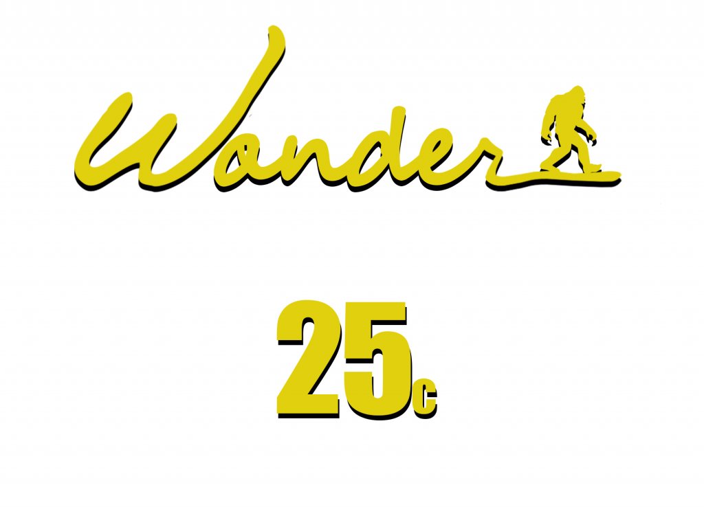
trying to match color of text and denomination to the "actual" color that the chip will be, is kind of a struggle.
 
The inlay design brings the Wynn charity chips to mind, which is to say that I like it.

I believe your inlay reads Wander? As in wander the outdoors. If so, I read it as Wonder at first, maybe make the “a” a bit more distinct. If it was meant to be Wonder, then carry on. :)
 
Ive come to realize that in person chips, look a heck of alot better then on the designer. While feedback had been great, I feel it only goes so far based on what people like for design, text, ect. I think NEX has done a great job helping me understand colors and edge sports more. So after ALOT of time with many different desings. I pretty much settled on this. Some designs seemed good in my head, but never came out as good. Others seemed, so mushy with (stuff) in it, others seemed to dark or to bright. So, with me taking my very first trip to Vegas and staying at the Encore a few weeks back, and these being my first custom chips, I figured Id link the two. I love the outdoors too, so to put everything together and get a clean inlay design, Im pretty stoked about. View attachment 197558
View attachment 197556

I like your inlay! Love the simple design, the message, the font (encore inspired?), and Sasquatch. Great execution.
 
Gorilla image could be a bit bigger on the inlay.

Oops Sasquatch could be bigger.
 
I messed with that. But it looks strange having it bigger bc its close to the edge.
 
I know you are essentially done, but I also was unsure about "Wander" vs. "Wonder". I also agree the squatch is very small. Would love to see it a little bigger, perhaps a mockup above the text or next to the denomination? Just $0.02 you can use as you see fit....
 
Last edited:
I too got confused with wander vs. wonder. Maybe move the script up on the o instead of how it is
 
That crossed my mind, but it would make it seem more cluttered and less clean.
 
I too thought it was Wonder when first reading it.

Also why no denominations on the 1-100 chips?
 
This inlay design is cool as it gets. Well done, love the changes. Simplicity in inlay is often the best route and looks amazeballs!
 
I too thought it was Wonder when first reading it.

Also why no denominations on the 1-100 chips?

I prefered no denominations at all. But chose to do the 25c because it I didnt like the way the .25 looked :banghead:
 
I prefered no denominations at all. But chose to do the 25c because it I didnt like the way the .25 looked :banghead:

Perhaps use the fraction 1/4 instead then?

The c is very small and hard to see in the actual mockups.
 
Done done. Final. Only thing would like is feedback on mold. I life the fdl because of the larger inlay and smoothness of it. Other then that, not a huge fan.
 
Last edited:
encore is my fav casino and I spend most my time there and playing poker
 

Create an account or login to comment

You must be a member in order to leave a comment

Create account

Create an account and join our community. It's easy!

Log in

Already have an account? Log in here.

Back
Top Bottom