Poker Chip Design Help Needed (1 Viewer)

My Advice is to not do both a .25 AND a .50. Go with either all .25s or .50s depending on stakes.

design your workhorse chip first (usually 1 or 5 depending on stakes) and work around those colors.

I do love the color combo on your quarter
Agreed. The quarter colors mesh quite well!
 
And as much as I love 6D18 I'd probably avoid it for the $5 depending on how many racks you want (most people get too few $5's, myself included, and have to add-on later). And regarding the $100, I'd get one made anyway lol.

I wised up and took that advice by scaling the $5 down to 4D14. Doubt the set will be added on to...but it's solid advice that I should heed just in case. Plus it will save me money in the original order....so that I can make a $500 chip? Lol just kidding, I just put it in there cuz I recently saw a Aztar $500 and fell in love with it - I have no intention of ordering that chip at this time though.

Rico's Room_6.22.png


How do you guys feel about 2-sided chips? I have one design in mind for the backside, and I like to tinker while I'm waiting around anyway (just like EVERYONE on this site haha).
 
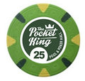
When you mentioned a spotlight, I immediately thought of the Pocket King design done for Apache's custom Majestic inlay contest by RiffRaffRandy. He's a member here.

Pocket King.jpg

This is a clean design, and the "knocked-out" circle around the denomination looks like a spotlight.

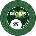
I did a super-quick mock up of the kind of thing I was thinking for you, using the Pocket King design, but with "Mr. Rico's Cardroom" as the text with the "o" as a spotlight shining down on the denomination.

Mr. Rico's Cardroom.jpg

Anyway, it's an idea. If you like it, maybe try to contact RiffRaffRandy to see if he would make you something like this?
 
Thanks @imnotlaughin! I agree the Pocket Kings logo is great. I originally had a very similar inlay concept to what you mocked up, but then I thought of a different concept that I thought might work better overall. I have asked J5 already to do the design, but I can ask him to mock up both concepts and see what looks better in the end.

I really appreciate your input! Do you have any other ideas?
 
Alright, cut out the 50 cent. I know everyone is probably stoked! Thoughts?

Rico's Room_7.926.png
 
Thanks @chipjoker! Few things...

1) It reminds me of working for his company as a stagehand which is pretty cool.
2) I'll send all these design ideas to J5 to see what he thinks would look best
3) Most importantly, I would never laugh or disregard somebody's work and effort - I really appreciate it!
 
I think this was my first post on this site. Still would like to do this set. Maybe a 60th bday present?

Title: Rico's Room
Mold: CSQ or MD50
Inlay: 2-sided (one is poorly mocked up by me, the other would be the hampton coliseum below). The lights of the coliseum would alternate to color match the chip. Also the spotlight colors would color match as well.
Location: Hampton, VA

I have no chip mock up at this time, but colors would definitely be standard

Hampton Coliseum:
310746
 
Oh I don't think I need help right now as the title states - the thread is just neco'd and I can't edit anymore!
 
Appreciate the advice, but already put a set together in a different direction from where I started out
That's fine, I just love 1/2 pie chips, especially with hotstamp, they just look sexy
 

Create an account or login to comment

You must be a member in order to leave a comment

Create account

Create an account and join our community. It's easy!

Log in

Already have an account? Log in here.

Back
Top Bottom