Hairy_Crocodile
3 of a Kind
Hey all!
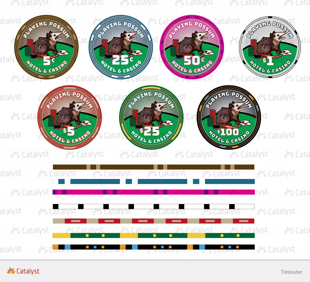
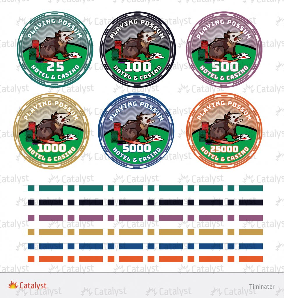
I am having some trouble deciding how to proceed with my first custom logo. I am pretty dang happy with the ceramics I have
The ceramics:


I guess my only thing I want to ask about these is whether or not I should keep the table in the image or not. Im considering having it removed so I can have a clean background on the chip face.
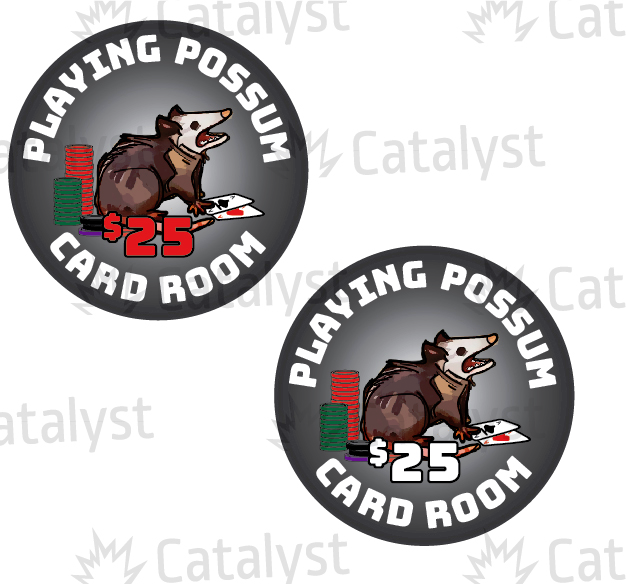
The thing I am more lost trying to figure out what to do for my label design to put on my RHCs
So far, I have this:


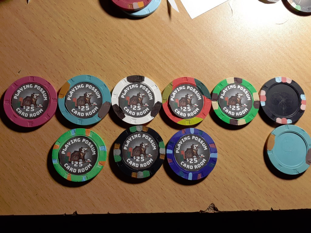
I am pretty happy so far, I even printed out paper to see what it would look like on some chips I have for my cash/tournament sets. However, I want to ask you all what you would change here.
Is the font size distracting to the denomination? Do I make it smaller?
Do I change the font size on the denominations to be larger than the card room's font?
Should I go with a different font for the logo?
Should my background fade to jet black vs the Grey?
What would you change in these designs? I know that it is my design at the end of the day, but Im asking so that I can see others' opinions that may point out flaws I missed or suggest better ways to go forward with thew design to make it better. I know that I tend to get really tunnel visioned with projects like this, so fresh eyes are very much appreciated.
I am having some trouble deciding how to proceed with my first custom logo. I am pretty dang happy with the ceramics I have
The ceramics:
I guess my only thing I want to ask about these is whether or not I should keep the table in the image or not. Im considering having it removed so I can have a clean background on the chip face.
The thing I am more lost trying to figure out what to do for my label design to put on my RHCs
So far, I have this:
I am pretty happy so far, I even printed out paper to see what it would look like on some chips I have for my cash/tournament sets. However, I want to ask you all what you would change here.
Is the font size distracting to the denomination? Do I make it smaller?
Do I change the font size on the denominations to be larger than the card room's font?
Should I go with a different font for the logo?
Should my background fade to jet black vs the Grey?
What would you change in these designs? I know that it is my design at the end of the day, but Im asking so that I can see others' opinions that may point out flaws I missed or suggest better ways to go forward with thew design to make it better. I know that I tend to get really tunnel visioned with projects like this, so fresh eyes are very much appreciated.
