Pink or black chip? Custom sun-fly (1 Viewer)

HMK

3 of a Kind
Joined
Mar 23, 2019
Messages
695
Reaction score
1,896
Location
Sweden
I'm going to get a set of 43mm Sun-fly. Borowed a sample of the Mountain top casino, and I absolutely love the chips. So this is where i'm at. It will be cali colored obviously. Denomination will be in swedish currency. Basicly, it's play money for all of you, but these 3 denominations will be sufficent for my games. Maybe adding a high value plaque down the road.

HMK is my initials but also the short form for "hans majestät konungen" (his majesty the King) , so the label is playing with that.

Mind you all, i'm doodling, pasting and coloring with my fingers in a free app on my Phone, so it is what it is. @timinater is on board to make this look professional later, but i figurered it would be a good idea to get the concept as far along as I can before he does his magic.

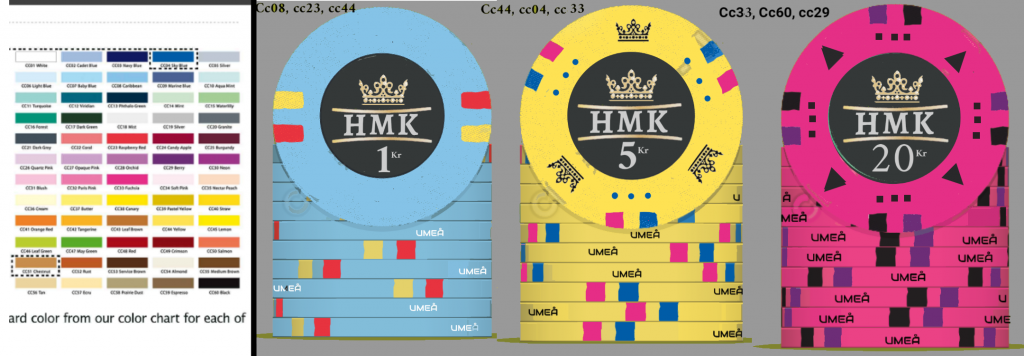
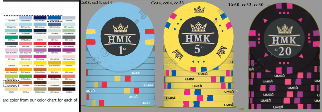
First of all, i can't decide what color i want on my 20 kr chip. Right now i think i'm leaning towards the pink chip...

Second. Umeå is the name of my city. I think it will look bad ass with that written on the side. It's a ceramic chip, so why not take advantage of that? However, i'm not sure, is there a risk it will only look messy on the actual chips? Is it something one will grow tired of in the long run?
sketch-1568386681421.png


sketch-1568386845794.png
 
Pink chip ftw, it makes the set so much brighter (may even want to brighten up the spots to better match the other two chips).

City name on the rolling edge is a nice touch, but I think I'd go with black text on the lighter blue chip.
 
Last edited:
Oh, and the blue 1kr chip looks a little plain compared to the others having fancy doo-dads. He's gonna think you don't like him.
 
These are ceramics - take advantage of the fact that the chip price doesn't go up when you add more complicated spot patterns!
- The 1 definitely needs more edgespots. Personally I'm a fan of 4TSA18
- The crowns on the yellow face are a little too much for me. Perhaps something else?
- And you could do the black with rainbow edgespots - multiple colours don't cost more!
 
All fair points @BGinGA. thank you. I have had a terrible hard time finding spot colors i like that matches with that pink/fuschia. So any suggestions would be welcome. Also, i don't know how limited color selection is, but for the sake of it i have only played around with the colors they have listed.

The 1kr chip might need some love... I don't want it to look bland, but still want it rather simple.
 
I love both, but I think I prefer the black chip. And definitely ad some spots, marks, crowns, etc to the 1kr chip.
 
  • Like
Reactions: HMK
I think I would prefer if all the chips had the crown, or none of them.
I originally thought the same thing, but after some thought, I think four crowns will look too busy on the pink chip, and just two crowns on the blue chip will look lost with too much 'white space'. The three crown chip looks pretty good to me.

I have had a terrible hard time finding spot colors i like that matches with that pink/fuschia. So any suggestions would be welcome.

The 1kr chip might need some love... I don't want it to look bland, but still want it rather simple.
Yellow, bright blue, white, and charcoal will all stand out nicely on that fuchsia chip. May even want to fill in that (missing) center spot and make the high-denom chip with three-color spots.

Just adding dots (just two, maybe?) and some minor doo-dad art will bring the blue chip in line with the others. Look around at some of the other hybrid designs and pr0n for inspiration.
 
Additionally, I think I would prefer if all the chips had the crown, or none of them.

One thing I like about the yellow chip having the crowns is that it's the only chip that with the current edge spots would get 3 crowns outside the label, and three crowns is a national emblem of Sweden. If the set is making a nod to our king, a "three crowns" chip makes sense. :)

three-crowns.jpg


Sweden! Sweden! Sweden!
 
Tre kronor (3 crowns) is also the name of swedish national hockey team. But, to be honest, this sort of national theme isn't what i'm angling at, more like a coincidence.
sketch-1568398105633.png


Tried out some other colors for the Pink chip. Now, it is beyond my skills as it isn't in the cpc designer, but i am soft for this spot pattern.
sketch-1568392933747.png
 
Oh, and I had a version before with 4 crowns and I also thought it became a bit too much with the crown in the label as well.
sketch-1568313951243.png
 
@HMK if you don't mind me asking, what's the cost per chip from sunfly? Minimum order? Just wanting to explore all options before I settle on who I want to make my custom set.
 
  • Like
Reactions: HMK
I like the top two pink chips quite a bit. Blue chip still needs work.
 
  • Like
Reactions: HMK
Yeah, i like that pink as well. Anyway, the question in the thread title is probobly settled. Pink it is. Now, what about the blue chip like any of these? Does it ruin spot progression? I Kinda like the middle version on it own but feel the fit with the other chips are better with either top or bottom.

sketch-1568499494813.png

sketch-1568499614031.png

sketch-1568500237784.png
 
Looking at patterns -- not colors -- I think the middle blue pattern works better in the 5kr slot, and move the yellow chip pattern down to the 1kr chip (it's a 3-4-6 progression). And find a different doo-dad symbol than a triangle (already used on the 20kr), then address the colors....
 
  • Like
Reactions: HMK
To confirm your wisdom in following @BGinGA's suggestion about dark letters on the rolling edge, I recently received some ceramic samples with writing (numbers) on the rolling edge. The dark numerals on the light background are much easier to read than the light numerals on a dark background. I think I read on a thread here (PCF) that the process of printing on the chips results in the dark ink crowding the light areas. So dark lines come out wider and light lines come out narrower.

If I have custom ceramics made with writing on the rolling edge, it will be dark characters on a light background even if I have to put the writing on the spots rather than the chip.
 
  • Like
Reactions: HMK
The dark numerals on the light background are much easier to read than the light numerals on a dark background. I think I read on a thread here (PCF) that the process of printing on the chips results in the dark ink crowding the light areas. So dark lines come out wider and light lines come out narrower.

I think this advice needs to be taken to heart for *anybody* who wants to put light graphics/text on a dark background, most often seen in mock-ups with black inlay backgrounds. Be very careful when organizing art and text in this situation - your thin lines may end up getting swamped over by the surrounding colour and end up virtually disappearing. Light colours should go a bit thicker over dark background, and dark colours should go a bit thinner over a light background. Sometimes, high detail is *not* your friend.
 
  • Like
Reactions: HMK
So, i didn't really like having the one as a fiver after trying, so instead i have added another spot to the crown version. I thought it might get a bit busy, but i belive this works. Here is a few version. The first one actually hasn't hot black spots if you look carefully, but a dark Green. I don't know if i would dare to order something like that tho as the colors on my screen might be very diffrent from what it looks like for real...

sketch-1568738600494.png
 
Top row blue and pink chips with middle row yellow chip.
 
  • Like
Reactions: HMK
Bottom row blue, top/bottom row pink (they're the same, right?), and middle row yellow but with black crowns like in the bottom row.

Also, I liked "UMEÅ" but I get that it's getting a bit crowded with these new spots.
 
  • Like
Reactions: HMK
Have you thought about having three sets of spots for all the denominations and make the complexity of the spot set progressive?
 
  • Like
Reactions: HMK
I think that is where this started out with a 2,3,4 spot pattern, unless i missunderstand.
 
I think that is where this started out with a 2,3,4 spot pattern, unless i missunderstand.
You are correct that the design started with a 2, 3, 4 progression of spot sets. I was asking about the same number of sets on each denomination and just having the complexity of the sets progress. For example 1 spot in the set for the 1 chip, 2 adjacent spots in the set (your current 1 chip has 3 adjacent spots) for the 5 chip, and 2 separated spots in the set (your 5 and 20 both feature this kind of set) for the 20 chip.

Sometimes adding stuff is not the best option. From my prospective, it looked with several of the recent changes to your design were cascading in more stuff being added to compensate for the effect of a previous addition, and I just though you might prefer something simpler than where the design seemed headed.
 
  • Like
Reactions: HMK
Yeah... You might be correct. You know, to be honest, i feel like my brain is on the verge of a meltdown thinking so much about this, haha. I guess i could be a good idea to revisit the early concept, atleast to make sure I like where this is heading. Thanks.
 
Yeah... You might be correct. You know, to be honest, i feel like my brain is on the verge of a meltdown thinking so much about this, haha. I guess i could be a good idea to revisit the early concept, atleast to make sure I like where this is heading. Thanks.
It's at times like this when it's good to park the design for a week or two and come back to it later. Either forget about it or work one something completely different.
 

Create an account or login to comment

You must be a member in order to leave a comment

Create account

Create an account and join our community. It's easy!

Log in

Already have an account? Log in here.

Back
Top Bottom