New to CPC game.. advice needed (1 Viewer)

Organista1

Flush
Supporter
Joined
Jul 16, 2019
Messages
1,732
Reaction score
2,649
Location
Los Angeles, CA
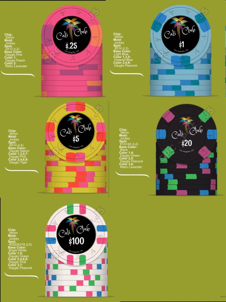
I didn’t realize how addicting it was to create chips but now I have the urge to make a set. I’ve already started putting colors together and have a sample set on the way. This is what I got so far and it’s no where near the final but would like to get your thoughts and ideas on these especially those with experience in ordering from CPC

I want it to be as simple as possible and I know this logo belongs to commerce casino and unsure if I can use it but thinking of doing something similar.

Let me know what you think, please excuse size and font or text not being uniform. I did this from my phone

Thanks

Erik
1641684299820.jpeg
 
You are definitely headed in the right direction, player! Ordering that sample was critical !

I'm sure folks better than me will come along with good feedback on the inlay design and clay color choices.

I'll start off by saying that I'm not sure your frac colors are contrasting enough. Those spots kinda blend into the base color a bit.

Keep at it. You won't regret it ...
 
I dig what’s going on so far! Initially, my only concern would be a dirty stack issue between your quarter and $5. Maybe replace the pink spot on the quarter with blurple? They’re going to be great!
 
I dig what’s going on so far! Initially, my only concern would be a dirty stack issue between your quarter and $5. Maybe replace the pink spot on the quarter with blurple? They’re going to be great!
Thanks for the feedback I’ll try that out
 
I wouldn't use both DG Peacock and DG Green as spots on back to back chips in the set. I think the spot progression and base colors are just fine, but there's work to do on the edge spot colors.

The quarter looks nice. But I'd try maroon instead of lavender here and use the lavender elsewhere.

There's just a bit too much blue in the $1. Get your color sample in before you decide, but I'm not sure that a light blue base and DG Peacock mix well here. Calm down a bit with the DG Peacock lol. Arc yellow would look really nice here instead of the DG Peacock with the Imperial Blue spot.

The DG Pink and DG Tiger spots on the $5 may bleed into each other. I'd try purple or blurple here instead of the DG Tiger to go with the pink.

I'd try DG Tiger, DG Green, and red on the $20, but three different spot colors on a 614 edge spot are incredibly hard to pull off and look good.

I think the $100 looks fine actually, but I wouldn't try to repeat edge spot colors used on the $20. Try a different blue, pink, and green here maybe?

Nice start! Take your time with the process and only order when you're 100% happy with what you have!
 
My two cents - definitely take it or leave it as youll get tons of opinions telling you to go 19 different directions on these threads.

Dayglo Saturn looks very different in person. My guess is you'll want to change it up once you see the samples. CPC doesn't have a strong yellow color unfortunately.

Would consider even going spotless for the frac.

Maybe take a look at the hundred- the pink repeat on all 4 sides is a little repetitive.

Denom font is a little playful - would look for something more blocky and easy to read.

Like what you've got going on the other chips. Clean and not too busy.
 
Last edited:
Calm down a bit with the DG Peacock lol.
lmao, great advice. I was overthinking it trying to have similar colors in the lineup but ultimately you are correct with having more variety and unique to each chip. Definitely can’t wait for the samples as I need to see how these colors really look. Thanks
 
My two cents - definitely take it or leave it as youll get yons of opinions telling you to go 19 different directions on these theeads.

Dayglo Saturn looks very different in person. Mt guess is you'll want to change it up once you see the samples. CPC doesn't have a strong yellow color unfortunately.

Would consider even going spotless for the frac.

Maybe take a look at the hundred- the pink repeat on all 4 sides is a little repetitive.

Denom font is a little playful - would look for something more blocky and easy to read.

Like what you've got going on the other chips. Clean and not too busy.
Thank you for feedback, I got some things to work on now. :tup:
 
I think you need more diversity in your spot colours.

I generally don't recommend a black base colour with a black background label. A purple $25 may do better here than a black $20.
Thank you Berny, once I get samples I will adjust Im sure, appreciate feedback
 

Create an account or login to comment

You must be a member in order to leave a comment

Create account

Create an account and join our community. It's easy!

Log in

Already have an account? Log in here.

Back
Top Bottom