So for many many years I wanted to create a viking theme set. To be honest this is a hard set to design to both have it cool and classic. I have made several design attempts before and never been happy with it until now I think I'm getting close. This set is quite expensive but when creating a set that will be my main set for years I decided to make it as cool as possible. I also accept that it will take some time to finish the set as I will probably order in parts to spread the cost. This is a cash set in Krónur 100kr = 1$
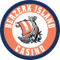
So the 500 chip is ready and a small batch is ordered for my meetup this year. So that design is final both chip and inlay. Other are work in progress and inlay colors to be decided.
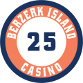
The fruit of my enemies. - 25 Krónur
Everything starts small, Insult turns to fight, fight to battle and the battle to war. So every step you make is step you have think about what is in it for me ? The colors on this one wore hard, I mean it is not vikingy to go with a bright green or pink for the lowest denom. On the other hand peach was a popular war spoil for vikings as it was a fruit not to be found at home. So when you sit eating your peach, look at the sky and it starts to get darker as night is coming ( blue and blue ) That is were you make the decision to go to war.

The march into blackout - 100 Krónur
You start running, weapons clashing, horns blowing and screams fill the night. This march can go for days, the adrenaline pulls you into a blackout ( black ) You don´t know and don't really care if the sun is coming up ( yellow ) or if it is coming down ( pink ) There is no turning back and the next thing that happens might be your last.

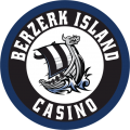
Berzerk and bloddy - 500 Krónur
When we see blood ( Red ) we react differently, vikings go Berzerk. To kill or be killed. The grass is green ( Green ) and death is near ( Black ) You don´t know if you are going to Valhalla ( White ) or if you head back for sea ( Blue )

The swim for greatness - 1000 Krónur
It does not matter if you won or fled. Those who don't die by swords and arrows can still drown ( Dark blue )
You find your self in the water ( Blue ) There are flames around you ( Orange ) You need to get to a ship.

The Knorr of wealth - 10.000 krónur
This is bank chip. Nothing said more wealth than having your own ship and the Knorr was the biggest of them ( Brown )
You don't own a ship without gold ( Yellow ) and you don't keep a ship without seeing some death ( black ). When you own your own fleet you are rich, you have clothes that are dyed with purple to make you royal ( Purple ) and your wine makes you happy ( Pink )

All together -

So the 500 chip is ready and a small batch is ordered for my meetup this year. So that design is final both chip and inlay. Other are work in progress and inlay colors to be decided.
The fruit of my enemies. - 25 Krónur
Everything starts small, Insult turns to fight, fight to battle and the battle to war. So every step you make is step you have think about what is in it for me ? The colors on this one wore hard, I mean it is not vikingy to go with a bright green or pink for the lowest denom. On the other hand peach was a popular war spoil for vikings as it was a fruit not to be found at home. So when you sit eating your peach, look at the sky and it starts to get darker as night is coming ( blue and blue ) That is were you make the decision to go to war.
The march into blackout - 100 Krónur
You start running, weapons clashing, horns blowing and screams fill the night. This march can go for days, the adrenaline pulls you into a blackout ( black ) You don´t know and don't really care if the sun is coming up ( yellow ) or if it is coming down ( pink ) There is no turning back and the next thing that happens might be your last.
Berzerk and bloddy - 500 Krónur
When we see blood ( Red ) we react differently, vikings go Berzerk. To kill or be killed. The grass is green ( Green ) and death is near ( Black ) You don´t know if you are going to Valhalla ( White ) or if you head back for sea ( Blue )
The swim for greatness - 1000 Krónur
It does not matter if you won or fled. Those who don't die by swords and arrows can still drown ( Dark blue )
You find your self in the water ( Blue ) There are flames around you ( Orange ) You need to get to a ship.
The Knorr of wealth - 10.000 krónur
This is bank chip. Nothing said more wealth than having your own ship and the Knorr was the biggest of them ( Brown )
You don't own a ship without gold ( Yellow ) and you don't keep a ship without seeing some death ( black ). When you own your own fleet you are rich, you have clothes that are dyed with purple to make you royal ( Purple ) and your wine makes you happy ( Pink )
All together -


")