My Tournament Set is Complete-Looking for Feedback (1 Viewer)

ne14poker

Sitting Out
Joined
Jan 21, 2023
Messages
28
Reaction score
37
Location
Harrisburg Pennsylvania
Hello Everyone,

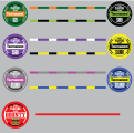
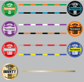
Just Finalized my design for my tournament set. By no means am I a graphic designer. I am a self taught Adobe Illustrator guy who loves poker.

Heres a little background. Twenty Years ago I had an underground game in upstate New York. I got married, moved to PA and sold my game. I was eBay one day and saw my original chips I designed up for sale as some individual pieces made thier way to Texas of all places. I decided to make a cash set and tournament set in honor of the club I once had. I have sent the artwork to my manufacturer and the samples came out great. They will go into production once I give approval, but wanted the groups opinion and suggestions for any changes. I will post the cash game set soon.

TIA
 

Attachments

  • The Players Club Tournament_MOCK UPS.png
    The Players Club Tournament_MOCK UPS.png
    186.3 KB · Views: 350
Agree on losing the dollar sign.

Do you need the word "The" in front of "Players Club"? Losing it would give you more space to make the font larger.

Really like the chips, and cool story about your original chips ending up in Texas.
 
Thirded on losing dollar sign. Different font for denoms, I like wider zeros but to each their own. Maybe lose "The" and wrap Players against the top of the circle? Just spitballing, good use of that space without loss of size. Cool chips, homie.
 
Last edited:
Is there another color you could use as the spot on the 100? I'd lighten up the 25 by using the green from the 100 instead of the darker green, then finding a different spot color for the 100.

Agree an all above suggestions -- especially swapping the red and gray.
 
Is there another color you could use as the spot on the 100? I'd lighten up the 25 by using the green from the 100 instead of the darker green, then finding a different spot color for the 100.

Agree an all above suggestions -- especially swapping the red and gray.
Spot color suggestion for the Black 100 chip?
 
I dont play tournaments, so more of a discussion point...

Does it make more sense to have 25,000 chip instead of 10,000?

Congrats on a nice looking set!
 
Agree lose the $

I like the set except the 10k. To me it looks too much like the 1k on the edge. I'd consider making it a 20k or 25k and maybe going a different color. Maybe orange, or red and doing perhaps a white or blue bounty
 
Spot color suggestion for the Black 100 chip?
One vote electric blue for the accent color on the hundo.

And then I’d swap the colors on the 5k so it’s a pink chip with gray accents rather than a gray chip with pink accents. And also go a little pinker and less purpleish on the shade so it doesn’t compete with the 500.
 
One vote electric blue for the accent color on the hundo.

And then I’d swap the colors on the 5k so it’s a pink chip with gray accents rather than a gray chip with pink accents. And also go a little pinker and less purpleish on the shade so it doesn’t compete with the 500.
Actually the pink is a hot pink and bright but when I export it for the mock ups it looks purple.
 
I was going to say blue spots on the 100, as well. Great looking set!
 
Definitely agree with losing the dollar sight.

As for the 10k chip, it can make sense for a T25 tournament. Because you really should never need a 25k chip in a T25 tournament unless it’s to color up, and then only if you have lots of tables and deep stacks. A 10k chip can be useful for deep starting stacks, and then you don’t have to worry about having many 5ks in the starting stack.
Great points for me to ponder. Tge most people I would get is 50 right now so maybe a 10000 chip would be more benefit than a 25000 chip
 
Great points for me to ponder. Tge most people I would get is 50 right now so maybe a 10000 chip would be more benefit than a 25000 chip
I’m not a multi-table authority; I’ve played a shitload (many of which were T25, 30k stacks using a 10k chip) but I’ve hosted zero. 50 is exactly where I’d say a 25k chip becomes useful in a t25 MTT, but most people here would probably take the under on that one.
 
First of all, thank you so much for the feedback. As the artist, you tend to think the artwork is as good as it will get, untill someone comes along with an outside perspective to make the artwotk GREAT!. I have taken almost all of your suggestion and made the necessary revisions and I think the set is a million times better because of it. Attached is an updated file for your viewing pleasure and thanks once again!
 

Attachments

  • The Players Club Tournament_MOCK UPS.png
    The Players Club Tournament_MOCK UPS.png
    192.4 KB · Views: 103
First of all, thank you so much for the feedback. As the artist, you tend to think the artwork is as good as it will get, untill someone comes along with an outside perspective to make the artwotk GREAT!. I have taken almost all of your suggestion and made the necessary revisions and I think the set is a million times better because of it. Attached is an updated file for your viewing pleasure and thanks once again!
Much better, imo.

I'd still make both the 25 and 500 chips a slightly lighter hue, to avoid any possible confusion with the 100 (it's a very common problem, and easily rectified before production).

I also liked your previous gray 5000 chip better -- I think the orange 1000 and (now) red 5000 clash, being members of the same color family. Making it gray with red (vs pink) would make it fit into the set much better. Alternately, a yellow 1000 would go better with the red 5000 (while changing the 10,000 accents to orange).

Lastly, typical numbering protocol is to use a comma only on denominations with 5 or more digits -- I'd remove it on the 1000 and 5000 chips for a cleaner look.

Kudos on the gold Bounty chip, it looks great!
Thank you. I will consider all suggestions and the bounty chip came out great!
 
I did some more revisions because I am in design addiction mode. I think all the color combinations are good to the point to eliminate dirty stacks. Attached is the file, hopefully 3rd time is a charm!
 

Attachments

  • The Players Club Tournament_MOCK UPS.png
    The Players Club Tournament_MOCK UPS.png
    192 KB · Views: 88
I think the design is really nice now. But, why do you wat a 10,000 chip? I'll go for a 25,000 chip instead.

Congrats!
 
I think the design is really nice now. But, why do you wat a 10,000 chip? I'll go for a 25,000 chip instead.

Congrats!
Lets ask the tread. The max i will host is 50 people. Once in a while this will be a 30,000 chip deepstack. Honestly, I have never done one of these before so I dont know the structure I will be using. Is the 25,000 chip more beneficial than the 10,000? Please vote and TIA.
 

Create an account or login to comment

You must be a member in order to leave a comment

Create account

Create an account and join our community. It's easy!

Log in

Already have an account? Log in here.

Back
Top Bottom