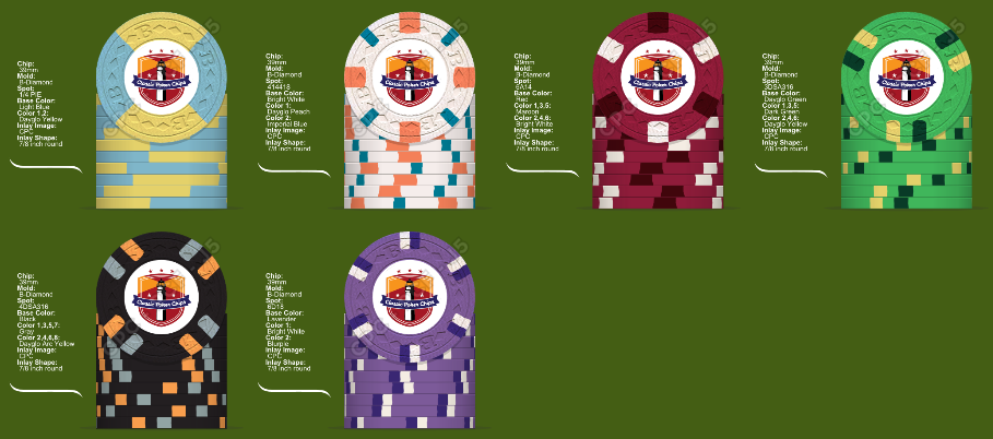
My preliminary mock-up (1 Viewer)

One last attempt before bed.

BillMock1.png
 
Bill1s.png
Ok before I was set on my $1 chip, and I am still set on my spot pattern, I'm wondering about the colors. I came up with a few slight variations and was wondering what you all thought:
 
Really really sweet looking mock-ups Bill. Totally love the quarters and $1s. Fwiw I think the dayglo peach spot is perfect on the single. Couple thoughts/ideas - I played with alternating retro red and retro blue spots on the $25 chip and thought it gave it some pop. Have you thought about black spots on the red chip instead of maroon? I think black on red is sharp. We can talk more tonight while you rob me blind. Enjoying how this is progressing, and seeing everyone's ideas.
 
Also, if you go with the orange/arc yellow/peach on the white chip I would use charcoal (edit: or gray...whatever you have mocked up) and DG pink spots on the black hundo you currently have mocked up.
 
Last edited:
I like the layout in POST 16, I wouldnt change much from that. Great Job, I have been working on a dream set for myself also, when you get a chip that you really like the lay out dont change it then work on the next. I find that getting the denoms that will be on the felt mostly is the ones you want to look the best (your favorite) then work on the others.

Again great job, post #16 looks awesome.
 
billmock7.png


One more attempt before I head out to play poker (before I have to head back in to work again tonight ugh). The butterscotch is growing on me in the $1 chip. I like the dark green/dayglo yellow edge spots on the green chip by itself, but the pink/dayglo yellow combo I think brightens up the whole set and maybe pulls it together a little bit? I thought about making the dayglo pink the spot on the $100 and the dayglo arc yellow (which I have to have somewhere in this set) on the green, but it didn't look as nice to me. plus, the arc yellow/grey on the black kind of look like Orioles colors (go O's)!!!


I like the layout in POST 16, I wouldnt change much from that. Great Job, I have been working on a dream set for myself also, when you get a chip that you really like the lay out dont change it then work on the next. I find that getting the denoms that will be on the felt mostly is the ones you want to look the best (your favorite) then work on the others.

Again great job, post #16 looks awesome.

Did you mean post #61? I went back to post 16 and I didn't see a mock-up in that post. Dave made one up in post 13.
 
Last edited:
Chippy, I'd stick with post #75 until you get those color samples in-hand. Then minor tweaks (if you even deem them necessary) based on what you can actually see..... but I really think you'll likely end up using those for the final spots/colors. Latest $25 chip is a winner.

Couple of minor things I'd change, but it's not my set -- and I think that #75 lineup looks great.
 
View attachment 13349

One more attempt before I head out to play poker (before I have to head back in to work again tonight ugh). The butterscotch is growing on me in the $1 chip. I like the dark green/dayglo yellow edge spots on the green chip by itself, but the pink/dayglo yellow combo I think brightens up the whole set and maybe pulls it together a little bit? I thought about making the dayglo pink the spot on the $100 and the dayglo arc yellow (which I have to have somewhere in this set) on the green, but it didn't look as nice to me. plus, the arc yellow/grey on the black kind of look like Orioles colors (go O's)!!!

I like this round a lot, except the bright white spot on the red 5. For some reason, that bright white spot on the 5 bugs me. A lot of bright white in the set. What about toning it down to regular white?
 
View attachment 13349

One more attempt before I head out to play poker (before I have to head back in to work again tonight ugh). The butterscotch is growing on me in the $1 chip. I like the dark green/dayglo yellow edge spots on the green chip by itself, but the pink/dayglo yellow combo I think brightens up the whole set and maybe pulls it together a little bit? I thought about making the dayglo pink the spot on the $100 and the dayglo arc yellow (which I have to have somewhere in this set) on the green, but it didn't look as nice to me. plus, the arc yellow/grey on the black kind of look like Orioles colors (go O's)!!!


Did you mean post #61? I went back to post 16 and I didn't see a mock-up in that post. Dave made one up in post 13.

This iteration is pretty damn fantastic, me thinks. The *only* thing I would change is the grey spot on the hundo, although what I would change it to I haven't a clue. Normally I'd say lavender, but that's the base color of your next chip and you've largely bucked progression for this set (save for the general color scheme from the quarters to the 1's). After that, retro lavender/pink...but you just used a pink spot on that gorgeous $25!

Very interested to see what the final set looks like after you get the color samples, and in acquiring a sample set, of course!
 
How about this? Takes away the gray from the hundo, moves the pink over, but keeps the overall set pretty bright I think. I just got the color sample from Dennis, so I'm going to try and envision what the colors will look like together.

Rob, I tried the regular white on the $5, and it just doesn't look as good (to me anyway). Actually tried the $1 chip as white instead of bright white, and it looks pretty sweet with the butterscotch/imperial blue, so maybe I go with that.


Ok. One more try. No repeats of colors other than bright white on the $1 and $500. All the dayglo colors except dayglo Orange, which I could put in the butterscotch spot, but eff that.
image.jpg


image.jpg


Ok off to look at the color samples :)
 
How about this? Takes away the gray from the hundo, moves the pink over, but keeps the overall set pretty bright I think. I just got the color sample from Dennis, so I'm going to try and envision what the colors will look like together.


Ok off to look at the color samples :)

Of the two, the top one for certain!
 
I'm going to weigh in soon. I'm not sold on the quarter pie, as all of the other chips have smaller spots. It, to me, stands out too much. You know it's tough for me to log on too take a look, but I'll try tonight to give a more robust answer.

Mark
 
Dissenting opinion here. Can't get past either copy-cat hundo (PCA secondary, Empress primary) to even evaluate the rest of the chips (although pink certainly helps the $5's bright white problem, and the non-blue quarter helps the 'too-blue' issue). Green chip is now ho-hum, as are both hundos. Always a bigger fan of mandarin red as a base color vs red, however.

Overall, a huge step backwards imo.
 
Just checked out those chips. I could see how you would think they were copycat but I assure you my brilliant mind came up with them all by myself lol. Anyway those are 818s not 618s and the Empress appears to be light blue and chocolate not dayglo arc yellow. I really don't know enough about casino chips to know what's worth copying.
 

Create an account or login to comment

You must be a member in order to leave a comment

Create account

Create an account and join our community. It's easy!

Log in

Already have an account? Log in here.

Back
Top Bottom