My first try.. (1 Viewer)

1A25R

Flush
Joined
Nov 30, 2018
Messages
1,789
Reaction score
2,307
Location
Montreux - Switzerland
This is my first serious try to have a real custom chip. And I have to admit.. i'm missing some key points.
To sum up I'm not sure what a "good poker chips" is, i'm not talking about the material and construction technique but regarding the intrinsic characteristics.

I know that chips represents a casino currency, therefore they must be easily differentiated and must avoid "dirt stacks" (obtained also by a clear differentiation of colors between chips denominations). But what about spots? it'a a low level security feature or it play in the role of chip differentiation? Chips could/should/or must have different spots patterns?

I would like to have a 4 chips set (with maybe a 5th as extension) It will be a cash set, even is that is not relevant now.
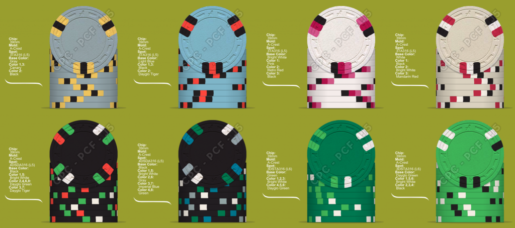
I started from "something that i like" but I noticed the I was using the same spot pattern. As the green did not match the set, I decided to replace it by a red or blue chip.. and finally I opted by chocolate and I tried to vary the spots.

May I ask for your feedback? What other things I must consider regarding the intrinsic characteristics?

Starting Point.
271653


Option 01
271654


Option 02
271655
 
The general guideline is that you should be able to tell the denoms apart in pots and stacks. Use your colours and spot patterns to do so. Everything else is up to your esthetic concerns. Don't limit yourself to narrow choices unless it will affect play.
 
Step 1: Play with the software a bunch, and come up with the perfect set!
Step 2: Ignore perfect set #1 for a few months, and play with the software a bunch more, and come up with perfect sets #2-11!
Step 3: Go back to perfect set #1, and try to figure what the heck you were thinking.
:D

But seriously, just do a ton of mockups, look at others's sets, get inspired, and have a bunch of fun with it.
 
Last edited:
There are some general rules of what color each denom should be. You can ignore these or use them as a guide.
Typically for standard sets it goes something like:
Fracs: pink/orange
$1 - Blue/White
$5 Red
$25 Green
$100 Black
$500 Purple
$1,000 Yellow

or you can be sexy and use Cali colors:

Fracs: red/pink?
$1 - Blue
$5 Yellow
$20 Black
$100 White

Also spot progression typically just means more complex spots on higher denom chips. $100 should have more complex spots/colors than your frac. Fracs are often just a solid color which still fits into the spot progression "philosophy". You can break all these rules but they represent the prevailing norms.

EDIT: Just my 2c but you should adjust your set so there is a spot progression. Right now to my eye it just looks like random spots used on each chip. Again just my opinion :)
 
I think you should plan your denominations and base colors first, and then decide on your edge spots.
 
One thing to worry: Dirty Stacks issue. Often occurs when you use a chip body colour and you also use that colour for the neighbouring denomination's spots..
 
The last 2 of the top row are to be eventually replaced by the last 2 of the bottom row so I don't see a risk making dirty stacks
 
I highly recommend sticking with standard casino denominations and colors...especially for a first set. If it was me I would google chips from casinos in Vegas and Atlantic City and find chips you like. Also notice trends you see in profession chip designs. I personally don’t like CA colors and $20 chips. In Vegas you often see blue $1s but blue used to also be associated with $10 chips ...which I also don’t like. Three of my friends also bought customs when I did and they all bought $10 chips. I did not. They hated them immediately as they are more frustrating than helpful in actual play.

To determine quantities of colors you need to decide what dries you will be playing.
 
allforcharity tip about shades and bright contrasting colors regarding a ceramic set
I put this here as a reminder for late use

Each chip is basically two shades of the same colour family. Nothing wrong with this if you want a "solid" feel to them. However, you do have a 6-colour pallet where most of the colours are "neutral", i.e. in the grey/black and brown spectra.

Some major colours that you haven't used include: White, Yellow, Orange, Purple, Green, and Red. What if you exchanged the "lighter" shade of your chips with a bright contrasting colour to give some more pop when it's on the felt?
 
Some comments and suggestions:
  1. If you don't already have one, get a color sample set! The colors often look different in person than on the screen
  2. Make sure you 100% love your workhorse chips (usually either the $1 and/or $5). You can design a really kick ass $100 chip that's the crown jewel of the set, but if you're only going to be using those at the end of the night for rebuys and there's only a handful on the table, it's kind of wasted. Focus on your workhorse chips first, then build around those.
  3. IMHO while each chip is nice, you've got kind of an odd spot pattern / progression going from the 1/2 pie to the A14 spot to the two D14 spot patterns. So some are very similar, others out in left field.
  4. Referring back to #1, I'd recommend swapping in DG yellow for yellow in the $25. I have these 3 in my custom t25 and they go really well together.
  5. All the chips aside from the frac are colorful with some contrast, the white/grey of the frac feels flat to me. Plus you now have 2 kind of white chips back to back. I think even going with grey & charcoal vs the white will make a big difference.
The inlay you have looks to be a placeholder, will it look kind of like that or completely different?

All just my 2¢ worth. Enjoy the endless hours of playing on the chip designer :)
 

Create an account or login to comment

You must be a member in order to leave a comment

Create account

Create an account and join our community. It's easy!

Log in

Already have an account? Log in here.

Back
Top Bottom