My First Poker Chip Labeling Project (1 Viewer)

jonte_myr

Sitting Out
Joined
Jan 16, 2020
Messages
11
Reaction score
42
Location
Germany
Hello everybody. I'm new here and I am slowly discovering the world of poker chips. Now it is time for the first individual set.

I would appreciate your feedback as I have never done anything like this before.

I chose "The Bank" from Apache Poker Chips. Now I want to relabel it. The aim is a micro cash set for a private game of poker.

I mixed my two passions for the topic: Poker & Wine. After a brainstorming session, I finally got the title: Sour Grapes - Pokerroom & Wine Cellar. (Because I want to do some poker games in my small private Wine Cellar).

I stole the title from a documentary film of the same name, look here: https://www.imdb.com/title/tt5728684/

Sour Grapes – the title fits well because a poker hand can be sour like a bad wine. ;) :wtf:

I don't have a lot of experience with vector software. I use the free software "Inkscape". With a little practice you can get along with it very well.

And here is the result. What do you think?
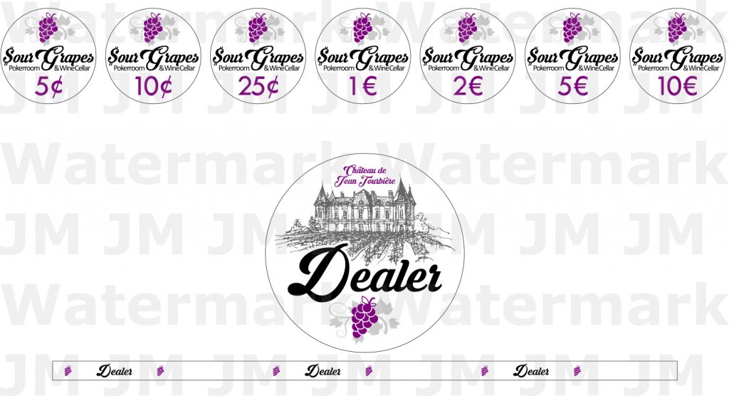
Zum Posten PCF.jpg
 
I will echo @CarlosStorm that it seems everyone likes to get a ton of different denominations for there first real set. They usually arent needed, but if thats what u want go for it. Design is great, only small change i personally would make is to make the denominations in a red instead of purple, but thats just me.
 
Beautiful design, really well done. I would see what adding some color to the background would do and maybe adjust each label slightly to match each denomination.
 
I agree you did a great job on your first design. ITs clean and simple, which are the biggest points people mess up. Only suggestion is to look at many times, then put it away for a week, then look at it again. Still happy or something you want to change? Make it right if needed, then put it away for another week. When you can look at it over time without changing your mind, then your ready.

Now for the question you didnt ask.... do you want advice on chip denominations?
 
First at all thank you all for the feedback. I am speechless. I appreciate very much. I am happy that you like my design.

@HeWhoWouldPun That's a good advice. I will do that. Thank you. :tup:

@Senzrock That's a good idea adjust the label the color of the chips. I will test it and post the results here. :)

@CarlosStorm & @Jasap47 I know, it's more denominations than needed. ;) But sometimes we play blinds .5/.10 €, sometimes .10/.25 € an from time to time also a little bit higher. It depends on the players who take part in the round. So I'm prepared for anything. And honestly: I just wanted a lot of chips. :p

@Silver_Fiend I would be happy with your advice on the denominations. I'm still in the learning phase and look forward to any help. :D

By the way, I have already passed this stage you describe. I slowly approached to the design maybe over a month. Then I let the finished design rest for two weeks. Then I changed a few little things - and it was done. Here you can see the history of the design:
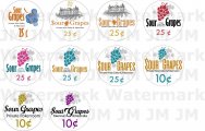
Historie.jpg

Working on a design it's enough to drive you mad! you could always keep working on it. But at some point you have to come to the end. ;) :wtf:
 
...................

@CarlosStorm & @Jasap47 I know, it's more denominations than needed. ;) But sometimes we play blinds .5/.10 €, sometimes .10/.25 € an from time to time also a little bit higher. It depends on the players who take part in the round. So I'm prepared for anything. And honestly: I just wanted a lot of chips. :p

@Silver_Fiend I would be happy with your advice on the denominations. I'm still in the learning phase and look forward to any help. :D

.............

The widely accepted denominations typically advance in multiples of 4 or 5. This makes good sense for a balance of how many chips you need to buy and the easy of play and making change. If you play a 5c/10c game, you CAN use 5/10/25/50/$1/$2 etc but it really ends up making the game slower and you end up with tons of chips on the table. So for 5/10 blinds you would want 5c and then 25c and $1. The quarters and $1 will be the main chips used for betting anyway.

The mostly commonly used chip denoms for you would be 5c, 25c, $1, $5. If you think you may stray up into 50c/$1 games then you would want to add in some $20 (or $25 depending on your style) for the high-value chips.

The good news about a set for a spread of blind options is that you can combine the needs of each level. So you dont need a FULL set for 5/10 and a FULL set for 50/1, etc.

Lots of different opinions on totals needed, but here is the breakdown I created for my games:
Blinds denoms 5c - 25c - $1 - $5 - $25 - $100 - $500

5c/10c 100 200 200 100
10c/25c 100 200 200 100 100
25c/50c 0 100 300 200 100
50c/$1 0 100 300 200 100 100
$1/$2 0 0 200 300 100 100
$2/$5 0 0 100 300 300 100 100

So, you dont need 4400 chips for the spread, you would need 100 5c, 200 25c, 300 $1, 300 $5, 300 $25, 100 $100, and 100 $500, for a grand total of 1400 chips. If you only play 50c/$1 then you only need 1000 chips for 4 different levels of play.
 
I think these are great looking labels. Nice job! Have you thought of maybe matching the color of the grapes and/or the denomination text to the chip colors?
 
Really cool labels.

I agree with denomination recommendations mentioned above. Stick with .5/.25/1/5/25.
 
Advice that has worked at my household - print a few labels to size, cut them out, and review. In particular, can you read it when it is in your chip stack (denom and text)? What about when it is in the pot? Black often bleeds, so small fonts can be blurry.
 
Really jealous that I didn't think of the name first.

Nice designs, but stick with the bigger fonts for the denominations, like the original version.

Agree with others that it's too many denominations, at least for me.

The main thing I would recommend changing is to make "Pokerroom" into two words: "Poker Room"
 
The widely accepted denominations typically advance in multiples of 4 or 5. This makes good sense for a balance of how many chips you need to buy and the easy of play and making change. If you play a 5c/10c game, you CAN use 5/10/25/50/$1/$2 etc but it really ends up making the game slower and you end up with tons of chips on the table. So for 5/10 blinds you would want 5c and then 25c and $1. The quarters and $1 will be the main chips used for betting anyway.

The mostly commonly used chip denoms for you would be 5c, 25c, $1, $5. If you think you may stray up into 50c/$1 games then you would want to add in some $20 (or $25 depending on your style) for the high-value chips.

The good news about a set for a spread of blind options is that you can combine the needs of each level. So you dont need a FULL set for 5/10 and a FULL set for 50/1, etc.

Lots of different opinions on totals needed, but here is the breakdown I created for my games:
Blinds denoms 5c - 25c - $1 - $5 - $25 - $100 - $500

5c/10c 100 200 200 100
10c/25c 100 200 200 100 100
25c/50c 0 100 300 200 100
50c/$1 0 100 300 200 100 100
$1/$2 0 0 200 300 100 100
$2/$5 0 0 100 300 300 100 100

So, you dont need 4400 chips for the spread, you would need 100 5c, 200 25c, 300 $1, 300 $5, 300 $25, 100 $100, and 100 $500, for a grand total of 1400 chips. If you only play 50c/$1 then you only need 1000 chips for 4 different levels of play.
Wow, a great explanation. That helps me a lot. But now I have to order more chips. Goodbye savings ... :LOL: :laugh:

I think these are great looking labels. Nice job! Have you thought of maybe matching the color of the grapes and/or the denomination text to the chip colors?
I tried it. But I don't have the right color codes for the "The Bank" chips so I better leave it. I didn't like it that much.


Advice that has worked at my household - print a few labels to size, cut them out, and review. In particular, can you read it when it is in your chip stack (denom and text)? What about when it is in the pot? Black often bleeds, so small fonts can be blurry.
I've already done this with a laser printer. In doing so, I made the experience that you are describing here. I had to enlarge all of the fonts. Now I am waiting for the first sample from the printing company. I'm excited :love:

Really jealous that I didn't think of the name first.

Nice designs, but stick with the bigger fonts for the denominations, like the original version.

Agree with others that it's too many denominations, at least for me.

The main thing I would recommend changing is to make "Pokerroom" into two words: "Poker Room"
Thank you for your advice. I will change that. :tup:
 
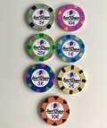
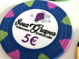
I have received my first sample labels. I put them on my sample chips. I ordered the sample labels before starting this thread. So your suggestions have not yet been considered. Unfortunately, the black fonts are bleeding a bit (see picture). Is that normal or should I choose another manufacturer?

20210415_070045187_iOS.jpg20210415_070140976_iOS.jpg
 
I have received my first sample labels. I put them on my sample chips. I ordered the sample labels before starting this thread. So your suggestions have not yet been considered. Unfortunately, the black fonts are bleeding a bit (see picture). Is that normal or should I choose another manufacturer?

View attachment 678974View attachment 678976
OH ouch, yeah you need a new printer or a different label type.
 
I use @Gear and haven't seen that level of bleed.
Then I will probably order from @Gear as well. I actually wanted to order from a local supplier in Germany. But when the quality is so bad, I order somewhere else.

Those have got to be paper labels, right?
I'm not sure. These are actually laminated labels from a professional and well-known poker chip dealer. That's why I'm a bit disappointed with the quality.
 
Seems like @Gear is pretty much the only game in town when it comes to quality custom labels. Will have to hit him up when I'm ready to relabel my Jack Cincy's
 

Create an account or login to comment

You must be a member in order to leave a comment

Create account

Create an account and join our community. It's easy!

Log in

Already have an account? Log in here.

Back
Top Bottom