My chip design - Rain Seattle (1 Viewer)

lane_robert_s

Flush
Supporter
Joined
Aug 31, 2021
Messages
1,227
Reaction score
754
Location
Seattle, WA
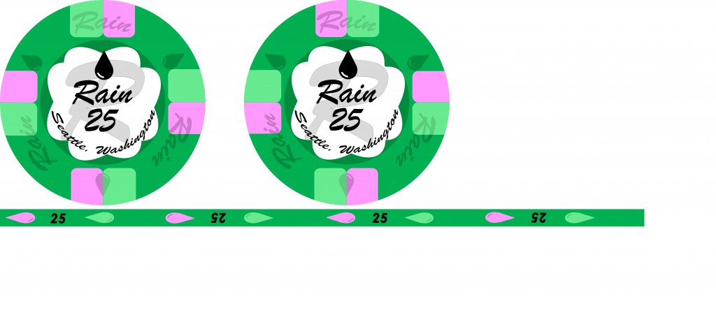
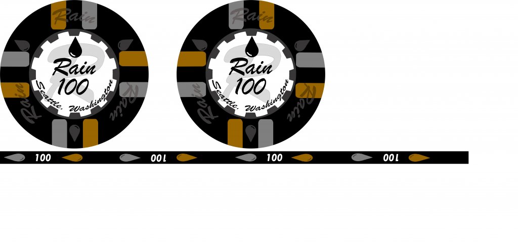
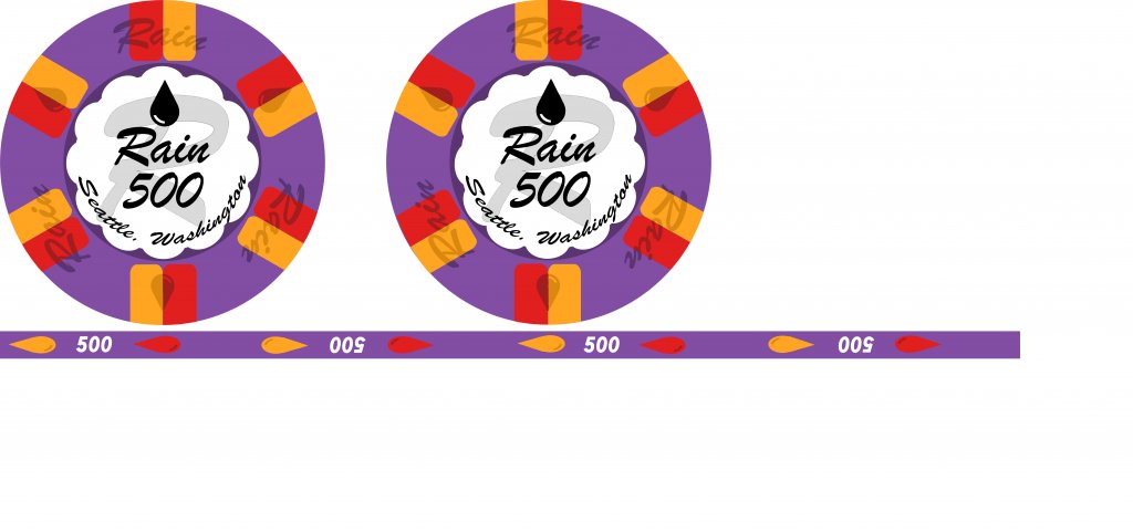
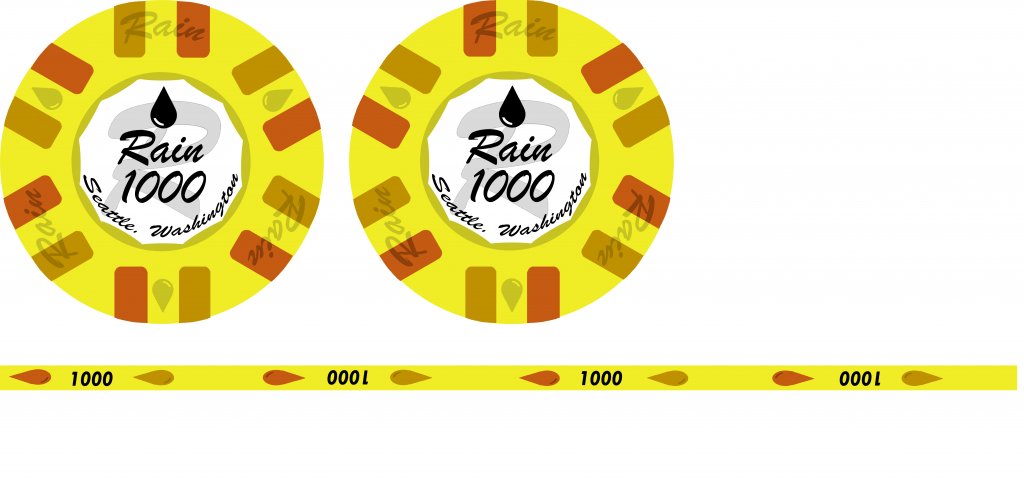
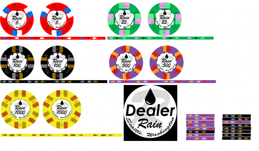
I mocked these up on Photoshop over the weekend.

I did them in the style of clay chips, but I am going to buy them as ceramic, since custom ceramic is like 1/5 of the cost of custom clay.

I went with a different pattern on the rim so I wouldn’t have to pay the extra amount for aligned edge spots.

The 5, 25, 100, and 500 are 39mm. The 1000 is 43mm and the dealer button is 60mm.

I was worried about the purple being too dark and that would cause dirty stacks with the 100s, but I think this will be ok, as long as the black doesn’t show up as dark gray when they are printed.

These are very close to “print ready” but I want them to be as close to perfect as possible if I am going to spend so much money on them.

What do you think? Advice and critique welcome.
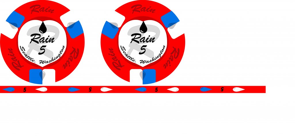

Rain Poker Chip 5.jpg
Rain Poker Chip 25.jpg
Rain Poker Chip 100.jpg
Rain Poker Chip 500.jpg
Rain Poker Chip 1000.jpg
Rain Poker Chip Dealer.jpg
Rain Chip.png
 
Instead of the big "R" in the background, might have been neat to have one of those big volume umbrellas, with the curved handle.

But I really like the spot patterns and color choices you made. I think the 100 is going to look neat, and I don't remember seeing anything quite like that. I love the 500. But my favorite is the 25. Cool rolling edges. Nicely done!
Love an umbrella theme - nice suggestion!
 
Instead of the big "R" in the background, might have been neat to have one of those big volume umbrellas, with the curved handle.

But I really like the spot patterns and color choices you made. I think the 100 is going to look neat, and I don't remember seeing anything quite like that. I love the 500. But my favorite is the 25. Cool rolling edges. Nicely done!
Thanks! I will try a version with an umbrella.
 
I guess to be picky, the "Seattle, Washington" at the bottom is a little tough to read. I don't know if it's the font, or the fact that it's crammed against the bottom of the "inlay" space, or something else. But it looks off to me.
 
I guess to be picky, the "Seattle, Washington" at the bottom is a little tough to read. I don't know if it's the font, or the fact that it's crammed against the bottom of the "inlay" space, or something else. But it looks off to me.
I am a little worried about that. If I go to BR Pro Poker I will get prototypes and make sure everything is readable before getting the final set printed. That being said.... the picture above with all the chips was a cut and past onto Paint. The resolution when I pasted the picture came out much lower than the resolution of the original in photoshop.
 
Looks good to me. And I appreciate that allforcharity mentioned the rolling edge not having to line up too!! Helpful for the rest of us to keep in mind.
I like the chip progression as well!

As far as the text curved along the bottom. It's REALLY hard (or just not worth it) to make an italic font look good along a curved edge.
 
My suggestion: Get really "Seattle" with the design. Something like the photos below. Or the Space Needle on a rainy day.

Also, the "inlay" must be in grayscale. No exceptions.

1630437117646.png


1630437124459.png


Edit: I do like your color choices.
 
I was looking at the italic script wondering if you were trying to get the effect of reading through the refraction caused by a drop of water... so the inlay has a water drop effect... If you were not going for that, throwing it out there as an idea?

2317CFF3-21CA-4D23-A4293E3D2C81AB77.jpg
 
My suggestion: Get really "Seattle" with the design. Something like the photos below. Or the Space Needle on a rainy day.

Also, the "inlay" must be in grayscale. No exceptions.


Reasonable comments.

I was going for the clean look of the Atlantic Club chip and that is why I didn't go gray scale or with some sort of photo.

I was looking at the italic script wondering if you were trying to get the effect of reading through the refraction caused by a drop of water... so the inlay has a water drop effect... If you were not going for that, throwing it out there as an idea?

View attachment 767495
Lol. No. That was not my goal, but it is a neat idea.

But I am going to change the font tonight and see how it looks. I do want it readable.
 
I like them. The thing that popped out to me is that perhaps the denomination font should be different than the font used for "Rain." Less of a script font.. more blocky with serifs. Perhaps red too.
 
I like them. The thing that popped out to me is that perhaps the denomination font should be different than the font used for "Rain." Less of a script font.. more blocky with serifs. Perhaps red too.
I ended up changing the font on the rolling edge to something blocky. I'll try that blocky font on the inlay too.
 
I guess to be picky, the "Seattle, Washington" at the bottom is a little tough to read. I don't know if it's the font, or the fact that it's crammed against the bottom of the "inlay" space, or something else. But it looks off to me.
I changed the font on the Seattle, Washington. What do you think?

I kept the font on the denomination and I kept the big "R" for the time being. I may play around with those things at a later time.

Rain Poker Chip 25.jpg
Rain Poker Chip 100.jpg
 
I changed the font on the Seattle, Washington. What do you think?

I kept the font on the denomination and I kept the big "R" for the time being. I may play around with those things at a later time.

Rain Poker Chip Dealer.jpg
Oh, and I had some fun with the back side of the dealer button. If I am paying for printing on 2 sides, I might as well get it!
 
I changed the font on the Seattle, Washington. What do you think?

I kept the font on the denomination and I kept the big "R" for the time being. I may play around with those things at a later time.

View attachment 768087View attachment 768088
I don't know what it is about the T100 chip, but I just love it. So much, those colors are so cool together.

The text is better, but it still seems weird to me. Maybe it's just "too much", and would look better as "Seattle, WA"? I don't know.

Anyone else want to chime in? Does it look fine?
 
The font is much better on the Seattle, Washington. But, it’s soooo long that it looks crammed. What about abbreviating the state:

Seattle, WA

Give it a bit cleaner look and not looked crammed.
 
I don't think you need to spell out Washington. Maybe try Seattle, WA or just Seattle. People know where it is, and I think not spelling out the whole state will make the inlay look less busy.
The font is much better on the Seattle, Washington. But, it’s soooo long that it looks crammed. What about abbreviating the state:

Seattle, WA

Give it a bit cleaner look and not looked crammed.

Haha - just a few minutes behind.
 
Thanks for your input everyone! I appreciate it. I don't take the idea of spending $1000+ on custom chips lightly and I want to get them right.
 
I made some edits. I think I am ready to go to BR Pro Poker to dial in the colors and get some prototypes.

5 through 500 in 39mm, 1000 in 43mm, and dealer button in 60mm.


Rain Poker Chip 5 Color.jpg
Rain Poker Chip 25 Color.jpg
Rain Poker Chip 100 Color.jpg
Rain Poker Chip 500 Color.jpg
Rain Poker Chip 1000 Color.jpg
Rain Poker Chip Dealer Color.jpg
 

Create an account or login to comment

You must be a member in order to leave a comment

Create account

Create an account and join our community. It's easy!

Log in

Already have an account? Log in here.

Back
Top Bottom