Monochrome Cash Set - Critique (1 Viewer)

Taadow

Sitting Out
Joined
Nov 12, 2020
Messages
48
Reaction score
50
Location
Washington DC
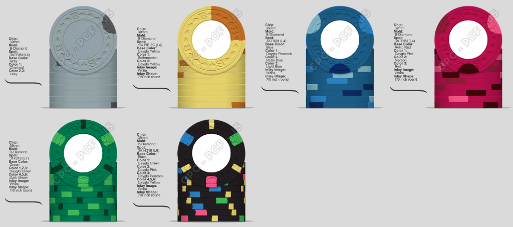
Started putting together a cash set and ended up down a monochrome path then a pop of color on the $100. No color sample in front of me so not sure how these colors will/won’t contrast. Any feedback is appreciated.

.05/.25/1/5/25/100
0248B9CA-EEA1-4247-AA1A-B78AE070CE89.png
 
My initial thoughts:
-I’m not crazy about the single moon spot on the nickel. How about a 1916 or 112?
-maybe a half pie on the quarter, and 1/4 pie on the dollar? Although, I do like both the one and the five.
-614 might look better on the 25

Overall, I love the idea!
 
I do't love the single spot on the gray chip. I don't hate it either. Its kind of "meh". Overall I like it. The light blue spot and the red spot will be tough to see.

I'm a fan of the monochrome colors.


D721A1B9-A996-4FE2-BE27-70BE17C14FC1.png
 
My initial thoughts:
-I’m not crazy about the single moon spot on the nickel. How about a 1916 or 112?
-maybe a half pie on the quarter, and 1/4 pie on the dollar? Although, I do like both the one and the five.
-614 might look better on the 25

Overall, I love the idea!
Thanks for the input, I’m not crazy about either frac so I’ll keep fiddling with them
 
Wow this is so much help!! Back to the (digital) drawing board. I’ve been going back and forth on which shades to use for the yellow .25
Before you place a CPC order, it’s definitely a good idea to get yourself a full color sample set. The design tool is great, but the colors don’t always translate well.
 
Thanks for the feedback above, drafted some variations. Got rid of the tri-moons altogether and definitely liking these versions a lot more. Played with some quarter pies but decided to keep it more uniform throughout. Loving the 1, 5, and 25 but unsure about the fracs and 100...

60ADB50D-765D-4D8C-8820-1BE1FD124109.png
 
I suspect I am the outlier, but I liked the single spot idea for the lowest denomination. Maybe not the single moon spot, but it reminds me of the Samurai Palace .25, which is one of my favorite low denomination edge spots.

45617-34e1935846c444d6645b56b9c7f247e2.jpg
 
I suspect I am the outlier, but I liked the single spot idea for the lowest denomination. Maybe not the single moon spot, but it reminds me of the Samurai Palace .25, which is one of my favorite low denomination edge spots.

View attachment 575900

If the one spot looks like this. Then Fuck yeah.

Started putting together a cash set and ended up down a monochrome path then a pop of color on the $100. No color sample in front of me so not sure how these colors will/won’t contrast. Any feedback is appreciated.

.05/.25/1/5/25/100
View attachment 575537

If it looks like this...........then "meh"
 
^^ i rather liked the bright mid dark progression on the one spot, now it looks like a greytone italian flag
 

Create an account or login to comment

You must be a member in order to leave a comment

Create account

Create an account and join our community. It's easy!

Log in

Already have an account? Log in here.

Back
Top Bottom