You are using an out of date browser. It may not display this or other websites correctly.
You should upgrade or use an alternative browser.
You should upgrade or use an alternative browser.
Midnight Casino mockups (1 Viewer)
- Thread starter SteveHNo96
- Start date
My latest suggestion:
Take the "00:00" and move it to the building graphic. Like maybe on a marquee (or just lettering) that can replace the Spade and the word "CASINO".
Then, your "MIDNIGHT CASINO" text can be made a tad larger to fill out the bottom of the inlay field.
Take the "00:00" and move it to the building graphic. Like maybe on a marquee (or just lettering) that can replace the Spade and the word "CASINO".
Then, your "MIDNIGHT CASINO" text can be made a tad larger to fill out the bottom of the inlay field.
SteveHNo96
Flush
For the T25k, I like having more of a maroon, or some kind of warmer red. In general, given the inlay has a very classy feel, I'd probably go the route of having warmer chip colors in general. The green, (black), purple, and blue seem fine, but the yellow and red are quite harsh for my liking.
Just my 0.02
http://www.sunflycasinoequipment.com/polyinno-chips
I've seen the color template that Sunfly uses and I actually own a sample set by Woody regarding his cardroom which is cool. If he's using the same colors he used for his design, they're less "SHOUT AT THE DEVIL" than the mockups look.
facinfears217
Straight
haha, i didnt even see the moon phases i was to impressed with the logo. nice job!
SteveHNo96
Flush
Woody has been a very busy bee.Some decisions we have to make:
1 --Are we going to have the chip value be on the chip or in the inlay?
2 -- which of these designs has the most pizzazz?
1 and 4 are practically identical, except for the denominations. (either way, I will have Woody change the 00.00 to 00:00 or just take it off and put in on the edge of the chip.
I have to admit the analog clock in the background of design 3 really looks good and if we go with that, we can take off the 00:00 entirely.
Sorry I'm not sure if it is on purpose since so many of them are there but the 00.00 is really unsettling to look at (I have a strong preference for 00:00)View attachment 450019
Woody has been a very busy bee.Some decisions we have to make:
1 --Are we going to have the chip value be on the chip or in the inlay?
2 -- which of these designs has the most pizzazz?
1 and 4 are practically identical, except for the denominations. (either way, I will have Woody change the 00.00 to 00:00 or just take it off and put in on the edge of the chip.
I have to admit the analog clock in the background of design 3 really looks good and if we go with that, we can take off the 00:00 entirely.
I personally like No.2 the best but I think the clock can be at the top (purple area) instead of on the doors. Preference for chip value on the inlay.
Also, not sure how this might work out/look, or whether people will even notice it, but your whole inlay could be the face of a watch so you can see 2 sticks (the minute and hour hand) in the background. Kind of subtle and an easter egg for your friends to notice while playing. No.3 is overkill with both the analog and digital clock. Less is more!
Just to be clear, these are just quick mockup showing different options for casinos and ways to include 00:00. Yea, I know there is a typo that will be fixed, just use your imaginationSorry I'm not sure if it is on purpose since so many of them are there but the 00.00 is really unsettling to look at (I have a strong preference for 00:00)
I personally like No.2 the best but I think the clock can be at the top (purple area) instead of on the doors. Preference for chip value on the inlay.
Also, not sure how this might work out/look, or whether people will even notice it, but your whole inlay could be the face of a watch so you can see 2 sticks (the minute and hour hand) in the background. Kind of subtle and an easter egg for your friends to notice while playing. No.3 is overkill with both the analog and digital clock. Less is more!
As far as your idea of a background clock, good idea, I have played around with it, but not really important for initial design discussions. So I left if off for now
I will use my imagination hahaJust to be clear, these are just quick mockup showing different options for casinos and ways to include 00:00. Yea, I know there is a typo that will be fixed, just use your imagination
As far as your idea of a background clock, good idea, I have played around with it, but not really important for initial design discussions. So I left if off for now
Edit: Amazing art by the way!
RowdyRawhide
Full House
When I shrink these down to inlay size and look at them some elements are lost at that size.
1) lose the 00:00 altogether, to me it represents a stopwatch not a time, perhaps if I operated off of military time I would feel different. If you want the time in there then the analog clock looks best IMO, if want digital then I suggest 12:00.....I think it’ll speak to more people. I think an analog clock at the top of the center tower would look best, and still be subtle. A compromise for this is down below
2) I think the moon in 2 and 4 looks best at inlay size
3)I like the casino building in 3 best. I don’t know if sunfly does A and B side inlays but a double inlay could be cool with 3 and 1 (not the moon). If so then I think adding a couple of old ‘30’s/'40's round body cars would be cool in front of 3. You could then keep the 00:00 on the inlay of 1
4) I think Put the denom on the chip and move it off of the inlay
SteveHNo96
Flush
When I shrink these down to inlay size and look at them some elements are lost at that size.
1) lose the 00:00 altogether, to me it represents a stopwatch not a time, perhaps if I operated off of military time I would feel different. If you want the time in there then the analog clock looks best IMO, if want digital then I suggest 12:00.....I think it’ll speak to more people. I think an analog clock at the top of the center tower would look best, and still be subtle. A compromise for this is down below
2) I think the moon in 2 and 4 looks best at inlay size
3)I like the casino building in 3 best. I don’t know if sunfly does A and B side inlays but a double inlay could be cool with 3 and 1 (not the moon). If so then I think adding a couple of old ‘30’s/'40's round body cars would be cool in front of 3. You could then keep the 00:00 on the inlay of 1
4) I think Put the denom on the chip and move it off of the inlay
One thing I will say about putting the denomination on the chip instead of the inlay is that we have 18cm of room to play with and this will allow that big part of the outer rim of the chip to have some pizzazz without it taking over the inlay design entirely.
Sunfly DEFINITELY does two-sided inlays. ALL of Woody's cardroom chips have a two-sided design.
Also, not sure how this might work out/look, or whether people will even notice it, but your whole inlay could be the face of a watch so you can see 2 sticks (the minute and hour hand) in the background. Kind of subtle and an easter egg for your friends to notice while playing. No.3 is overkill with both the analog and digital clock. Less is more!
Holy shit, I didn't even think of this idea, that's really interesting. I have no idea if it can be done, but I'd like to see if it could work. That probably would eliminate even the entire need for a 00:00 anywhere on the chip.
The one thing that seems to be in agreement is the denom should be on the chip.
something like this?

or this
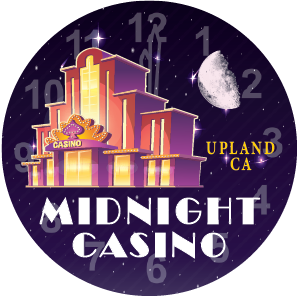
Out of the four mockups, I like the bottom left best, but take out the clock face.
You don't have to have the same inlay art on both sides of the chip. You can experiment with different sides.
You don't have to have the same inlay art on both sides of the chip. You can experiment with different sides.
View attachment 450019
Woody has been a very busy bee.Some decisions we have to make:
1 --Are we going to have the chip value be on the chip or in the inlay?
2 -- which of these designs has the most pizzazz?
1 and 4 are practically identical, except for the denominations. (either way, I will have Woody change the 00.00 to 00:00 or just take it off and put in on the edge of the chip.
I have to admit the analog clock in the background of design 3 really looks good and if we go with that, we can take off the 00:00 entirely.
These look great!
Mmm, seems like a lot going on. Do just ticks work any better?
SteveHNo96
Flush
If it doesn't work, we won't worry about it.
I admit, I like 1 and 3 a lot.
I admit, I like 1 and 3 a lot.
I really like the clock on casino idea. Def scratch the 00:00, it really doesnt look good and the inlay is killer. The Upland, CA looks way better at the bottom.
SteveHNo96
Flush
those of you who have been saying to ditch the "00:00", I have some good news, the new mockups do exactly that.
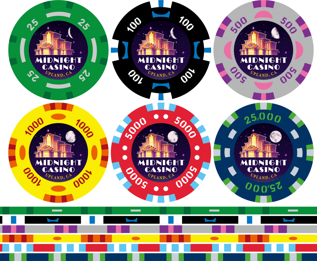
Inlay 3, now with the denoms on the chip!
and Inlay 1, also with the afore mentioned value on the chip:
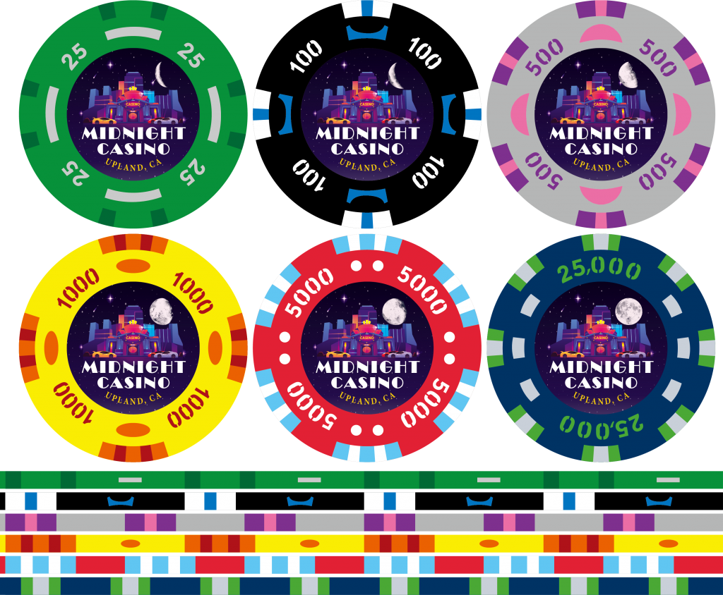
I think we have a winner with these two ideas.
Inlay 3, now with the denoms on the chip!
and Inlay 1, also with the afore mentioned value on the chip:
I think we have a winner with these two ideas.
Def inlay 3
Try this http://www.sunflycasinoequipment.com/Everytime I attempt to access a Sunfly link posted here, I get denied. Am I doing something wrong? Doesn't matter if it is Firefox, Chrome, or IE, or from a desktop, or mobile. Any ideas?
SteveHNo96
Flush
I haven't had a problem posting Sunfly links -- but when I try to show the chips from Sunflycasinochips.com, it keeps telling me the site isn't able to provide a secure connection.
That works, thanks.
Def inlay 3
Yep, no arguments here, best one to date
That was me playing around with color options, I was trying different combinations and I kind of liked it. Sometimes depending on the purple used on the 500 it can be too close to the black 100, this option made it stand out but kept the purple color. Just an option to see what kind of reaction it got.What made you change from purple to grey on the 500?
SteveHNo96
Flush
I may honestly end up keeping the template for both of those and use inlay 1 as a backup or secondary inlay because they're both really good in my opinion =)
updated colors, using Sun-Fly standard colors
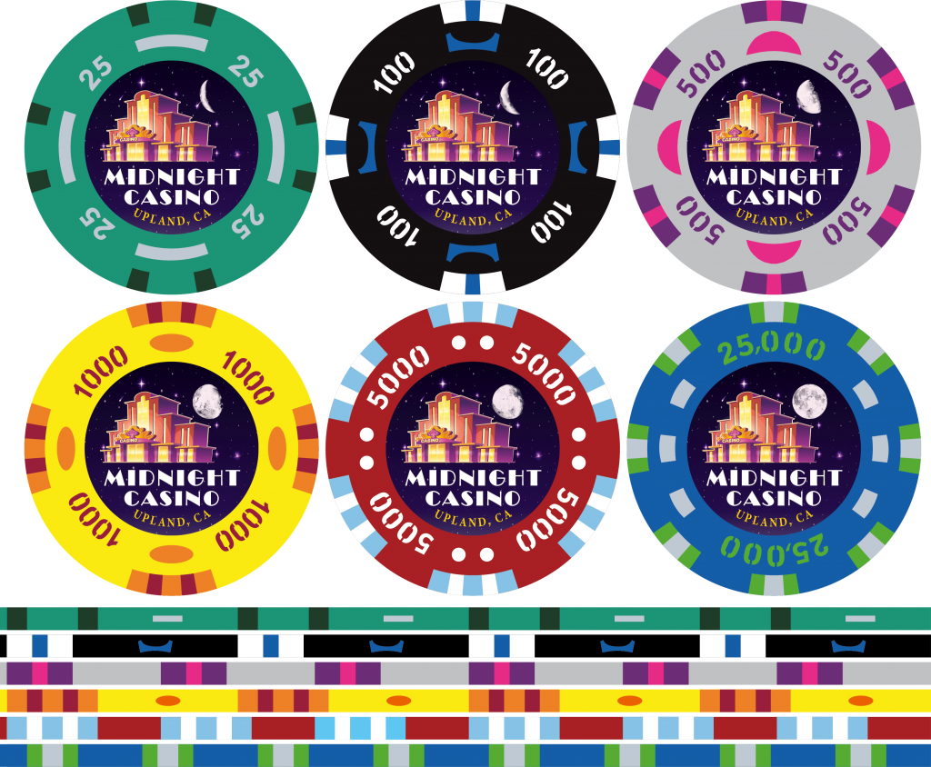
Alternate 500
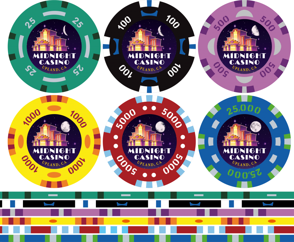
Alternate 500
Wow how big will your set be? Primary and secondary chips?I may honestly end up keeping the template for both of those and use inlay 1 as a backup or secondary inlay because they're both really good in my opinion =)
I think having 2 inlays would be good if you're planning a cash and tournament set, no worries about overlapping denominations. Or you could use that design for a Dealer button to freshen things up. Or rebuy/reload chip. Or seating chip. So many options!
Loving the purple!! Prefer the previous dark blue for 25k, will be a pity if sunfly doesn't offer a darker blueupdated colors, using Sun-Fly standard colors
View attachment 451483
Alternate 500
View attachment 451484
SteveHNo96
Flush
Wow how big will your set be? Primary and secondary chips?That'll be really cool!
I think having 2 inlays would be good if you're planning a cash and tournament set, no worries about overlapping denominations. Or you could use that design for a Dealer button to freshen things up. Or rebuy/reload chip. Or seating chip. So many options!
Loving the purple!! Prefer the previous dark blue for 25k, will be a pity if sunfly doesn't offer a darker blue
You know what? there's more going on with Inlay 1 and dealer buttons are huge, so I think that will work, make Inlay 1 a dealer button (course then we can just do that with any moon phase we want)
SteveHNo96
Flush
Three different styles and the color chart (Sunfly has a 60-color standard design on left to choose from)
The silver 500 chip is part of design 6, the purple 500 is 7 and the one with the yellow 25's is design 8.
I'm really liking design 6 and 7.
Similar threads
- Replies
- 32
- Views
- 1K
- Replies
- 15
- Views
- 514
- Replies
- 7
- Views
- 343
- Replies
- 16
- Views
- 525
