Messing with inlay/label designs (2 Viewers)

Since getting a Cricut Maker machine, I decided not to sell my large (~1,300-piece) set of murdered ASM H-molds. My new plan is to split these in half to make two traveling sets, one cash and one tourney, with inlays reflecting some of my non-chipping interests.

Here is my first experiment. Foraging wild mushrooms is one of my other non-poker hobbies. This draft design (using quick-and-dirty clip art, lightly modified) showcases five common edible mushrooms which I take throughout the year:
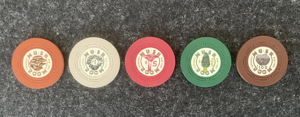
themushroom-3.jpg

  • Orange NCV — Oysters — Summer/Fall
  • Cream $1 — Maitake (“hen of the woods”) — Sept./Oct.
  • Red $5 — Chanterelles — July/Aug.
  • Green $25 — Morels — Apr./May
  • Brown $100 — Lion’s Mane — Sept./Oct.

I may completely revise this idea, but am fairly happy with it as a first stab. I think on the back I would give the name of the mushroom instead of the town/state.

The other half of the set is different colors, more suited to tourneys.
 
Last edited:
That is a beautiful inlay design. Any significance to which mushroom is assigned to each chip?

I was vaguely putting them in order of rarity, but it’s not quite in correct sequence. It should more properly go oysters, chants, hens, morels, hericia (Lion’s Mane).
 
I was vaguely putting them in order of rarity, but it’s not quite in correct sequence. It should more properly go oysters, chants, hens, morels, hericia (Lion’s Mane).

Very cool. I love how you switched up the style/location of the denomination on each one.

I have one suggestion, and this may say more about me than the design, but I'd suggest moving the chanterelle off the red chip. First impression is giving me flashbacks to a diagram of the female reproductive system I saw in an 8th grade health class textbook. Just my two cents
 
One more iteration... I’ll hold off on posting more until some non-virtual labels are actually produced. Getting closer!


themushroom-almostthere.jpg


Closeups:

1712082793006.png


1712082806096.png


1712082822783.png


One change here is that I kept the color of the smaller text items (“The,” “Taghkanic,” mushroom names) consistent throughout the set. Not sure if I’ll stick with that.
 
Well, back to the drawing board.

I output a trial batch of textured inlays for these H-molds, but I’m either going to have to greatly simplify the design, or try something entirely different:

IMG_3223.jpeg


1) These got bumped down maybe a half-millimeter, so they are not quite centered. That’s fixable.

2) At this scale (22mm or 7/8ths of an inch), the design is both too busy and too hard to read.

The images printed quite crisply, but are too small to make out from any distance besides holding the chip up to your face. The smaller type is likewise way too small.

If I stick with this theme, I’ll have to:

A) Make the MUSH ROOM name smaller but bolder;

B) Make the other type (e.g. TAGHKANIC) larger, or dispense with it entirely;

C) Use larger art with much simpler lines.

I also may have to go back to my usual preference (crutch?) of matching the background to the base color, instead of the cream-colored backing used here. The type on a curve could be moved closer to the edge, for example, if the inlay color bled into it.

I wanted a vintage look, but I think it contributes to the sense of everything being crammed together.

Another option, since I can do custom runs, might be to put the art and mushroom name on one side and the room info on the other. That way everything can be larger and also less bunched up.

Oh well! Try, try again.
 
Last edited:
Well, back to the drawing board.

I output a trial batch of textured inlays for these H-molds, but I’m either going to have to greatly simplify the design, or try something entirely different:

View attachment 1304787

1) These got bumped down maybe a half-millimeter, so they are not quite centered. That’s fixable.

2) At this scale (22mm or 7/8ths of an inch), the design is both too busy and too hard to read.

The images printed quite crisply, but are too small to make out from any distance besides holding the chip up to your face. The smaller type is likewise way too small.

If I stick with this theme, I’ll have to:

A) Make the MUSH ROOM name smaller but bolder;

B) Make the other type (e.g. TAGHKANIC) larger, or dispense with it entirely;

C) Use larger art with much simpler lines.

I also may have to go back to my usual preference (crutch?) of matching the background to the base color, instead of the cream-colored backing used here. The type on a curve could be moved closer to the edge, for example, if the inlay color bled into it.

I wanted a vintage look, but I think it contributes to the sense of everything being crammed together.

Another option, since I can do custom runs, might be to put the art and mushroom name on one side and the room info on the other. That way everything can be larger and also less bunched up.

Oh well! Try, try again.
Do they have to be textured?
 
These are awesome, but I’m not surprised, coming from the same mind that gave us Hot Dog Hallway. Are you going to offer sample sets? If so, dibs!
 
First attempt at simplifying the design. On the flip side I would replace the denoms with the fungi names. Trying to make the art bigger and the text bolder. Still some text too small.

IMG_3226.jpeg
 
Round 2 of Mush Madness! I simplified the fonts, enlarged the art, eliminated the lines, etc.

Also these got a satin laminate instead of textured, which at this small size definitely makes it easier to see detail:

IMG_3246.jpeg


On the flip sides, I’m going to replace the denoms with the name of each mushroom type.

Lots of small fixes left to do. For example, I want to make the background more of a cream color like the base of the $1 to give more of a vintage look. Also I cut these at a little under 22mm and that is leaving some gaps.

A big challenge is going to be laminating these in quantity. It’s pretty tricky to apply it without wrinkles. Getting better at it but still losing a lot from each sheet.
 
Last edited:
Round 3. Still have some color and alignment issues to resolve, but I’m getting more proficient with the Cricut software.

One side has denoms, the other fungi names.

IMG_3268.jpeg
IMG_3269.jpeg


Practice makes less imperfect…
 

Create an account or login to comment

You must be a member in order to leave a comment

Create account

Create an account and join our community. It's easy!

Log in

Already have an account? Log in here.

Back
Top Bottom