You are using an out of date browser. It may not display this or other websites correctly.
You should upgrade or use an alternative browser.
You should upgrade or use an alternative browser.
Mapes & Money Tree CPC semi customs : Poll (1 Viewer)
- Thread starter 5aces
- Start date
Ben8257
Royal Flush
Well... number 1 is a no for me, I don't fully see her making the b... 2 is a little over the top with the "goods" sticking way out there... 3 or 4 would be close to a tie for me... but 4 gets my vote!!
Looking forward to see where this goes!!
Looking forward to see where this goes!!
Ben8257
Royal Flush
You didn't cast your vote!! 3 is still empty!!3 because there’s more separation between the model and name making it easier to read. 3>4>2>1
Great job, if you open a sample thread I’m in.
Ben8257
Royal Flush
Dave that is absolutely halarious sir!! Just laughed very loud for a solid minute!! I like it!!5. Similar to #1, but crouching and hanging off a stripper pole with butt sticking out making the 'b'.
5aces
Full House
To be honest I started with a provocative idea for the large "B" (breasts) but I decided, that the design should not represent too clearly my dubious character or certain preferences.5. Similar to #1, but crouching and hanging off a stripper pole with butt sticking out making the 'b'.
Great idea.5. Similar to #1, but crouching and hanging off a stripper pole with butt sticking out making the 'b'.
Looking forward to the DB desgin. Make the girls dance.
3 or 4 for me!
Great re-work of the Mapes chips!
Great re-work of the Mapes chips!
It’s a great idea but bear in mind that the label will be pretty small once printed so what looks like a babe on screen may just be a blur. look at a real Mapes chip as an example - you’d be hard pushed to tell that to two cowboys without knowing what they’re meant to be.
5aces
Full House
That's what John said, too. Thanks!It’s a great idea but bear in mind that the label will be pretty small once printed so what looks like a babe on screen may just be a blur. look at a real Mapes chip as an example - you’d be hard pushed to tell that to two cowboys without knowing what they’re meant to be.
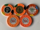
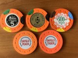
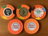
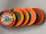
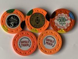
Meanwhile my new color sample set arrived. I checked colors in different light situations and think I'll continue with this:
I think that DG Tiger looks better next to DG Peacock than DG Peach. Site note: The longer I starred and compared both colors the started to look almost the same. Maybe I should have a break?!
I ended up ordering these for my Money Tree set:

DG Tiger is a great colour and would be my choice too if I was making 5s.
DG Tiger is a great colour and would be my choice too if I was making 5s.
guyfleegman
Flush
I’m an ass man myself!To be honest I started with a provocative idea for the large "B" (breasts) but I decided, that the design should not represent too clearly my dubious character or certain preferences.
3
Ben8257
Royal Flush
not sure how I missed this but those look amazing buddy!! I am guessing they will be in production for a while?I ended up ordering these for my Money Tree set:
View attachment 572620
DG Tiger is a great colour and would be my choice too if I was making 5s.
Ben8257
Royal Flush
Time to design another custom set around your "Back Door Flush" hot sauce!! LMAO
OfficerLovejoy
Full House
Great looking set sir! I voted 3. I like the idea of the girl leaning in towards the logo, not away from it. Seems like a no brainer, brand marketing wise. 
Of all the beautiful sets that get posted here, I get most excited about the ones from @5aces since there is an actual chance I will see them in person one day.
Of all the beautiful sets that get posted here, I get most excited about the ones from @5aces since there is an actual chance I will see them in person one day.
Phish1321
Full House
3
I should be in the next scrown run, hopefully early next year.not sure how I missed this but those look amazing buddy!! I am guessing they will be in production for a while?
5aces
Full House
The topic continued to concern me, although I always gave priority to other Paulson sets.
After I had the opportunity to view and play on fantastic custom sets from @NeoViny23 and @cpac54 several times, I finally ordered my first CPC set at the end of 2023.
With the help of @liftapint and @MajorTom I made a few changes to the colors and molds and finally decided against scrown.
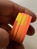
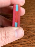
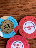
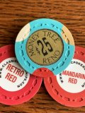
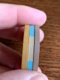

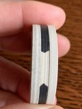
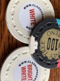
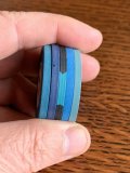
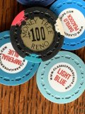
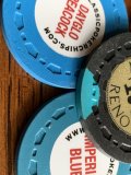
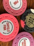
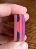
The feeling of CSQ is outstanding for my taste and since a 1:1 copy was never the goal anyway, this mold ended up being the same. I am very excited to receive the set this year and wanted to share the excitement with you.
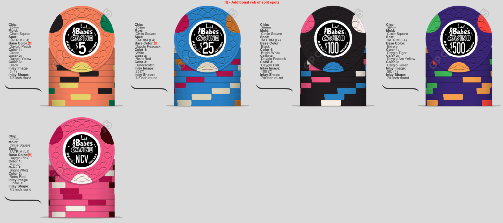
After I had the opportunity to view and play on fantastic custom sets from @NeoViny23 and @cpac54 several times, I finally ordered my first CPC set at the end of 2023.
With the help of @liftapint and @MajorTom I made a few changes to the colors and molds and finally decided against scrown.


The feeling of CSQ is outstanding for my taste and since a 1:1 copy was never the goal anyway, this mold ended up being the same. I am very excited to receive the set this year and wanted to share the excitement with you.
Last edited:
mattross1313
Full House
Really nice work - colours, label, all work very well.The topic continued to concern me, although I always gave priority to other Paulson sets.
After I had the opportunity to view and play on fantastic custom sets from @NeoViny23 and @cpac54 several times, I finally ordered my first CPC set at the end of 2023.
With the help of @liftapint and @MajorTom I made a few changes to the colors and molds and finally decided against scorwn.
View attachment 1275472View attachment 1275473View attachment 1275474View attachment 1275475View attachment 1275476View attachment 1275477
View attachment 1275484View attachment 1275485View attachment 1275486View attachment 1275487View attachment 1275488
View attachment 1275478View attachment 1275479View attachment 1275480View attachment 1275481View attachment 1275482View attachment 1275489View attachment 1275490
The feeling of CSQ is outstanding for my taste and since a 1:1 copy was never the goal anyway, this mold ended up being the same. I am very excited to receive the set this year and wanted to share the excitement with you.
View attachment 1275491
Your NCV tri-moon is similar to mine except the retro red is my base, then DG Pink, Maroon and BW spots. Also on CSQ, and excitedly waiting for a shipping notice!
finally decided against scorwn.
I am proud of you.
I'm partial to the NCV chip.The topic continued to concern me, although I always gave priority to other Paulson sets.
After I had the opportunity to view and play on fantastic custom sets from @NeoViny23 and @cpac54 several times, I finally ordered my first CPC set at the end of 2023.
With the help of @liftapint and @MajorTom I made a few changes to the colors and molds and finally decided against scorwn.
View attachment 1275472View attachment 1275473View attachment 1275474View attachment 1275475View attachment 1275476View attachment 1275477
View attachment 1275484View attachment 1275485View attachment 1275486View attachment 1275487View attachment 1275488
View attachment 1275478View attachment 1275479View attachment 1275480View attachment 1275481View attachment 1275482View attachment 1275489View attachment 1275490
The feeling of CSQ is outstanding for my taste and since a 1:1 copy was never the goal anyway, this mold ended up being the same. I am very excited to receive the set this year and wanted to share the excitement with you.
View attachment 1275491
That’s exactly why I voted 2.Well... number 1 is a no for me, I don't fully see her making the b... 2 is a little over the top with the "goods" sticking way out there... 3 or 4 would be close to a tie for me... but 4 gets my vote!!
Similar threads
- Replies
- 8
- Views
- 3K
