Making my design a little less shit (1 Viewer)

Annorax

Two Pair
Joined
Oct 23, 2018
Messages
449
Reaction score
321
Location
Texas
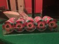
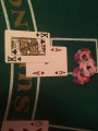
Those of you who've seen the pron of my first attempt at a custom set already know that a turd in the street has better design skills than I do. I thank everyone who provided feedback in that thread, and I'm attempting to make version two less shit, or preferably not shit at all. I'd like to get some thoughts on the concept I've come up with for something that might be slightly less garbagey so that when the set's done, the pr0n is something that you guys might actually want to look at.

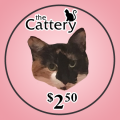
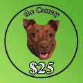
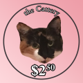
I'm thinking I'm on to something here, but the design clearly needs a bit of work. (and yes, the dog being on the first Cattery design here is not optimal, every other design will feature one of my cats or my girlfriend's cats... this is just the one I think she'll want to see ready to print first)
 

Attachments

  • aa-rush-25paulson-v2-0a.png
    aa-rush-25paulson-v2-0a.png
    90.6 KB · Views: 91
  • v2-click-250-2-0a.png
    v2-click-250-2-0a.png
    108.2 KB · Views: 94
From a distance the current mock-up looks a bit shitty.....


See what I did there lol
 
for Inspiration, see the bubbs poker den set by @ChaosRock

Or the truman’s House set by bergs.

Both are great inlays in honour of pet dogs. I can’t think of any cat inlays, but it still applies.
 
I've seen them. My Photoshop skills are a bit... shit.

The inspiration behind this exploratory design was bergs' Truman's House set. I'm not going to outright copy it, I just wanted something vaguely similar that'd let me show off as many of my four-legged "kids" as possible.
 
The outline on the text is making it less legible especially at the top. The point size of the font is too small for it. Either the text needs to be way bigger with a thinner outline or no outline. For legibility contrast is king. You could go with a gradient. The base color full at the bottom transitioning to a lighter value at the top. Then use solid black text.
 
Your assessment is correct. This is not good. If you want to pay homage to your pets you can do so and make a nice looking set. If you are going to pay the money for a custom set don't cheap out on the inlay design. I strongly strongly suggest more than I ever have that you employ the services of a graphic designer.

I think @Quicksilver-75 could do a great job of making a cartoon caricature of your pets. If not him then find someone else.

This x's a million!!!! Designers did both of my custom sets and I couldn't be happier :)
 
In my humble opinion, it is generally not good to use a direct photograph onto a chip label. A modified photo to make it look more like a drawing or painting, or somehow more abstracted, would be better. The detail of the photographic portion clashes with the simple nature of the frame (i.e. the chip) because with the latter we are dealing with mostly solid fields of colour with perhaps blocks of edgespots and generally simple text.
 
I did some photo illustration/abstract work on the photo, tweaked text a bit, and made an actual logo. This probably isn't finished product worthy, but do you guys think this looks a little less shit than the previous ones?
 

Attachments

  • v2-click-250-2-0b.png
    v2-click-250-2-0b.png
    104.8 KB · Views: 85
Anyone a picture from Duys Palace? One of my goat candidates putting portraits onto an inlay.
 
I did some photo illustration/abstract work on the photo, tweaked text a bit, and made an actual logo. This probably isn't finished product worthy, but do you guys think this looks a little less shit than the previous ones?
Better and I like the layout of the logo. I'm still worried about the outline on the text. You should do some test prints at scale to check legibility. I was also thinking if the dog would make a good NCV chip? Then it makes more sense as an outlier.
 
Putting Rush (the dog) on an NCV makes a lot of sense. I've got some yellows that were originally planned to be a $20, but that color would make a good NCV as well.

I'll do some test prints soon (probably later today); I've got some cheap POS paper labels left over from the first solids experiment that are easily removable, so test print photos are a definite possibility. I'm glad I went with those crap labels so I could theoretically de-label the entire first version set and redo those as a tournament or total NCV set.

EDIT: Could use some suggestions for the denom font as well; using these fonts I've got left over from Magic photoshoppery is okay, but there has to be something better I could be using.
 
Test print along with something random that was sitting on my desk.

Edit: The white outlines don't seem to be as big a problem as I thought, I've still shrunk them down a pixel. I'm thinking they might be necessary for legibility on the red and green when we get to that point, but this chip doesn't seem to need them.
 

Attachments

  • testprint1.png
    testprint1.png
    1.1 MB · Views: 93
Last edited:
I'm working with it in Photoshop; I can tweak the illustration mod I did to it to get it blockier. What I posted above is just a quick mockup to make sure the layout's not smelling like a cat box before I get into more detail with the art.
 
Test print design v2, using the Spirit molds I failed to sell. They won't stay that way, as the final version of the set is going to be on the ABC/PGI 8vs from the blowout. These Spirit molds will likely get relabeled with nonstandard denoms for a small limit or headsup set (not pictured: 50 yellows I didn't do anything with for the test printing frenzy).

I'm thinking the final layout will be similar, but I'll hire an artist to do drawings of all eight pets for the final version (those sets linked above inspired me to not use illustration-modified photos on the final set). The garbage labels on the solid set will be removed & that set will be redone as a tournament set once this whole thing is done. Seeking feedback on the general design from these pics.
 

Attachments

  • 2018-11-19 06.28.38.jpg
    2018-11-19 06.28.38.jpg
    105.8 KB · Views: 81
  • 2018-11-19 06.29.00.jpg
    2018-11-19 06.29.00.jpg
    141.5 KB · Views: 75
  • 2018-11-19 06.38.42.jpg
    2018-11-19 06.38.42.jpg
    114.3 KB · Views: 73
  • 2018-11-19 06.27.43.jpg
    2018-11-19 06.27.43.jpg
    121.5 KB · Views: 82
Last edited:

Create an account or login to comment

You must be a member in order to leave a comment

Create account

Create an account and join our community. It's easy!

Log in

Already have an account? Log in here.

Back
Top Bottom