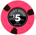
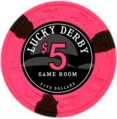
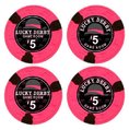
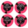
Lucky Derby Tribute Label (2 Viewers)

In the new inlay it looks like the background is imitating a wet / chromatic material because the derby hat is cropped behind the point of recognition. If that's is the intent it is ok. If you want the derby hat to read but still be in the background I would rethink how large it is / how you crop it.
 
This pretty much says it all, doesn't it. The only person you have to please is you. :cool:

Personally, I like the look...I'm a fan of inlays with dark backgrounds and large denoms. Like MoscowRadio, I would only associate the background with a derby because I've been following the thread.

I was kinda baked when I made it so I'm less enthusiastic now. :eek: My intention was to design it in the style of the Bellagio and Aria chips but with a color denom. Now I'm trying just blacks greys and whites. The derby chips are so colorful on their own that a black/grey/white label might compliment them well.

Here's the latest.

4FINALDERBY5g.pngFIVE6.png
 
Last edited:
I like the color matched denoms better. I usually like one aspect of the chip to change from one denom to the next, whether it's the denom, the text or a part of the image. IMO it doesn't even need to color match, it just needs to be different (and at least complement the chip's color). Think of it as the middle edge spot.
 
I like the color matched denoms better. I usually like one aspect of the chip to change from one denom to the next, whether it's the denom, the text or a part of the image. IMO it doesn't even need to color match, it just needs to be different (and at least complement the chip's color). Think of it as the middle edge spot.

Thanks again for the feedback.
 
...the derby hat is cropped behind the point of recognition. If that's is the intent it is ok. If you want the derby hat to read but still be in the background I would rethink how large it is / how you crop it.

I agree

Having the hat this large crops out the other side of the brim and that's what makes it unrecognizable as a hat, at leat to me. Here it is with a smaller hat that includes both sides of the brim. I also connected the brim to see how it would look.

derby pink.png
 
I agree

Having the hat this large crops out the other side of the brim and that's what makes it unrecognizable as a hat, at leat to me. Here it is with a smaller hat that includes both sides of the brim. I also connected the brim to see how it would look.

View attachment 5639

Awesome. Thanks for the mockup. With the hat being off center just a bit makes it feel misaligned. I'm with you though that it would be nice to be able to see that it's a hat. Also, that FIVE DOLLARS font is so small. It'd be barely visible on a chip, wouldn't it?
 
He's right that "five Dollars" text will be way too small. I used existing casino chips and found the smallest legible text - usually the part that reads "Las Vegas, NV", and measured it. I would have to go back through my notes, but it is larger that you would think.
 
I hate this 'attachment vs pic' bullcrud. Why does the forum seem to randomly make something an attachment instead of a pic?

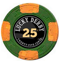
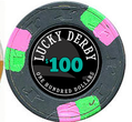
20G.png25f.png100f.pngonefive.png

...anyhow. Here's what I have. Not sure about the denom colors.
 
The only things I would change about the new label would be to center the hat and to maybe make sure the hat brim doesn't go through the white circle on the label. I think this could be a winner though.

- - - - - - - - - Updated - - - - - - - - -

Whoops. Didn't read to the end of the thread.
 
I prefer the ribbon in the derby to have no color matching; otherwise it looks like a women's dress hat to me.
 
I think I've lost my appreciation for the big derby and "game room". The mini derbys are a neat idea but it looks like a pattern you'd see on underwear imo. I think I'm gonna lighten up the grey background derby, increase the spelled out denom font and find the right color for the denom. Also might bring the hat back a bit more so you can see the rim.

- - - - - - - - - Updated - - - - - - - - -

Also, regarding labels I asked Joe from Palm for a quote on laminated labels and he claims that his laminate labels are too thick for any Paulson. That seems thick. I believe him but has anyone else used his laminate labels?
 
derby6.pngderby7.png

I think these might be the ones, I think maybe a bit of more attention to the alignment on the denoms but otherwise, it's pretty satisfactory to me.
 
...The mini derbys are a neat idea but it looks like a pattern you'd see on underwear imo....

Or pajamas

Also, regarding labels I asked Joe from Palm for a quote on laminated labels and he claims that his laminate labels are too thick for any Paulson. That seems thick. I believe him but has anyone else used his laminate labels?

I've used his laminated labels but not on Paulsons. They're on my Claysmith Gaming Double Trapezoid chips (blank Milano chips). Order some samples from Joe and try them out.
 
Also, regarding labels I asked Joe from Palm for a quote on laminated labels and he claims that his laminate labels are too thick for any Paulson. That seems thick. I believe him but has anyone else used his laminate labels?

I haven't used Palm's laminated labels, but I've used the unlaminated vinyl and they are really nice. I think people want lamination to help protect the label, but Joe's unlaminated labels are very durable and color-fast in my experience.
 
I've used his non-laminated labels as well, and they're fine but I fear the hotstamping underneath these chips will be visible. The hotstamping is barely visible under the the Glossy Vinyl Smooth Laminate labels Gear offers so wanted to compare prices.

I swear I asked Joe twice in two separate email about the price of his laminated labels and the answer I got was essentially that they won't fit. Then says they don't have "glossy samples" after I asked about smooth laminate samples. I think it might be just easier to do business with Gear.
 
Last edited:
Yeah, the non-laminated ones will definitely show the ridges of a hotstamp. You might need to do a light scraping no matter what label stock you pick.

I can't wait to do a project with Gear's labels. Just need to get the drill press and jig ready.
 
I think the version in post #82 is a winner for me. I hope they turn out as well as you want them to.

Oh yeah...give Gear your support!:D
 
Yeah, the non-laminated ones will definitely show the ridges of a hotstamp. You might need to do a light scraping no matter what label stock you pick.

This unfortunately is the problem with labelling over hotstamps. An unlaminated label is usually thin enough to not cause stacking problems or spinners, but might not be thick enough to adequately hide the hotstamp ridges. In some cases the hotstamps on chips are nice and smooth to start with, and everything works out great, but good luck finding an entire rack (or two or three) of chips that fit that description.

Laminated labels in most cases will hide the ridges, but will be too thick for the inlay area. And of top of that, in both cases (laminated and unlaminated) the label itself will be adhering to less surface area, because it will mostly be sticking to the ridges, making them more prone to falling off prematurely, etc.

That's mostly for mint/unused or only very lightly used. If you have chips that are quite used and worn, the good news is that the hotstamps will have been worn smoother, but the bad news there's almost no inlay depth at all to work with anymore. Pretty much any label, even unlaminated, is going to give you handling and stacking problems by being too thick. At that point you're definitely better off milling out the inlay area, if only to get some depth back.

The "sweet spot" is somewhat-used chips where the ridges have been knocked down a bit but the inlay depth is still reasonable.

For chips that fit this description, (i.e. with relatively smooth hotstamps, or if you don't care as much about ridges showing through), I would recommend matte unlaminated labels for sure, or smooth laminated labels if you check the depth (get samples.)

If the ridges on your chips are a problem, you can scrape them down with the back edge of an Xacto blade or utility knife and then label them unlaminated, or better still, mill out the hotstamps and get a nice textured laminated label. :)

The short version of the dilemma is that the newer the chip, the deeper the inlay area will be, but the bigger effect the hotstamp ridges will have. The more worn the chip, the smoother the hotstamps are, but the less inlay depth will remain.

FWIW I'll be milling the pink $2 Derby chips I bought from the Chip Room sale, and adding laminated labels - pictures coming in early February when I get back from vacation.


BTW, there is almost never a problem with the hotstamp itself (i.e. foil) showing through the label directly. The vinyl is opaque enough to block that.
 
What do you think about only labeling the denom side of the lucky derby chips? Leaving the beautiful Lucky Derby logo hotstamp visible with a new denom label over the old denom side.

PS I bought a wood carving set and have milled down a few of the chip centers to smooth the surface the label will go on. This is when I thought how much of a shame it is to mill down a perfectly good hotstamp, especially if my label will be consistent with the Lucky Derby theme.
 

Create an account or login to comment

You must be a member in order to leave a comment

Create account

Create an account and join our community. It's easy!

Log in

Already have an account? Log in here.

Back
Top Bottom