You are using an out of date browser. It may not display this or other websites correctly.
You should upgrade or use an alternative browser.
You should upgrade or use an alternative browser.
Lucky Derby Tribute Label (2 Viewers)
- Thread starter 200 Motels
- Start date
200 Motels
Flush
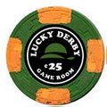
I'm thinking it needs more to it, or possibly the hat in the center with the text wrapping around the edge. What about leaving the hotstamp logo on one side of the chip and labeling over the denoms but with a label that is designed like the hotstamp.
- - - - - - - - - Updated - - - - - - - - -
What about a video game theme like Payday.

- - - - - - - - - Updated - - - - - - - - -
What about a video game theme like Payday.
links_slayer
4 of a Kind
I really dig the 2-color hats. I prefer the OP mock-up to the more recent version. I would explore different fonts though. Just a suggestion 
200 Motels
Flush
I really dig the 2-color hats. I prefer the OP mock-up to the more recent version. I would explore different fonts though. Just a suggestion
Awesome, thanks.
The Hats... 100%
If there is anything I have picked up from Gear, it's "keep it simple"
That design is easy to read, and the two tone hat accents that match the chip are awesome.
I only wish Gear had a set so I could play with them!
Well done sir.
If there is anything I have picked up from Gear, it's "keep it simple"
That design is easy to read, and the two tone hat accents that match the chip are awesome.
I only wish Gear had a set so I could play with them!
Well done sir.
MoscowRadio
Flush
I really like this idea, and, like Wifey said, I think simple is the best. On the .25 chip the headband on the derby hat is black against a black background. I think this would look good across all denominations, but that's just my opinion.
200 Motels
Flush
I really like this idea, and, like Wifey said, I think simple is the best. On the .25 chip the headband on the derby hat is black against a black background. I think this would look good across all denominations, but that's just my opinion.
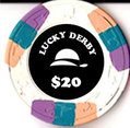
I thought the exact same thing this morning so I updated the design a bit.
MoscowRadio
Flush
I think the hats look AWESOME like this. To me it looks a little more 'art deco' and simplistic. I really dig it.
bmichaelhorn
3 of a Kind
Like the new direction. I think the labels could use a border. I wonder if there's too much color matching going on? Maybe the fonts all stay white and the hats change color with the chips? I think it works best to have some consistency in the label and one small variation. Good looking stuff keep at it!
MoscowRadio
Flush
In my opinion, color-matching isn't always all that it's cracked up to be. In some instances, yes, color-matching works great. The Mariposa Poker Club Chips, GCOPs, and the Bel-Air CPCs leap to mind, but I get the feeling that a lot of people find it to be necessary and there are some AMAZING sets out there that don't include color-matching at all and still look phenomenal. Abby's Lady Luck Club chips (both version) don't incorporate color-matching and I find them to be some of the best sets out there.
200 Motels
Flush
Like the new direction. I think the labels could use a border. I wonder if there's too much color matching going on? Maybe the fonts all stay white and the hats change color with the chips? I think it works best to have some consistency in the label and one small variation. Good looking stuff keep at it!
That's great advice. I'll toy around with it some more.
One suggestion, if I may... make the $ sign a few points smaller than the numbers, and move its baseline up a few points. Almost all of the denominated chips I've ever seen make the $ or ¢ smaller than the numbers in this way.
I agree with Moscow. Sometimes color matching works sometimes not. I think it could work here but at the moment it's to much for my liking. I would try just matching the hat, and have the text plain. Maybe just white or yellow.
- - - - - - - - - Updated - - - - - - - - -
Edit. Didn't see bmichaelhorn post.
- - - - - - - - - Updated - - - - - - - - -
Edit. Didn't see bmichaelhorn post.
200 Motels
Flush
Meddler2
Full House
Love them. Are you gonna mill the recess area?
links_slayer
4 of a Kind
What's the point of relabeling a chip the same name as the original chip?
Some of the hotstamps were pretty worn based on some of the pictures floating around. And some folks don't like hotstamps.
bmichaelhorn
3 of a Kind
Nice job. Are you leaving the hotstamp on one side are are you just showing before and after?
What's the point of relabeling a chip the same name as the original chip?
Some of the hotstamps were pretty worn based on some of the pictures floating around. And some folks don't like hotstamps.
Also, changing the denominations.
bmichaelhorn
3 of a Kind
Also, changing the denominations.
Although not the point you were making, as a rule of thumb having different fonts as well as a different font size for the denom and title helps create a hierarchy and increases legibility. Might be worth experimenting with.
The hats look awesome. I really like that you gave the top-end chip (hundo) a little extra treatment.
200 Motels
Flush
Love them. Are you gonna mill the recess area?
Nope. I threw some old vinyl labels on them to see how noticeable the hotstamp would be. It was minimal. Also using matte finish labels (that's a thing right?) might increase the concealment.
What's the point of relabeling a chip the same name as the original chip?
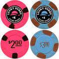
Change the denoms mainly. The c50, $2s, $3s, and $100s were in great shape which is why I bought them instead of $1s and $5s. I couldn't think of an original theme that wasn't just silly so I though Lucky Derby was tasteful. If they were denomed the way I wanted, I'd totally leave the host stamps. I think they're beautiful.
Nice job. Are you leaving the hotstamp on one side are are you just showing before and after?
I was just too lazy to crop out those chips. Each side will have the same label.
Gotcha. I do dislike "1" in Cooper font. I'll update it something different. Thanks for the additional input.Although not the point you were making, as a rule of thumb having different fonts as well as a different font size for the denom and title helps create a hierarchy and increases legibility. Might be worth experimenting with.
200 Motels
Flush
The hats look awesome. I really like that you gave the top-end chip (hundo) a little extra treatment.
Agreed. They look great
Use of Impact should probably be limited to Trailer Park Boys titles:
I've been indoctrinated against the use of Impact for a long time, but even without my bias I would say the two fonts as they are don't complement each other enough. The strict jarring nature of Impact clashes with the fun soft shaping of the Lucky Derby font.
I think it should be "The Lucky Derby" instead of just Lucky derby, and you'd need to look at more creative font. Personally, I like the derby at the top to give you more real estate in the middle of the chip for a stylized font for the text. Art deco/20s type of feel might be good for that theme.
Poker Zombie
Royal Flush
Use of Impact should probably be limited to Trailer Park Boys titles:

I've been indoctrinated against the use of Impact for a long time, but even without my bias I would say the two fonts as they are don't complement each other enough. The strict jarring nature of Impact clashes with the fun soft shaping of the Lucky Derby font.
Thanks for ruining my favorite font. Back to the highly creative and never overused Comic Sans-Serif
200 Motels
Flush
I think it should be "The Lucky Derby" instead of just Lucky derby, and you'd need to look at more creative font. Personally, I like the derby at the top to give you more real estate in the middle of the chip for a stylized font for the text. Art deco/20s type of feel might be good for that theme.
Hmmm. Not bad. What's everyone think of this update?
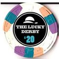

Change log
- Changed fonts from Cooper / Impact to and Blackoak Std / Poplar Std
- Changed derby position from center to top
- "Lucky Derby" is now "The Lucky Derby" an is center positioned
- Outline circle is now thinner
- Font color and outline circle are now grey instead of white.
- Font color for $20 is now color matched (kinda but will be) to an edge spot color.
- "Game Room" has been removed
Similar threads
- Replies
- 15
- Views
- 870
- Replies
- 26
- Views
- 2K
- Locked
- Poll
Lack of Interest
"Aura" Tournament (Aria Tribute) on Sun-Fly PolyInno (Hybrid) Chips
- Replies
- 86
- Views
- 5K


