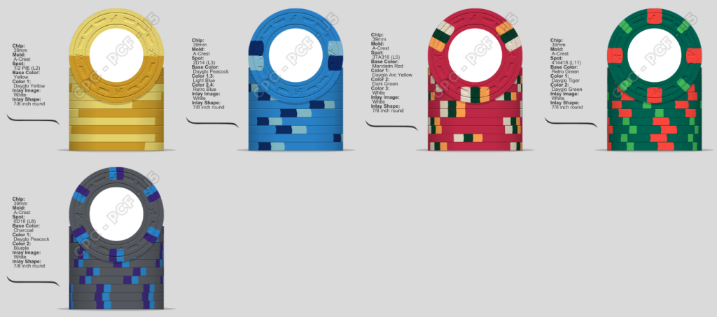
Keeping somewhat close to your original, but with some changes.
You are using an out of date browser. It may not display this or other websites correctly.
You should upgrade or use an alternative browser.
You should upgrade or use an alternative browser.
Looking for design help (with reward!) (2 Viewers)
- Thread starter Rbonus012
- Start date
Or, slightly different with more distinct base colors
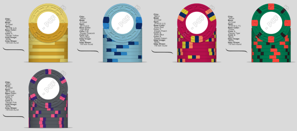
I'll throw my edits into the ring as well.
I would opt for a 1/4 pie on the frac if at all possible. I gave your dollar a bit more contrast with the rest of the set as well. Dark blue and dark green, IMO, don't work well as base colors unless you're going to go really bright on the other chips and on the edgespots.
I like the PCA 5'er idea that @Seeking Alpha Social Club had. Pure fire and goes well with the rest of the set.
Consider green as the base on your $25. If you have lots of $25's and think you'll get $100's in play and want a charcoal $100, you'll have issues with dirty stacks and pots on your upper denonimations if you go with dark green and charcoal bases. I tweaked the $25 edge spot colors as well to give them some more POP.
And the $100? Pure fire. You're welcome.
Chippy McChiperson
4 of a Kind
Rbonus012
Full House
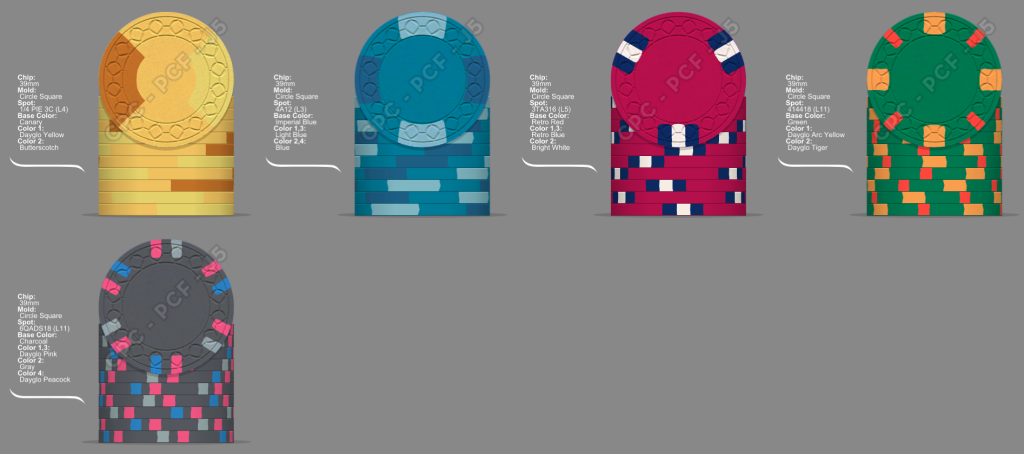
Anyone have thoughts on something like this?
Ha! Totally coincidental. I worked from $100 to frac and kinda ran out of colors.Binions 50c dovetail
Looks like cache creek $1
Cool ideas imported there
Last edited:
I’d swap the Yellow for DG Peach. Much betterNot quite right, I need to look at my samples… I really don’t like green chips….
View attachment 966018
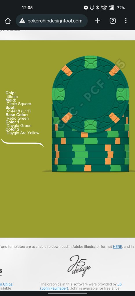
If y'all gonna demand a green 25....
Rbonus012
Full House
I’m also demanding a red $5If y'all gonna demand a green 25.... View attachment 966163
Gross. Why?I’m also demanding a red $5
There. I think that's red.I’m also demanding a red $5
Rbonus012
Full House
First set I made had arc yellow based $5. I want a red five nowGross. Why?
Lol. All good. You know me and rules an all. I just want things to be pretty.First set I made had arc yellow based $5. I want a red five now
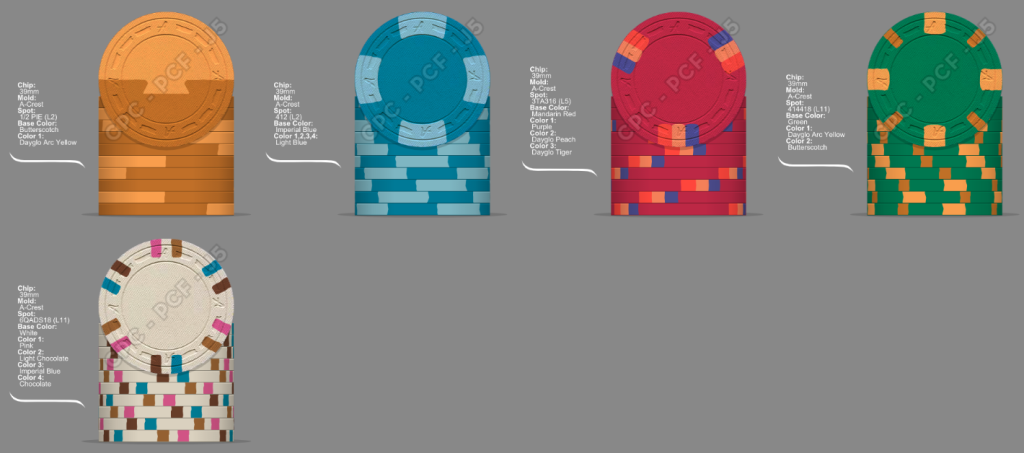
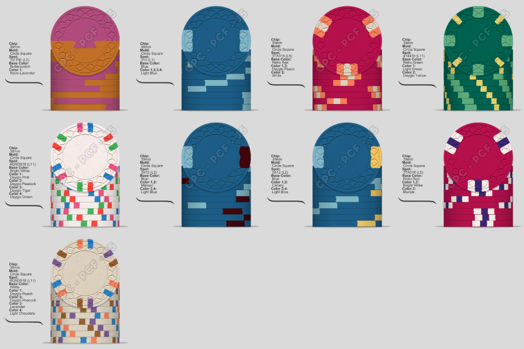
This one's tough and a lot of great ideas above. Following what I see are some themes you like, with some options (warning: colors look better in real life). I realized, what I've been struggling with is the $25 having only 2 colors after some 3-color $5s. It just seems off for me. So this keeps color and spot count progressing. Unfortunately the 4-spot patterns don't allow for the same level of pop after the 3TA316...
The next challenge is spots on the $1. I tried to have the 1/5/25 follow a pattern of base color + lighter version of base color + really light pop color. But that's tough without a lot of yellow hues across the spots (see the canary option). The $100 pulls in DG variants of the spot colors.
I threw in some options as well. I like maroon and canary on blue, but maroon is noticeably dark in the set.
Rbonus012
Full House
I’ve used peach and white on a $5 beforeThis one's tough and a lot of great ideas above. Following what I see are some themes you like, with some options (warning: colors look better in real life). I realized, what I've been struggling with is the $25 having only 2 colors after some 3-color $5s. It just seems off for me. So this keeps color and spot count progressing. Unfortunately the 4-spot patterns don't allow for the same level of pop after the 3TA316...
The next challenge is spots on the $1. I tried to have the 1/5/25 follow a pattern of base color + lighter version of base color + really light pop color. But that's tough without a lot of yellow hues across the spots (see the canary option). The $100 pulls in DG variants of the spot colors.
I threw in some options as well. I like maroon and canary on blue, but maroon is noticeably dark in the set.
View attachment 966589
(PC: John)
KarateMaster72
Flush
I see you like the retro colors. I do as well. I am using the retro red. I don't know why I didn't look at the retro green but I'm going to switch to that most likelyThere. I think that's red. View attachment 966220
Rbonus012
Full House
I think I might been closing in on a design I like. Need to sit on it for a coupes days and revisit. I appreciate all the ideas you guys gave. Helped the creative juices flow.
Retro and Vintage is kinda my thang.... Everyone is tried of me and my demand of orange/butterscotch/Maroon.....I see you like the retro colors. I do as well. I am using the retro red. I don't know why I didn't look at the retro green but I'm going to switch to that most likely
Gorgeous colors. I’m firmly in your camp.Retro and Vintage is kinda my thang.... Everyone is tried of me and my demand of orange/butterscotch/Maroon.....
Eloe2000
Straight Flush
Gorgeous colors. I’m firmly in your camp.
I am a Butterscotch convert.
Gorgeous colors. I’m firmly in your camp.
JOIN THE CULT OF BUTTERSCOTCH.I am a Butterscotch convert.
kirchhausen
Flush
Do you have an inlay, or a theme that you can share? This info would help with chip designHello PCF! Looking for some help for my next set. Here is where im at. Love the frac and $25. Everything else im open to ideas. mostly the $5.
If i end up going with you chip design in the end ill gift you a sample
View attachment 965713
kirchhausen
Flush
Similar threads
- Replies
- 25
- Views
- 954
- Replies
- 16
- Views
- 784
- Replies
- 0
- Views
- 108
