Looking for Design Feedback - Cherry Hills Card Room (1 Viewer)

BSteck

Full House
Joined
Feb 5, 2017
Messages
3,432
Reaction score
8,686
Location
Colorado
Hi all,

I've been iterating on a couple of designs for my relabel projects for a bit now and it's to a point where I'd love some feedback on them.

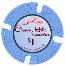
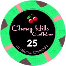
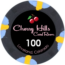
The Cherry Hills name comes from my neighborhood subdivision - I have the entry 'sign' on the corner of my lot so it made a bunch of sense to use it as the name for my card room. I'm using a retro'ish font because most of the houses in the area are from the mid-century modern era. Finally, I'm putting together cash and tourney sets so I wanted the labels to be similar but yet still very distinctive. Both designs turned out to be pretty straight-forward: graphic, name, denomination, location. Maybe it's nice, simple and clean - maybe it a little too simple and clean.

All suggestions are welcome! Thanks in advance...
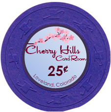
Quarter.png
One.png


T25.png
T100.png
 
Top one for sure! Are you going to do any color matching the the chips with the leaves?

I really like a more simple design. It has everything you need though. Some art, a cool name and the denomination.
 
Top one for sure! Are you going to do any color matching the the chips with the leaves?

Hadn't really considered that.... since I'm trying to depict cherry blossoms I think I'll need to stick with the pinks. But maybe some color matching on the outer rim would be a good idea. Thanks for that.
 
I guess I didn't really clarify it well enough in my initial post. I would be using both of these designs... the cherry blossoms for the cash set and the cherry fruit for the tourney set.
 
One of my last iterations removed the branch on the cherry blossoms so they were kind of blowing across the chip. Any thoughts on branch vs. no branch.

Quarter.png
One.png
 
After I read it agin I realized that. I’m also going on 3 hours of sleep from playing poker last night so I’m more than a little slow on the uptake!

What other chips are you planning on using for each set. The background color looks great on the purple and blue chips, but might not look as good on a red and green chip.
 
A pink $5 would be great in this set! There are lots of great 50c chips you could label as a $5
 
I like the branch. Do cherry trees turn white at some point too? Don’t know my fruit trees very well.

I think it might depend on the variety of the tree - some are white and some are pink. But mixing some white blossoms in with the pinks would be a good idea. Thanks again!
 
Too much pink/red on the $5. Between the text leaves, and color fade it is all blending together too much.

Yah... I agree. Definitely a bad/quick execution of the idea on my part, but I think I'm liking the sky being blue instead of color matched.
 
Last edited:
Yah... I agree. Definitely a bad/quick execution of the idea, but I think I'm liking the sky being blue instead of color matched.
Agree. It looks weird with the pink chip and is probably too much sky overall to work in the colour match. Was worth a quick mock-up though, at least to confirm my idea was shit haha.

I like the one above with the white in the blossom.
 
So fruit or blossom for the tourney label? The fruit obviously has the slots/casino connection but maybe the single blossom echos the cash set a little better.

1543982534522.png
 
Last edited:
Personally I wouldn't give up on the sky color matching yet. The 25c purple isn't overpowering and I like the way it goes with the chip, you could probably get the gradient on the $5 to match nicely.
I think the cherry blossom can work on the tourney chip, but going with the cherry would separate the two better.
 
Not a fan of the color matched background. I think i like the lighter background the best.
 
Last edited:
Not to be a dick, because I really like your cash inlay, but I’m not liking that tourney inlay at all.

The blue looks like the sky, so it gives an impression of depth or something that I can’t quite put my finger on. But it looks good.

The black just seems a bit bland, next to the cash one. Could you just do another sky effect for the tourney set, but make it a different shade? Or add a faint cloud effect or anything like that?
 
Try like a speed cloth background on the tourney chip... with everything else on top.

I’m good with either cherry or the flower, but probably prefer the new single flower on T chips.
Also not a fan of the light blue background on $ chips. Would prefer solid white, solid black or a blend with gray possibly as the background?

Keep the branch.
 
Last edited:
Thanks for all the feedback everyone! Here's where I'm at for the cash set...
I tried a few versions with a color-matched background and just white but I think it lost that outdoorsy, light, sky look that I was liking. So I'm going with the blue sky background. But I did add a little subtle color matching on the outer rim which I'm digging. So I think this is getting close...
Quarter.png
One.png
Five.png


And I agree with the couple of comments that the tourney labels look kinda bland and flat next to the cash labels. So I'm going back to iterate on the tourney set for a bit. Thanks again!
 
Thanks for all the feedback everyone! Here's where I'm at for the cash set...
I tried a few versions with a color-matched background and just white but I think it lost that outdoorsy, light, sky look that I was liking. So I'm going with the blue sky background. But I did add a little subtle color matching on the outer rim which I'm digging. So I think this is getting close...
View attachment 224627View attachment 224626View attachment 224625


And I agree with the couple of comments that the tourney labels look kinda bland and flat next to the cash labels. So I'm going back to iterate on the tourney set for a bit. Thanks again!


Like the light airy feel of these inlays with the sky background, good move to keep the branch as well. Only suggestion would be instead of the color matching outer ring try a fade out to a darker version of the blue/sky that would give it a shading effect. All in all great job!
 

Create an account or login to comment

You must be a member in order to leave a comment

Create account

Create an account and join our community. It's easy!

Log in

Already have an account? Log in here.

Back
Top Bottom