Landshark Lounge Poll (1 Viewer)

Which $5 chip mockup do you like better?

  • #1 Left

  • #2 Middle

  • #3 Right


Results are only viewable after voting.

rebels9999

High Hand
Joined
Feb 8, 2021
Messages
75
Reaction score
104
Location
Mississippi
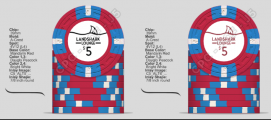
I'm trying to decide what I like better from an inlay standpoint. The solid background with the watermark or the ocean theme with one of the two variations on the naming presentation.

I'd love to hear what you think! I'd like the good, bad, or otherwise. The left most solid red is #1, middle #2, and far right #3.

5 Chip Compare.PNG
 
My suggestion...

Straighten out the word Landshark
Move the text to the center of the inlay
Put a wavy water line above the text
And have the fin towards top of inlay
Do not color in water below, it divides chip

Good luck!
 
My suggestion...

Straighten out the word Landshark
Move the text to the center of the inlay
Put a wavy water line above the text
And have the fin towards top of inlay
Do not color in water below, it divides chip

Good luck!
Are you thinking something like this?
 

Attachments

  • 5 Chip ALT.PNG
    5 Chip ALT.PNG
    174.2 KB · Views: 59
Are you thinking something like this?
Yes, along those lines. Maybe don’t have the water line go all the way to edges, could keep it just over the text only. I’d also probably shift everything downward a bit (denom, text, water, fin, etc...). But these are only suggestions...
 

Create an account or login to comment

You must be a member in order to leave a comment

Create account

Create an account and join our community. It's easy!

Log in

Already have an account? Log in here.

Back
Top Bottom