Labels for Club Cal-Neva Solid (1 Viewer)

Kid_Eastwood

Full House
Joined
Jan 28, 2016
Messages
4,792
Reaction score
8,364
Location
BE
Hi,

I've ordered to @allforcharity a small (200 chips) tournament set to play 6-max in breakdown 8/8/4/7(/2). The chips are original Roulette chips from Club Cal-Neva (Reno). See WTS here.

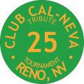
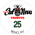
Day Green x 50 --> to be labelled as T25
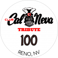
Chocolate x 50 --> to be labbed as T100
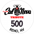
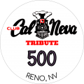
Purple x 25 --> to be labelled as T500
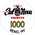
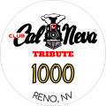
Yellow x 55 --> to be labelled as T1000
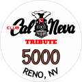
Orange x 15 --> to be labelled as T5000
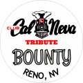
White x 12 --> to be labelled as Bounty

I've chooen "fair" chips (used chips with quite worn hotstamp) so that they can directly take a non-laminated label.

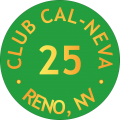
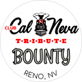
Here's the first mock-up for the label :
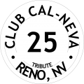
237686

The white part would match the chip color and font color will be goldish to "simulate" an hotstamp.

My first question is: do you think it can look nice ? Isn't it "heresy" ?

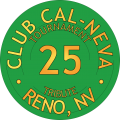
Second question: I hesitate between this kind of chip or faux-shaped labels. The problem with faux-shaped labels is that - I think - they look nice when there is some kind of logo or image inside (e.g. Gold Course on the Dunes or the Horseshoe). However I don't feel that I'd be nice with just text inside. What do you think ?
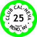
237691
(back color to be adapted to Day Green)

I also think that 'tribute' is written too small and would not be visible when printed. I'll increase its size in 2nd iteration of the mock-up.

—> Link to final version of the labels
Kid.
 
Last edited:
Thanks, I would curious to see how it renders. Another option is to keep the white background instead of color match the back ground with chip color.
 
If using as a tourney set, I would tend toward keeping the white background (or whichever colour you choose) consistent between the chips, which would serve to visually tie everything together, considering the chips are all solids with no edge spots.
 
What do you mean by decal size?
The label size ? I hesitate between entired "recessed" area or just a little bit smaller.
 
So here's some mock-up :

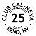
1) With denomination matching the chip color

238051

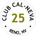
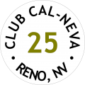
2) As suggested by @Thomacetti , "RENO, NV" in smaller font, denomination matching the chip color and removal of "tournament" and "tribute"

238052

3) Same as (2) but with initial font size for "RENO, NV".

238053

Here's the redering on a CPC chip :

238054


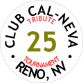
My preference goes for the version with words "TRIBUTE" and "TOURNAMENT".

I've also tried a kind of "faux hotstamp" label.

238055


On the simulator, it looks good but I'm really curious to see how it'll look on a real chip ...
 
Some more mock-up :

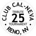
Mock-up 1 : White back-ground, circled Tournament / Tributes
238361

Mock-up 2 : White back-ground, circled Tournament / Tributes with denom matching the chip base color
238363

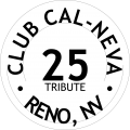
Mock-up 3 : White back-ground, no Tribute / Tournament with denom matching rhe chip base color
238364

Mock-up 4, 5, 6 : faux hotstamp with "golden" texture in the font
238365238366238371

Mock-up 5 : Tributes / Tournament not circled
238367

Mock-up 6 : Tribute not circled
238368


I think it's quite important to at least write something like "TRIBUTE" on a label that uses a real, still operating casino name on a label. What do you think ?
Which elements from the different mock-up do you like ?

Do you have other suggestions ?
 
Unless you are getting a metallic ink I’d skip the gradient thing or do it lightly. The chips I pictured above have the gradient and I’m ok with it but I think they would have been better with the single gold color.

I understand, but I don’t like the word tribute. I’d rather see dates, and if your not using $ signs I’d worry about it less.
 
Here's without the gradient :
238389

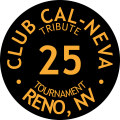
And I also tried with a black label:
238390


I also put the 3 back-ground on the CPC designer tool to see how it's rendering.
So first thing will be to decide on the back-ground :
  • Faux hotstamp ;
  • White
  • Black

238392
 
Hi,

I totally changed direction. Here it is on the CPC designer tool.
What do you think ?

238810


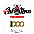
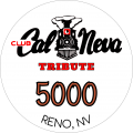
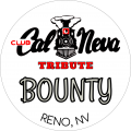
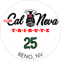
And the labels only :
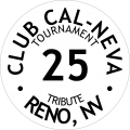
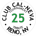
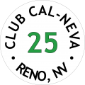
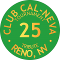
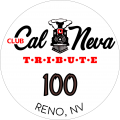
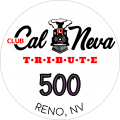
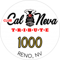
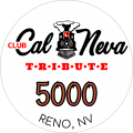
238811238812238813238814238815238816

Kid.
 
I really like the new labels! The only suggestion I would make would be to put a little space between the letters in "Reno, NV". It just looks a little crammed, IMO.
 
@JWC very nice simple inlay !

@MoscowRadio I’ll check this tomorrow. This bottom text gives me a hard time. The letters seem to be stuck together.

I’ll redo the path all over again.
 
OK, so I've just tweaked a little bit the "TRIBUTE" word and I think I'm good to go:
240162240163240164240165240166240167

@allforcharity , if you want to use them to sell your Cal-Neva Roulette, feel free to refer to these design in your sale thread. I can also change the denom and color-match them.
 
OK, so I've just tweaked a little bit the "TRIBUTE" word and I think I'm good to go:
View attachment 240162View attachment 240163View attachment 240164View attachment 240165View attachment 240166View attachment 240167

@allforcharity , if you want to use them to sell your Cal-Neva Roulette, feel free to refer to these design in your sale thread. I can also change the denom and color-match them.

Wow, thanks for the offer! I'll post a link to here on the sale thread!
 
I got great advice on how to optimize my design for better printing results.
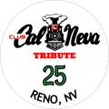
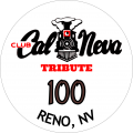
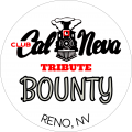
So, I only kept from the logo the locomotive and took a font which is matching the Cal Neva text for less blurry results.

I also spaced the letters "TRIBUTE". It'll be easier to read.
I have also added some spacing between "RENO, NV" letters. I've been adviced to not have a black border on the denom. I've still to figure out what to do there...

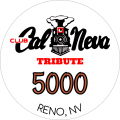
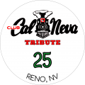
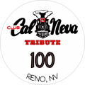
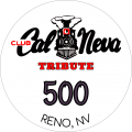
243826243833243828243829243830243832

What do you think ?
 
Last edited:
I can do it but it'll be for tomorrow.
My computer is now shutted down.
 

Create an account or login to comment

You must be a member in order to leave a comment

Create account

Create an account and join our community. It's easy!

Log in

Already have an account? Log in here.

Back
Top Bottom