Label Design First Draft (1 Viewer)

Joined
Jun 6, 2020
Messages
160
Reaction score
123
Location
Phoenix, Az
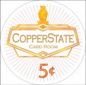
Am taking my first stab at label design for a set of Majestics (microstakes set). Any feedback is appreciated. Not married to the name CopperState, I'm pretty crap at naming things, mainly looking for some decent word play with copper in the name (being a redhead and an Arizonite - leading copper producing state). Any suggestions there also appreciated lol. Thanks guys.
 

Attachments

  • Chip Label 5c.jpg
    Chip Label 5c.jpg
    116.4 KB · Views: 108
This is a set for myself I should add... my first full set of chips. Mainly concerned if the lines are too busy / close to work when printed. Planning on going through Gear to print.
 
If you plan to stay with a white/light background, I think the radiating lines will probably print ok. You may want to play around with your font sizes because your label size will be less than 1" diameter, and it would be good to be able to read the label clearly when the chip is held at arm's length.

Remember, a true metallic can't be printed with a standard printer, so you'll have to settle for "close enough". Gear does work nice magic, though.
 
Close enough to metallic should be fine with them being matte laminated I think. @Gear - do you have CMYK colors you generally recommend as a starting point for matching the majestics?

Still messing around with other background ideas besides the radiating lines.

labels.jpg
 
Last edited:
Since all feedback is welcome, here goes:
The 10ct denom between the 5ct and 25ct seems a bit redundant, but I do know the dilemma of wanting to use as many cool colors as possible.
I personally would put $1 & $5 on the 100ct / 500ct chips or don't put any ct / $ at all on there if you want to be able to use them as a T5.
This is the only set I'll be doing the 10 cent on for sure. Normally wouldn't do that either, This is meant as a $10/20 buy-in microstakes set where more limping will be going on for learning new games / people new to poker / just hanging out for fun and to add a bit of color (since the orange chips would probably very rarely get used).
 
Last edited:
This is the only set I'll be doing the 10 cent on for sure. Normally wouldn't do that either, This is meant as a $10/20 buy-in microstakes set where more limping will be going on for learning new games / people new to poker / just hanging out for fun and to add a bit of color (since the orange chips would probably very rarely get used).
Yeah, I get you. I think it's perfectly fine to do, if you trade easy cashouts and the higher initial investment cost into moar chips and are aware of the pros and cons.
 
Personally I'm not a big fan of faux effects, but other than that I think your logo is nicely done. The intricate lines at the top of the logo might not be very visible on the end product and could end up looking like a block of gold, if you want to emphasize the design maybe use a slightly different color (not just for the lines, but the different parts). I would also try the texts in black and denom in red to add a little depth to the overall design.
 
Personally I'm not a big fan of faux effects, but other than that I think your logo is nicely done. The intricate lines at the top of the logo might not be very visible on the end product and could end up looking like a block of gold, if you want to emphasize the design maybe use a slightly different color (not just for the lines, but the different parts). I would also try the texts in black and denom in red to add a little depth to the overall design.
Thanks! I'll give those a try
 
This is the only set I'll be doing the 10 cent on for sure. Normally wouldn't do that either, This is meant as a $10/20 buy-in microstakes set where more limping will be going on for learning new games / people new to poker / just hanging out for fun and to add a bit of color (since the orange chips would probably very rarely get used).
If the 5 rarely will see play I would imagine a 20 never will. Nonetheless, I would skip the 10ct in favor of a 20/25. While the 10ct is completely useless (since you have a 5ct), the 20/25 will see use eventually. If nothing else through inflation.

Really like your design by the way!
 
Maybe use a gradient instead of the lines. If you want to chnge the name maybe Copper Mine card Room
 
The color suggestions were great, thanks! Will continue working on various alternatives to the lines like gradients / alternative patterns

View attachment 601645
I def like these colors better. Also on board with mipevi as a sceptic on doing faux inlay shapes, I think all circular would be great, and you’ll never be disappointed by some slight color difference.
 
As long as the labels are color matched, the printed inlays look ok. The Horseshoe chips for example, while definitely I prefer the look of actual inlaid Paulsons, the Horseshoes aren't bad. I will be accounting for 1 or 2 test label print runs first with various shaded CMYK colors to tune in the colors to make sure the shading isn't off, that would drive me nuts too.

I'm actually preferring no infill or lines though in the white space now... stuff like that is probably best left to ceramic chips and plaque designs. Thought I would give it a shot though. Simplicity adds a lot quite often, less is more.

Below, the 2nd image is just a white background field, and #4 is a very slight gradient at the edge near the color border. They seem to be the ones to go with. Will try both with the first test print batches.


LabelsColors3a.jpg
LabelsColors3b.jpg
LabelsColors3c.jpg
LabelsColors3d.jpg
LabelsColors3e.jpg
 
Last edited:
I like the gold wave background, but I'm not sure if they would come out well, given how difficult it can be to print intricate designs on labels. Either way, that's a really nice design, especially as your first one.
 
Last edited:
I like the gold wave background, but I'm not sure if they would come out well, given how difficult it can be to print intricate designs on labels. Either way, that's a really nice design, especially as your first one.
Thanks! I may try to see how some of these print, just to see what happens - I am curious what the fine limits are
 

Create an account or login to comment

You must be a member in order to leave a comment

Create account

Create an account and join our community. It's easy!

Log in

Already have an account? Log in here.

Back
Top Bottom