Label (Artwork) Feedback (1 Viewer)

Dodger

Flush
Joined
Jun 15, 2018
Messages
1,540
Reaction score
3,526
Location
Upper Left
Samples ordered, and waiting for them to come in. So I tried my hand at some label artwork and mocked them up on the Majestics.

I live in a small town where the paper mill has anchored the town since before it was an incorporated town. So that’s the inspiration.

Any and all feedback welcome.
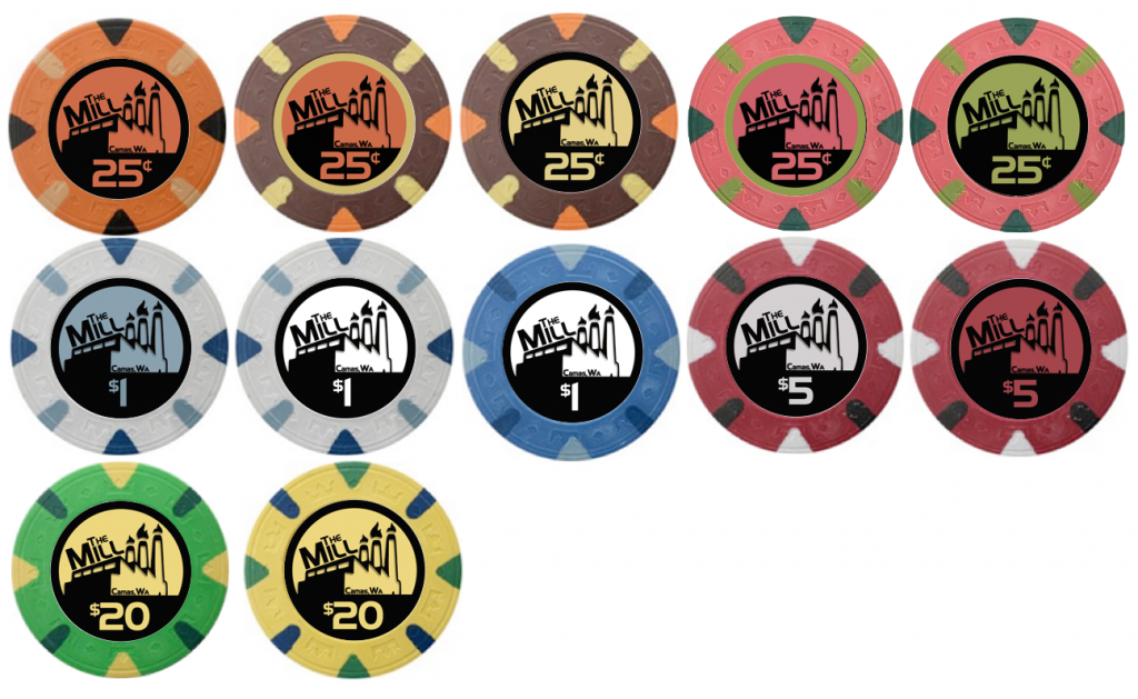
49A93F13-245B-4D1F-8B2A-B62D4CDAEB04.png
 
Like the design and favor the background color matching the spot rather than the chip itself.
 
Samples ordered, and waiting for them to come in. So I tried my hand at some label artwork and mocked them up on the Majestics.

I live in a small town where the paper mill has anchored the town since before it was an incorporated town. So that’s the inspiration.

Any and all feedback welcome.

View attachment 183202

Very cool! Agreed with color matching the spot.
 
I’m with you all on the spot matching.

From a color/denom standpoint, I think I favor the pink .25 (green label), the white $1 (blue label), and green $25 (yellow label).

Be interesting to get this label design mocked up on the Milanos, but I think the Majestics are looking good.
 
I like the design as as a simple black and white like in the 2nd & 3rd version of the $1 chip from the OP.
 
I like them. But I'm partial to colorful chips. I can see @Rhodeman77 point of the simpler black and white, but the color is more fun and not over done at all. I vote to ship it and go all in.
 
Very nice, indeed. Have you experimented with how it would look with making the denom numbers and symbols match the chip cut keeping the background color-matched with an edge spot? I'm not saying it would look better but it might. In the case of black, use the other color edge.
 

Create an account or login to comment

You must be a member in order to leave a comment

Create account

Create an account and join our community. It's easy!

Log in

Already have an account? Log in here.

Back
Top Bottom