Psypher1000
Straight Flush
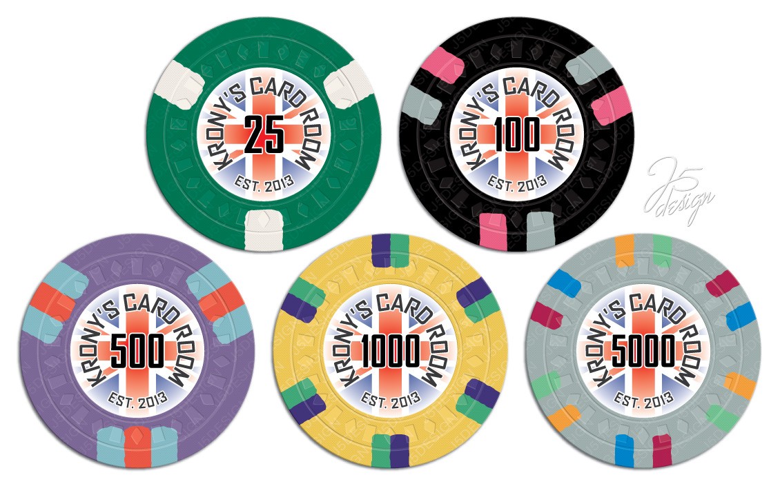
Still prefer the black, but the dark grey is okay. I'd avoid the light grey.
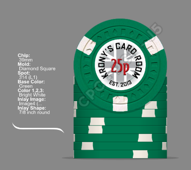
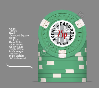
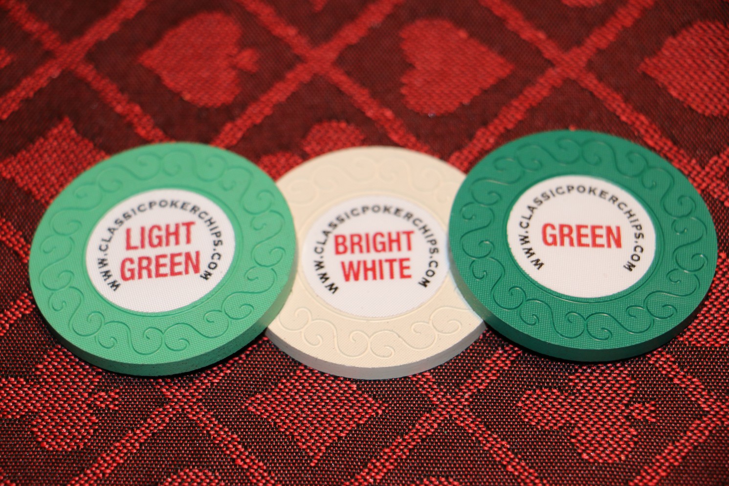
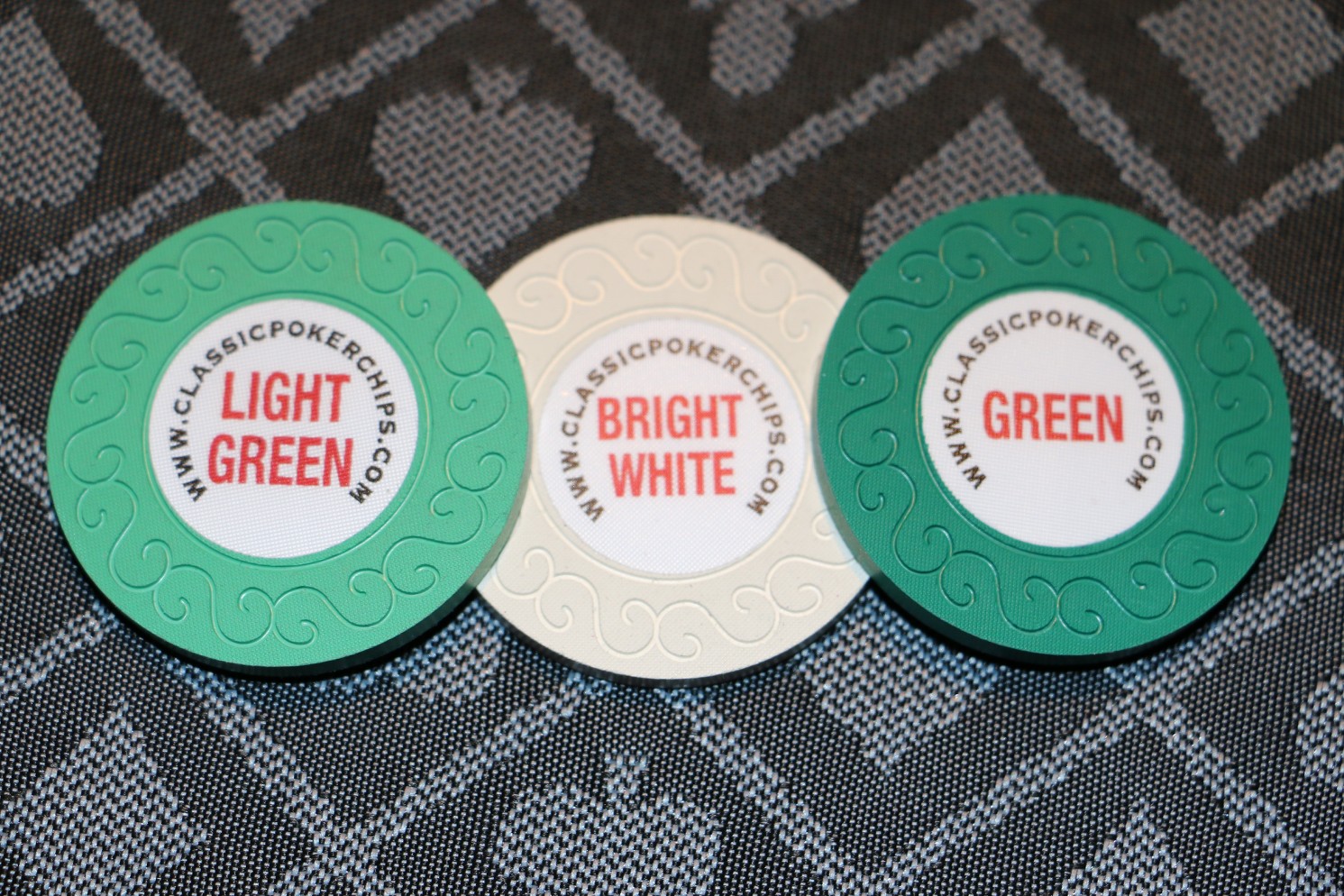
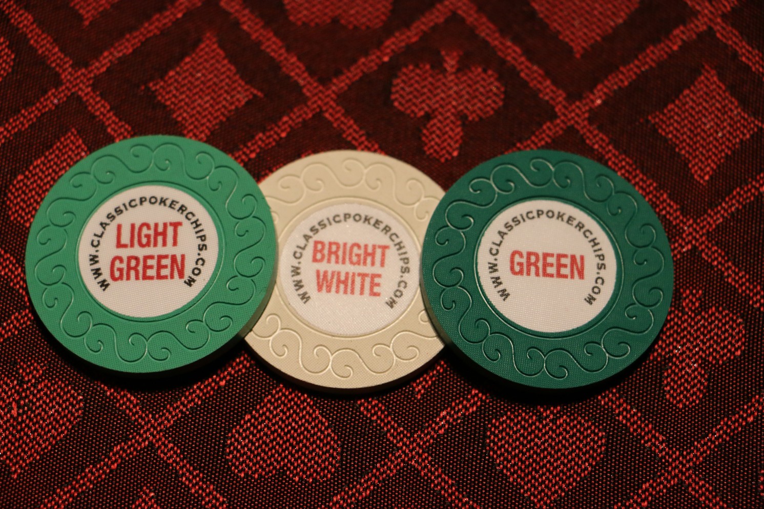
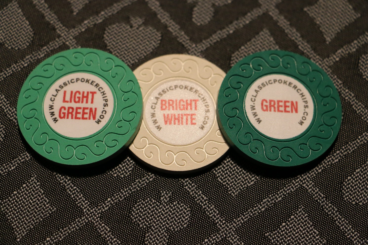
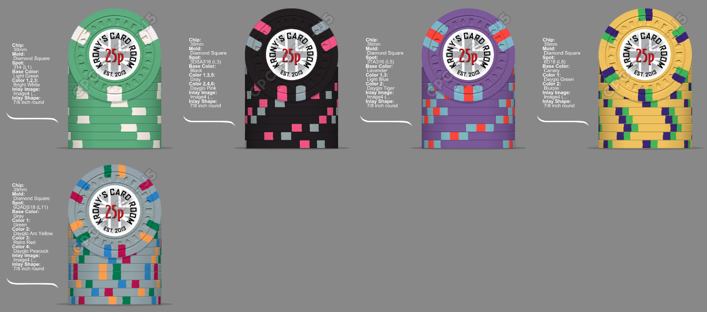
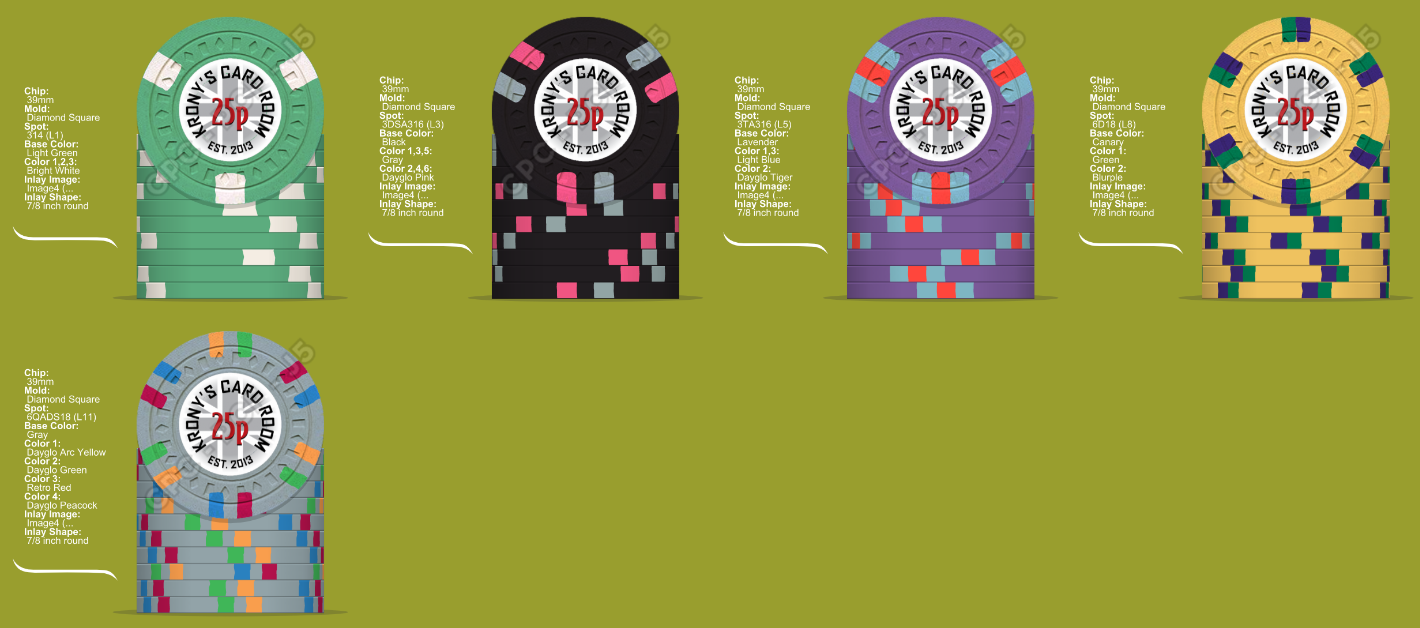
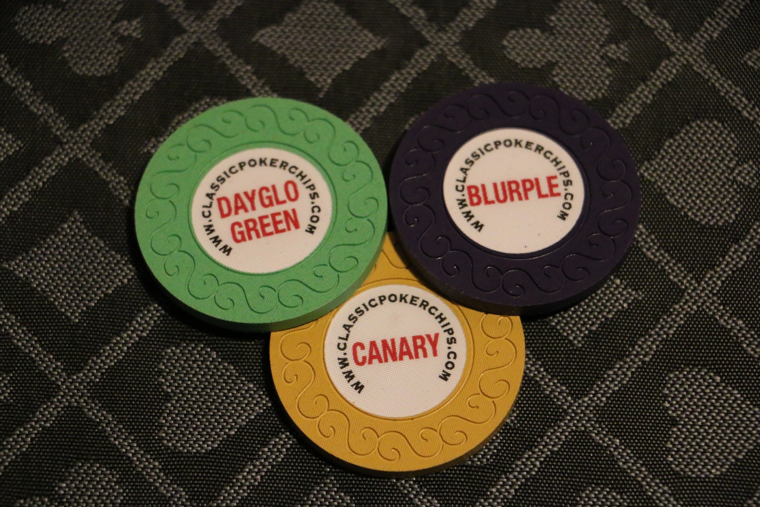
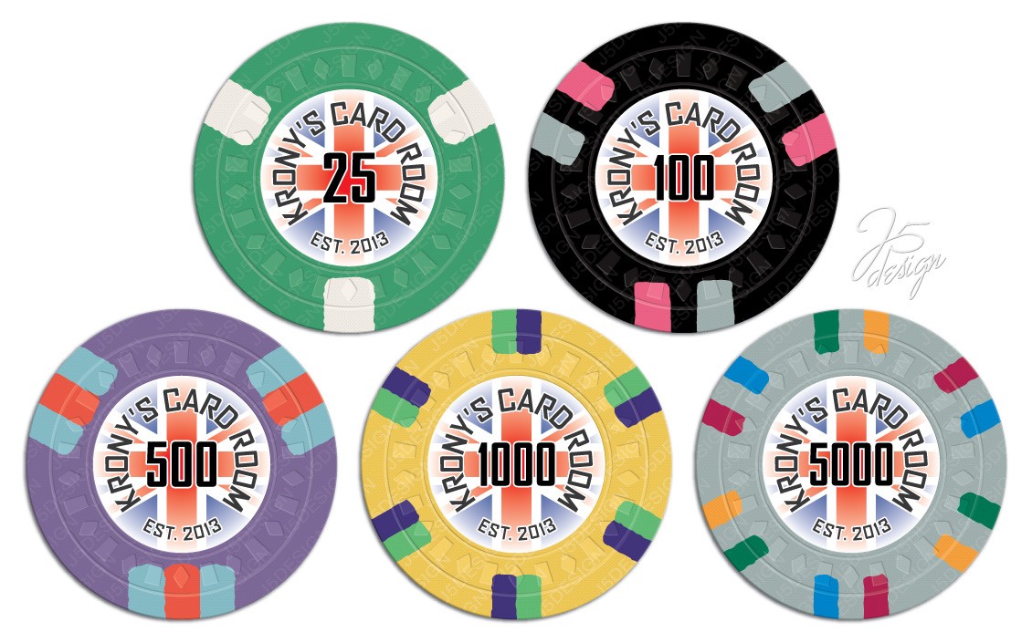
For what it's worth, here's a chip of light green and bright white so you can see how it looks. Looks fine to me. Just a matter of which you think looks better next to your t100.am now thinking do a swop out the green for light green on the 25?
(y) :thumbsup: Solid choice. Light green is my favorite CPC color FWIW.Thanks, yea i think the Light Green choice is the way to go, look better mixed in with black 100's and the contrast between the green and white is still enough.
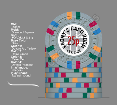
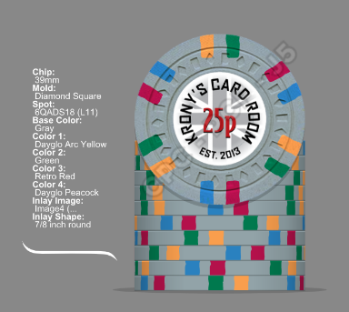
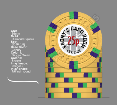
Love it! Can't wait to see them for real!Final mock from @Johnny5 with the new colours")